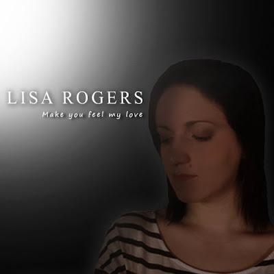
This is the first design I produced. For this concept I took reference from my research on Adele's album cover, which portrayed her from the soft lighting and colour combinations as very femenine. For my design, I used the idea of a spotlight over me to create this light, turning the opacity down on Photoshop to create a fading effect as it got further away. I did this to look like the light was chasing me and covering me, contrasting with the black background, which I chose to represent sadness and being alone, as that is what the heartbreak song represents. I wanted the two tones combined to show how I could not reach happiness until something had happened, which is the design of the plot in our video, as I go through a series of flashbacks before meeting Jacob to confess my love at the end.
The text that I chose was smart and similar to the font that Adele uses. It is easy to read by any audience and shows clearly the name of the artist. I also chose a text whilst experimenting with this for the album title, which I thought was an appropriate looking hand-rendered version, however I may edit this when choosing a final design. I coloured both titles in white to make it clear for the audience to read, and to represent the innocence of the character and the artist. I finally placed the chosen photograph of myself (in medium close up to show clear facial expression and emotion), just to the right of the design so that the light could be seen coming towards me, along with the title beside the image. I used the shadow effect over my face to again show that I am lonely and that perhaps an emotional shadow of guilt or loss is hanging over me. Overall, I am pleased with the effect of this design, as it portrays a clear message and is easy for an audience to read, however I do not think that the shadow idea is effective enough as it covers too much of my face, and also the image itself stands out too much from the rest of the design.

This is the second design that I created, using one of the photographs taken during our time in the recording studio. I thought this, already taken in black and white tone, looked professional and clear, and that the use of the microphone sound sheild and headphones also gave a very efficient and professional approach.
The text I used is again a type that I thought was clear for the audience to understand, which I decided to capitalise for a smarter effect. I also chose a hand-rendered text for a more personal feel, which I preferred to the previous hand-rendered font I used. I then coloured both of these gold, as in my research of Leona Lewis' album 'Spirit', as I thought this was eye-catching and gave an official type of effect on the album. The next touch that I added was a soft brush on Photoshop, which I lowered in opacity and flow to cut out the harsh outlines of the photograph to give a flawless and neverending feel, making the design more delicate. The last thing that I did was change the levels of the photograph so that it contained more depth and detail to my face so that it could be seen better to show expression and emotion clearer. I am very pleased with this outcome, as I feel it represents the artist in a very feminine and gentle manner, and also looks very professional as something you would expect to see in a music store on the shelf.
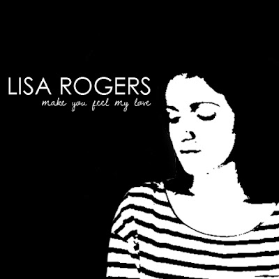 This is my third design for my CD, which was mainly experimental, however I had taken reference from this from The Script's black and white design for their CD 'The Script' and thought about ways that I could expand on this for my cover. I chose that design to look at, as it was bold and straight to the point, allowing the audience to see exactly what they are getting in a smart and simplistic format with no difficulty of reading the text.
For this design , I created a black background and placed my image again to the right to allow space for the text. The main theme was black and white, so I experimented with the Threshold tool on Photoshop to match this. I liked the effect, as it was simplistic yet created an iconic representation of the artist with this tool so that the audience would recognise it when seeing the cover to be my CD. I then chose a text which I thought looked very smart yet had an informal curvatious shape about it so that it did not look like a text used for office printing or a newspaper. Below this, I used a hand-rendered text that I thought was appropriate, and coloured them both white to contrast with the background and for easy reading for the audience. Overall, I am pleased with this design, as it is not complicated but still holds iconic representation of the artist to the audience. The only issue with this is keeping the theme throughout the rest of the digipack in a way that still represents romance and heartbreak in the correct way.
This is another design that I created, which I experimented with by keeping the same theme as the last design, but using a red colour in replacement of the white to represent love and romance. I like this design, however I think that with the change of colour it looks too modern and leans towards a dance or DJ genre for a CD cover, therefore I have decided not to use this for my final outcome.

This is a design I created in reference to my original notes of planning, in which I said I would include a grey gradient/erroded background. I decided to experiment with this to see the outcome instead of using a predominantly black background. To do this, I uploaded a texture that I had saved, and experimented by lowering and heightening the depth using the levels tools on Photoshop. I lowered the texture more to get a more depressing, lonely and urban street kind of look, as this is what streets with the same type of walls represent and give off in videos and films to an audience. For this design I also used a different photograph to see the effect, this time one of me sat with my back against a wall and my legs out infront of me. My arms were loosely wrapped to represent loneliness, and I was looking ahead to show I was thinking of what would happen next in the story. For the development of this idea, I experimented with the opacity levels to give a slightly opaque effect to represent how the character's future in the video was unclear since her split with her boyfriend. The overall design represents depression and loneliness, to link with the similar conventions used in heartbreak videos. For the title I found and downloaded a font called 'Day Roman', which had serif qualities which I thought looked smart and easy for any audience to read. It also fitted well with the style of the background, which looked like an old stone building, and the text used for the title looked like an engravement font you would see on a building of the same type. This also indicates this theme of sadness and depression, as this is what old buildings stereotypically represent, aswell as emptiness and a sense of division from the world, which is what I am trying to show within the character's personality. The text that I used for the album title is named 'Dawning of a new day', which I used in previous designs above. I have decided to keep this font for my final design, as I like the warmth and personal approach it gives in contrast to the lonely and darker text and background, making the audience in this sense feel a connection to the artist. I chose to colour this white for easier reading and contrast with the rest of the design.
Overall, I am pleased with the result of this design, however I am worried that the colours are too dark to show enough of the artist's face and emotions. I like the use of the erroded texture, as it gives the representation of desolation towards the artist's feelings that I want, therefore I will still consider this for my final design.

This is the next design that I created for my front cover, which I did by taking reference from Rihanna's CD design in my research. For this process, I first made a gradient background of a light blue and turned down the opacity and flow levels in order to create a seamless flowing design. I then, using the same fonts as in the previous design for my arist and album title, placed these into the top centre of my design to catch the audience's attention when viewing the CD. I also used the same image as in my previous designs and airbrushed my face to erase blemishes, giving a fresher more alert look to my face, and applied hints of makeup to my eyes for a smokier look using the colour brush, matching the background colour and again representing loneliness from doing so by using the blue shade. I finally placed the image slightly to the right and enlarged it in order to see facial and emotional expression. This design is simplistic and purposely follows similar conventions to Rihanna's design in order to see if similar effects could be created, as her design conveys depression and sadness from the shadows over her face and the colour combinations used for the background. I think that my background could have been made darker to convey this idea to the audience further. I also tried to add shadow over my face to represent loneliness, however I found this difficult, as I had not properly erased smaller parts of the background from the original image, and therefore ended up with large spots around the image after editing which I could not get rid of, which spoiled the simplistic design. I will not use this design for a final image, as I think it could have been developed further to create stronger genre conventions to be put accross to the audience.
NOTE: During my design process, I have found the images that I have used limiting for my designs, as there is not a very wide variety, making designing difficult as it is hard to expand when I feel some of the pictures do not express enough emotional impact through body language and facial expression. I also feel that the sad and depressing theme to highlight the genre of the song has been difficult to design for during the process, as it is hard to keep the pattern in different ways throughout the design. Therefore, I have decided that I will take more photographs to use for my overall digipack design, which may make the development easier. I have also decided to use Ellie Goulding and Mariah Carey as influences for my digipack design, as I have decided that a more positive approach will attract the audience more, focusing on the feeling given to the album as a whole instead of the particular genre of the song, as it is not a single and so the song is not the main focus. Their designs involve lots of soft light and warm colour, therefore I will try to represent this in my own digipack product as much as possible.

This is Mariah Carey's front cover for her greatest hits that I decided to look at for reference now that I had changed my idea, as I had not studied her actual front cover previously. This contains much natural looking light and delicate shadows. The text is golden like in previous designs I have looked at to represent the artist as smart and classy. The font is serif to go with this, and the text is limited. I will use this for reference in my cover and try to get a similar design.
 This is the next design that I created using the reference from my Mariah Carey research and album cover. For this design, I used the same light grey gradient background used in Mariah's cover, then placed the image of me into the centre. I tried using this pose to see the effect, however I preferred ones of me stood or sat straight as it looked more professional and less casual, therefore I decided I would use this in my next attempt. I then posterized the image and placed a light shadow over it to get the warm effect Mariah had in her cover. The next thing I did was place the artist name at the top in a large font named 'Day Roman' for a professional and eye catching approach, colouring this gold for a classy effect. I then used the same 'Dawning of a new day' font for the album title, giving a shadow below it for a delicate look, and coloured it grey to match the background.
The reason I am not using this design is because I have resized the picture in a way that my body looks unbalanced and distorted, and the use of the posterize tool made me look too orange and animated. The grey text for the album title was also too faint and the shadow made it look like it was wet ink running down the page, therefore I decided to use a fainter shadow and a different colour scheme for my next design.
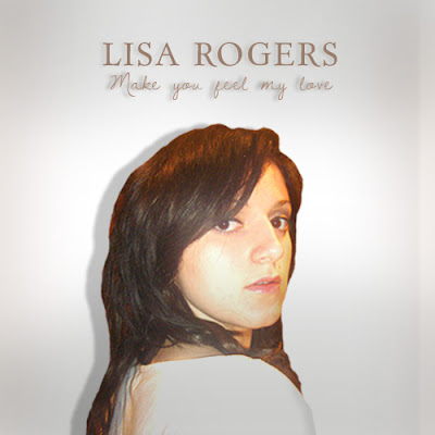 This is the next design that I created, using the same gradient technique and experimenting with the levels to make a light shadow over my face. I placed the image of me into the centre and enlarged it, cutting off some of my body for emphasis on my face, making it iconic so that the audience could remember what I looked like from the cover. I then placed a light shadow behind my head, representing the sadness that was hanging over me. At the top I added the artist and album titles in the same fonts as in the previous design, but this time used a brown sample colour taken from the image of me which I thought looked professional yet had a modern appeal to a younger audience. I placed the shadow fainter this time behind the album text, making it look softer and more delicate. I like this design, as it shows recognition of the artist to the audience, and as in my research gives off a very delicate approach.
 This is the next design that I created using the reference from my Mariah Carey research and album cover. For this design, I used the same light grey gradient background used in Mariah's cover, then placed the image of me into the centre. I tried using this pose to see the effect, however I preferred ones of me stood or sat straight as it looked more professional and less casual, therefore I decided I would use this in my next attempt. I then posterized the image and placed a light shadow over it to get the warm effect Mariah had in her cover. The next thing I did was place the artist name at the top in a large font named 'Day Roman' for a professional and eye catching approach, colouring this gold for a classy effect. I then used the same 'Dawning of a new day' font for the album title, giving a shadow below it for a delicate look, and coloured it grey to match the background.
The reason I am not using this design is because I have resized the picture in a way that my body looks unbalanced and distorted, and the use of the posterize tool made me look too orange and animated. The grey text for the album title was also too faint and the shadow made it look like it was wet ink running down the page, therefore I decided to use a fainter shadow and a different colour scheme for my next design.
 This is the next design that I created, using the same gradient technique and experimenting with the levels to make a light shadow over my face. I placed the image of me into the centre and enlarged it, cutting off some of my body for emphasis on my face, making it iconic so that the audience could remember what I looked like from the cover. I then placed a light shadow behind my head, representing the sadness that was hanging over me. At the top I added the artist and album titles in the same fonts as in the previous design, but this time used a brown sample colour taken from the image of me which I thought looked professional yet had a modern appeal to a younger audience. I placed the shadow fainter this time behind the album text, making it look softer and more delicate. I like this design, as it shows recognition of the artist to the audience, and as in my research gives off a very delicate approach.
No comments:
Post a Comment