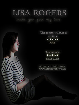
 This is the first design that I created using my original pictures. For this, I followed the rule of my digipack initial designs and used a black background to represent sadness and isolation. I then placed the image of my sat folding my arms, again to reference loneliness, into the image, changing the levels on Photoshop to give more of a shadow over my face to give this impact further. I also added a white outer glow to give emphasis on the artist. I placed a serif style font that I had previously used in my digipack designs into the design for the artist title to give a professional look, and used the same style hand-rendered font named 'Dawning of a new day' for the album title. I coloured these both a light grey and added an outer glow for emphasis. I used the same colour technique for the quotes from magazines about the album below this, an idea I decided to use from the Stone Roses magazine advert I had looked at. They also had star ratings which I placed into the advertisement, colouring them white to contrast with the black background, and gave an outer glow again for a bold emphasis to catch the audience's attention when looking at this. Below, I wrote a short statement about visiting the artist's website to buy the album which had been released.
Overall, this design is eyecatching and conveys the correct emotions about the genre of the music to the adience by using contrasting tones rather than colour, however, I do not think it contains enough of these codes to really attract someone and make them want to buy it, as the image is not eye-catching enough and the information on the page is limited. I think that the image needs to be brighter so as not to get lost between the bold text and quotes, and the background could perhaps be different rather than one plain colour for more attraction to the advert when opening the page.

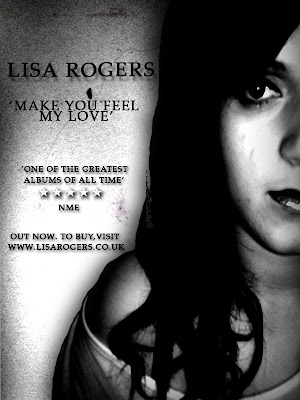
This is the next attempt that I created, this time using the new imagery of me that I had taken, as I felt that my original images were few and limiting for designing. I chose this picture as it was visually clear and expressed emotion well. I enlarged this image to make it instantly eye-catching when opening the page, placing it on the right hand side so that text could be placed beside it. I then placed a grainy texture behind it that I downloaded to again connotate sadness and depression. The next thing I did was experiment with the levels to darken the image drastically, giving darker shadows over my face and making my eyes look darker, again emphasising the depression and darkness of the genre of the song and the advert. I next placed all of my text the left of the image and used the same serif font as previous, as I thought this looked professional. I coloured it all black as the background was a lighter grey which I thought still allowed the text to be seen, and added a drop shadow for emphasis on the font. As the space for text was limited due to the image being so large, I added only one quote this time, and placed the star rating once again between this and the magazine it came from.
Overall, I like this design as the darkness and the use of drop shadow captures its boldness and emphasises the genre of the video and advert. However, I think that the image was too large, and that there could have been more space allowed for more information on the album, as it looks quite brief to an audience reading it who would want to find out more. I therefore decided that my next design should include more information using my research to create a successful and eye-catching advertisement to promote as much as possible.

This is the next design that I created. For this design, I had begun to change my ideas, as the dark and erroded style I had decided to use was becoming difficult to develop successfully. I wanted a more positive and striking approach to my designs to capture the audience's attention to the album and more importantly the artist, rather than focusing on the genre of the one song. I looked back on my research for my digipack designs and saw Mariah Carey's album, filled with natural light and warm colours, giving attraction to the audience from the delicate tones and professional look overall. I then thought back to the new images I had taken of me, and a particular pose that I had chosen in reference to the Ellie Goulding research that I had done, where I was smiling up to the sky to represent liberation and positivity. I wanted this sense of 'letting go' to appeal and become the theme of my advertisement, changing the perspective of my music and making the audience feel that it does not all follow the same heartbreak genre, but genreally creates a relaxing feeling that conveys passion through the vocals and instrumental used. I looked back again to my Ellie Goulding research and realised the them of her and Mariah carey's designs were similar, using soft white light and images predominantly featuring the artist. I still wanted to show aspects of romance in my own designs, using the images Jacob and I holding hands, but wanted to do this in a way that showed love in a positive light rather than all negative, as I thought this would not get enough positive feedback from an audience on an entire digipack design showing just heartbreak and depression. I decided that from now on that my work would be heavily influenced by these two designs in order to create this liberal feeling, and successfully conduct positive feedback from the consumer audience.
The first thing that I did to create this design was look at the style of background Ellie Goulding used in her advertisement. This was a simple scene which was shown to be slightly out of focus to draw attention to the artist. I had previously taken pictures at the marina of the sea, but had them out of focus to give the audience a warm relaxed feeling as they look at the image. I decided that this would be a good image to use for my background, so placed this underneath the image of me in the Ellie Goulding pose in her advertisement. I then used the soft brush to blend a black light over the top and botton thirds of the design in reference to Ellie's design, before adding a black drop shadow over the image of me. I experimented with the levels of the image of me, which I placed in the centre for direct attention to the artist as the first thing the adience sees, however it did not look fitting with either a lighter or darker level, as I wanted to have brighter colours rather than contrasting shades in this attempt. Therefore I tried posterising the image, which brightened sections, giving it more of a subtle burst of colour to make it more eye-catching and positive. The next step was to add the artists name, which I did using the previous serif font as I thought it looked professional, and coloured this white, giving it a white outer glow for emphasis. I made this large to catch the audience's eye and make them remember the artist's name. I then looked at Ellie's advert and noticed she had a brief summary from a listener's point of view of how the music makes them feel and the consumer. I thought that this was a good technique to use, as it is explaining what you will get in the album and makes it more likely for a consumer to listen to this and decide to try it for themself. Therefore, I came up with a brief synopsis and placed it below the title. I did not include the album title as I wanted this advertisement, like Ellie's, to be more if a promotion to the artist rather than the song or album itself. I then added quotes about the album around the image, colouring them white for emphasis with the outer glow, and adding my star ratings below them as in previous designs. The last thing that I did was place a relevant line about the album release and website adress below the image as in the previous designs.
Overall, I think this design looks a lot more professional and informative than other designs, as the soft brush effect behind the text and posterising of the image gives a positive and colourful approach, making the audience feel happy just looking at the advertisement. I like the idea of using the synopsis, as it is informative and gives the audience an insight on what they will hear, and the star ratings are good for another person's point of view as it is all promotion of the artist and album.
Despite this, I have decided to change this design, as I think the black light, although successful in Ellie's design, makes the overall impact duller and leaning towards a negative approach. I also think that the text for the artist's title is too much in a serif style and needs to be made more casual as Ellie's font is designed, making it more personal to the audience and breaking the serious undertone they would pick up when reading this. I have also decided to use promotion of stores where the album can be bought as in Madonna's advertisement and that of The Stone Roses, using synergy to link the companies to the artist for attraction and more promotion of the overall product.

This is the final design that I have used and change. For this design, I changed the black soft brush light to white to send off a more positive vibe to the audience, and give emphasis on the liberated feeling I wanted them to feel when looking at the design. I also changed the artists font to a more curvatious and rounded text that gave a more modern and personalised feeling, and coloured the rest of the fonts in black to this time contrast with the white, also adding more of a drop shadow for emphasis on this. This time, below the artist, I included information about being able to download the album from Itunes, and below this added the icon on the bottom right, paired with the HMV logo on the far left for more iconic value and use of synergy. Overall I am pleased with the design, as I think it now contains more information for the reader to take in, giving opinions from other media, and linking companies to the artist for more promotion.
No comments:
Post a Comment