Tuesday, 29 March 2011
Public awareness of advertisement.
This is the public advertisement I created, the purpose being to attract and allow the audience to become aware of what is being advertised through the conventions used within the design, and the convention of using the bus stop advertisement itself to do this. I placed my image onto a picture of a bus stop to show how it can fit and look successful as a public advertisement that would attract and promote the album successfully. I am happy with this outcome, as the text and image are large and attractive to catch the audience's attention upon first sight, and is bright and bold enough to make them want to read more and hold potential for them to buy and listen to the album.
Saturday, 19 March 2011
Digipak construct pictures.
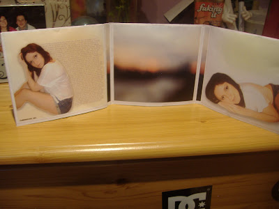
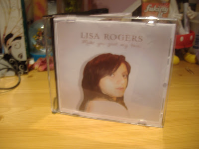
This is my digipak construct, which I have taken pictures of to show how it works in a CD case as a professional product album. I am very happy with this result, as I believe the design is conventional to be appealing to the audience using appropriate type and imagery to look professional and believable as a real product.


Friday, 18 March 2011
New CD Design.
Album promoted on Itunes
Other Digipak designs.
These are the digipack designs I only did one or two attempts of and did not post the individual process for on my blog. Below I will state why I designed these in the way that I did and why I decided to use them for my final product.
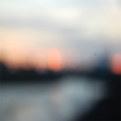 The first design is for the inside central cover, which would have the CD placed over it. Therefore, this would have to be very simplistic, yet still stay within the generic style that I was working with. I chose to use the out of focus image of the marina, as this showed much colour and light, following the pattern of the rest of my design. It also looks very soft, connotating romance and emotion, therefore representing the genre that I wanted to portray in my digipak and designs. I am happy with this image, as it contains the codes and convention of a romantic song, yet is still simplistic enough for the CD to be placed over the top of it without taking away too much attention.

 The first design is for the inside central cover, which would have the CD placed over it. Therefore, this would have to be very simplistic, yet still stay within the generic style that I was working with. I chose to use the out of focus image of the marina, as this showed much colour and light, following the pattern of the rest of my design. It also looks very soft, connotating romance and emotion, therefore representing the genre that I wanted to portray in my digipak and designs. I am happy with this image, as it contains the codes and convention of a romantic song, yet is still simplistic enough for the CD to be placed over the top of it without taking away too much attention.
This is the design for the inside right of the digipak, showing a medium close up of me laid down and looking into the camera. I experimented with the levels on photoshop for this outcome, and was happy with the light effect that it gave the edges of the photograph, making it look delicate and gentle like I wanted throughout my design, as this connotates love and affection, aswell as positivity when looking at the image, giving a good light on the artist. I also played around with the blur tool and slightly blurred the image to give a much rounder and softer appeal to the face and body, again emphasising the gentle elements of the design. I am happy with this outcome, as it reflects positivity and the gentle and warm effect I wanted the audience to feel when opening the digipak. The image does not have any text beside it, as I wanted the focus to be on the artist and promoting them, as this is the main element of my designs that I wanted to make clear to the audience.
Completed Digipak.
Here is my completed digipack design which I fitted onto the digipak template I had found. I am very happy with this design, as with the covers combined, it looks very professional and believable as a CD that has come from a well-known artist in the charts, which is the effect I was trying to create based on my research of signed and popular artists.
Thursday, 17 March 2011
Back Cover Designs.
Here are my designs for my back cover that I created for my digipack. I will state below which I will be using for my final product and why.
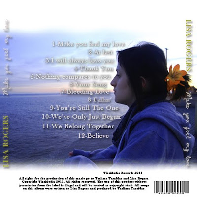
This is the first design that I created, using a medium shot of me stood at the wall seen at the end of our video and in the flashback scene, which is why I chose this shot, looking out at the sea. I liked this shot as it was clear and looked professional from the lighting, and was also iconic to the audience as it was something taken directly from the video which I knew they would recognise. I then took reference from the Justin Timberlake back cover design I had researched. I placed the song title, coloured in gold for a professional look, and the album title, in the hand-rendered white font for clarity and a personal effect, down the side of the cd to the right and left for recognition to the audience so that they remember the name of the album even by just reading the back cover. I also experimented with the levels of the picture to give a deeper and more romantic effect, before using the 'Dawning of a new day' font to create the song titles for the design. For this process, I looked up 'greatest heartbreak songs' on the internet and found lots of titles that related to the same genre. I then named the tracks from these titles, and placed them in the centre around the figure of me, rehiterating the idea that the artist comes before the text and is the most important feature. I added drop shadows to make the text stand out over the background, and added a barcode and terms and conditions at the bottom of th design. I like the appearance of the darkened image and drop shadows over the text, as it gives a deeper more emotional feeling from the blue colour connotating sadness. However, I think that the text at the side of the design makes it look tacky and does not match with the colour codes as a whole. I have also considered the rest of the design, and I realise that this blue colour will not match the bright white backgrounds predominantly used in the rest of the digipak, therefore I have decided not to use this cover, and to instead create something bright to fit the colours and match the rest of the design to develop continuity further.
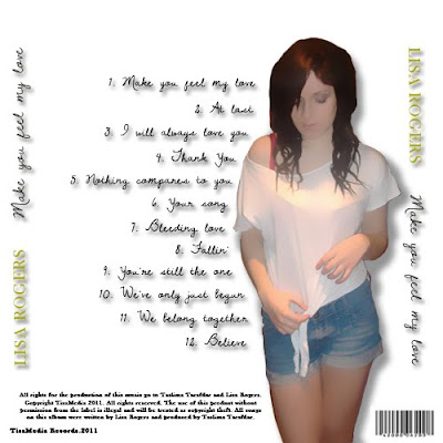
This is the second design that I created, this time using a white background to fit with the theme of my digipak. I used the hand-rendered text for the track titles, giving a shadow underneath for clarity of the text on such a contrasting background. I spaced these again around the large image of me which I placed slightly to the right of the design to allow space for the album titles to be placed. I experimented with the blur of this image on Photoshop, creating a very computerised animated effect. I liked this, as it was a different approach to the design and was very unique compared to previouus pages. I then placed the artist and album title headings on either side as before, and placed the music rights and barcode beside the image at the bottom. I like this design for its unique effect, however I do not think the animated effect fits enough with the rest of the design and looks odd in comparison. I also dislike the album headings at either side, as I still think that they look too bold and tacky, therefore I will design another cover and will not include this in it.
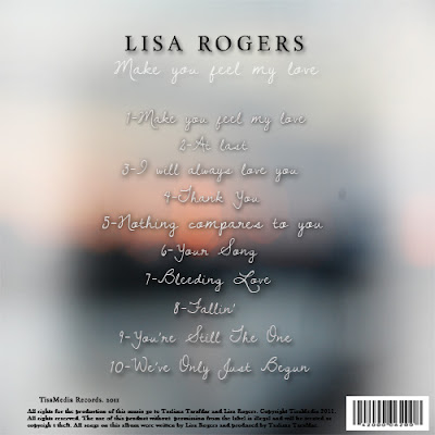 This is my final design I created. For this product, I debated about which image I should use to create the correct romantic effect that I wanted. After searching my images and experimenting with text over the background, I decided that the out of focus image I had previously used for the CD panel would be the most successful, as the soft effect of the poor focus connotates affection and emotion in a romantic way that will bring this idea accross to the audience when viewing the design. I then placed the album titles down the centre of the page in the same hand-rendered text as in previous designs, giving a drop shadow for clarity when reading. I also placed the artist and album titles at the top of the design as in the front cover, giving continuity and easier recognition to the audience. I like this better than in previous designs where the text was placed vertically at either side, as the colours in the image made the text difficult to see. I placed the rights and record producer name at the bottom again in black text along with the barcode. I decided not to use an image of the artist in this cover, as I thought that it would take away from the main romantic ideology of the background, and was finding it hard to make previous imagery fit in a way that would make this idea clear to the audience, and fit with the overall design. I like this outcome, as it conveys the correct ideas to the audience about the genre of the album, and is presented in a way that delivers a clear message of what is contained in the album to the audience when looking at it. For these reasons I have decided to use this in my final product.

This is the first design that I created, using a medium shot of me stood at the wall seen at the end of our video and in the flashback scene, which is why I chose this shot, looking out at the sea. I liked this shot as it was clear and looked professional from the lighting, and was also iconic to the audience as it was something taken directly from the video which I knew they would recognise. I then took reference from the Justin Timberlake back cover design I had researched. I placed the song title, coloured in gold for a professional look, and the album title, in the hand-rendered white font for clarity and a personal effect, down the side of the cd to the right and left for recognition to the audience so that they remember the name of the album even by just reading the back cover. I also experimented with the levels of the picture to give a deeper and more romantic effect, before using the 'Dawning of a new day' font to create the song titles for the design. For this process, I looked up 'greatest heartbreak songs' on the internet and found lots of titles that related to the same genre. I then named the tracks from these titles, and placed them in the centre around the figure of me, rehiterating the idea that the artist comes before the text and is the most important feature. I added drop shadows to make the text stand out over the background, and added a barcode and terms and conditions at the bottom of th design. I like the appearance of the darkened image and drop shadows over the text, as it gives a deeper more emotional feeling from the blue colour connotating sadness. However, I think that the text at the side of the design makes it look tacky and does not match with the colour codes as a whole. I have also considered the rest of the design, and I realise that this blue colour will not match the bright white backgrounds predominantly used in the rest of the digipak, therefore I have decided not to use this cover, and to instead create something bright to fit the colours and match the rest of the design to develop continuity further.

This is the second design that I created, this time using a white background to fit with the theme of my digipak. I used the hand-rendered text for the track titles, giving a shadow underneath for clarity of the text on such a contrasting background. I spaced these again around the large image of me which I placed slightly to the right of the design to allow space for the album titles to be placed. I experimented with the blur of this image on Photoshop, creating a very computerised animated effect. I liked this, as it was a different approach to the design and was very unique compared to previouus pages. I then placed the artist and album title headings on either side as before, and placed the music rights and barcode beside the image at the bottom. I like this design for its unique effect, however I do not think the animated effect fits enough with the rest of the design and looks odd in comparison. I also dislike the album headings at either side, as I still think that they look too bold and tacky, therefore I will design another cover and will not include this in it.
 This is my final design I created. For this product, I debated about which image I should use to create the correct romantic effect that I wanted. After searching my images and experimenting with text over the background, I decided that the out of focus image I had previously used for the CD panel would be the most successful, as the soft effect of the poor focus connotates affection and emotion in a romantic way that will bring this idea accross to the audience when viewing the design. I then placed the album titles down the centre of the page in the same hand-rendered text as in previous designs, giving a drop shadow for clarity when reading. I also placed the artist and album titles at the top of the design as in the front cover, giving continuity and easier recognition to the audience. I like this better than in previous designs where the text was placed vertically at either side, as the colours in the image made the text difficult to see. I placed the rights and record producer name at the bottom again in black text along with the barcode. I decided not to use an image of the artist in this cover, as I thought that it would take away from the main romantic ideology of the background, and was finding it hard to make previous imagery fit in a way that would make this idea clear to the audience, and fit with the overall design. I like this outcome, as it conveys the correct ideas to the audience about the genre of the album, and is presented in a way that delivers a clear message of what is contained in the album to the audience when looking at it. For these reasons I have decided to use this in my final product.
Audience Feedback.
Before I could evaluate my work, I needed to get audience feedback to get an insight on their opinion and how my designs and knowledge of production have developed over the course. Here are the different questionnaires that I created based on the effectiveness of the designs.
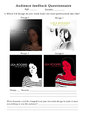
This is the first questionnaire that I created to look at to initiate how appealing my CD designs were to the audience and which they preferred. I also asked the reasons for their preferred design and any other comments to improve it so that I could use this for my evaluation and further development.
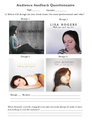
This is the next sheet formatted in a similar structure for the rest of the CD designs I have produced. I placed the same questions as previous onto this questionnaire to see any constructive advice that people could give to help me develop the designs.
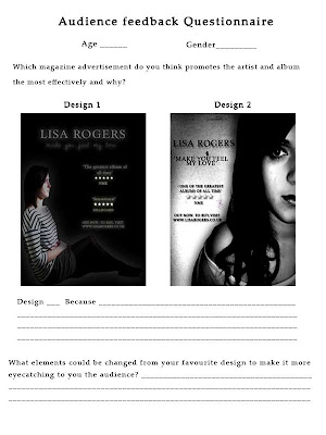
This is the magazine feedback questionnaire I produced, again stating the designs, but this time asking which design the audience thought promoted the artist in the best way, as that is essentially what the advertisement is about as well as promoting the CD, and is a key feature in previous research advertisements that I have referred to in my designs. I then asked what could be changed in order to make the designs more eyecatching to the audience.
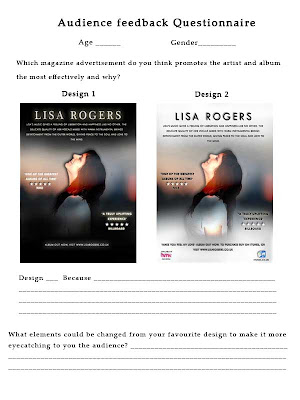
This questionnaire is formatted in the same way as the previous one, asking which design promotes the artist in the most successful way as the rest of the designs are shown.
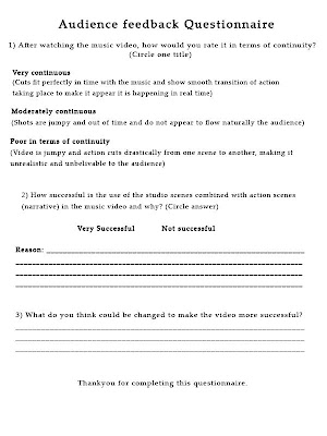
This is the questionnaire I created to ask about how continuous the cuts were in the music video, as we aimed to create a smooth transition as possible. I also asked how successful the use of the studio and action scenes combined were, as this was a process which could go either way in terms of continuity and clarity to the audience when following the story.
This is the final questionnaire I created to ask about the effectiveness of promoting the artist in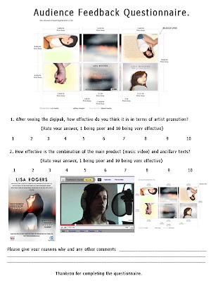 the digipack design overall, as again this is a key feature we used from previous research. I also asked how effective the combination of the music video and ancillary texts were, as I wanted to see how successful the advertisements were in catching the audience's attention and making them want to go on to watch the video or listen to the artist's CD.

This is the first questionnaire that I created to look at to initiate how appealing my CD designs were to the audience and which they preferred. I also asked the reasons for their preferred design and any other comments to improve it so that I could use this for my evaluation and further development.

This is the next sheet formatted in a similar structure for the rest of the CD designs I have produced. I placed the same questions as previous onto this questionnaire to see any constructive advice that people could give to help me develop the designs.

This is the magazine feedback questionnaire I produced, again stating the designs, but this time asking which design the audience thought promoted the artist in the best way, as that is essentially what the advertisement is about as well as promoting the CD, and is a key feature in previous research advertisements that I have referred to in my designs. I then asked what could be changed in order to make the designs more eyecatching to the audience.

This questionnaire is formatted in the same way as the previous one, asking which design promotes the artist in the most successful way as the rest of the designs are shown.

This is the questionnaire I created to ask about how continuous the cuts were in the music video, as we aimed to create a smooth transition as possible. I also asked how successful the use of the studio and action scenes combined were, as this was a process which could go either way in terms of continuity and clarity to the audience when following the story.
This is the final questionnaire I created to ask about the effectiveness of promoting the artist in
 the digipack design overall, as again this is a key feature we used from previous research. I also asked how effective the combination of the music video and ancillary texts were, as I wanted to see how successful the advertisements were in catching the audience's attention and making them want to go on to watch the video or listen to the artist's CD.
Wednesday, 16 March 2011
Magazine advert designs.
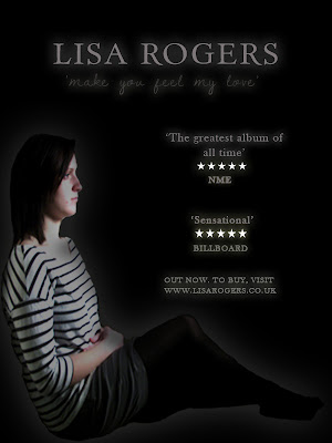 This is the first design that I created using my original pictures. For this, I followed the rule of my digipack initial designs and used a black background to represent sadness and isolation. I then placed the image of my sat folding my arms, again to reference loneliness, into the image, changing the levels on Photoshop to give more of a shadow over my face to give this impact further. I also added a white outer glow to give emphasis on the artist. I placed a serif style font that I had previously used in my digipack designs into the design for the artist title to give a professional look, and used the same style hand-rendered font named 'Dawning of a new day' for the album title. I coloured these both a light grey and added an outer glow for emphasis. I used the same colour technique for the quotes from magazines about the album below this, an idea I decided to use from the Stone Roses magazine advert I had looked at. They also had star ratings which I placed into the advertisement, colouring them white to contrast with the black background, and gave an outer glow again for a bold emphasis to catch the audience's attention when looking at this. Below, I wrote a short statement about visiting the artist's website to buy the album which had been released.
Overall, this design is eyecatching and conveys the correct emotions about the genre of the music to the adience by using contrasting tones rather than colour, however, I do not think it contains enough of these codes to really attract someone and make them want to buy it, as the image is not eye-catching enough and the information on the page is limited. I think that the image needs to be brighter so as not to get lost between the bold text and quotes, and the background could perhaps be different rather than one plain colour for more attraction to the advert when opening the page.
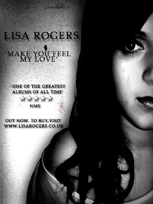
This is the next attempt that I created, this time using the new imagery of me that I had taken, as I felt that my original images were few and limiting for designing. I chose this picture as it was visually clear and expressed emotion well. I enlarged this image to make it instantly eye-catching when opening the page, placing it on the right hand side so that text could be placed beside it. I then placed a grainy texture behind it that I downloaded to again connotate sadness and depression. The next thing I did was experiment with the levels to darken the image drastically, giving darker shadows over my face and making my eyes look darker, again emphasising the depression and darkness of the genre of the song and the advert. I next placed all of my text the left of the image and used the same serif font as previous, as I thought this looked professional. I coloured it all black as the background was a lighter grey which I thought still allowed the text to be seen, and added a drop shadow for emphasis on the font. As the space for text was limited due to the image being so large, I added only one quote this time, and placed the star rating once again between this and the magazine it came from.
Overall, I like this design as the darkness and the use of drop shadow captures its boldness and emphasises the genre of the video and advert. However, I think that the image was too large, and that there could have been more space allowed for more information on the album, as it looks quite brief to an audience reading it who would want to find out more. I therefore decided that my next design should include more information using my research to create a successful and eye-catching advertisement to promote as much as possible.
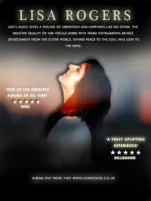
This is the next design that I created. For this design, I had begun to change my ideas, as the dark and erroded style I had decided to use was becoming difficult to develop successfully. I wanted a more positive and striking approach to my designs to capture the audience's attention to the album and more importantly the artist, rather than focusing on the genre of the one song. I looked back on my research for my digipack designs and saw Mariah Carey's album, filled with natural light and warm colours, giving attraction to the audience from the delicate tones and professional look overall. I then thought back to the new images I had taken of me, and a particular pose that I had chosen in reference to the Ellie Goulding research that I had done, where I was smiling up to the sky to represent liberation and positivity. I wanted this sense of 'letting go' to appeal and become the theme of my advertisement, changing the perspective of my music and making the audience feel that it does not all follow the same heartbreak genre, but genreally creates a relaxing feeling that conveys passion through the vocals and instrumental used. I looked back again to my Ellie Goulding research and realised the them of her and Mariah carey's designs were similar, using soft white light and images predominantly featuring the artist. I still wanted to show aspects of romance in my own designs, using the images Jacob and I holding hands, but wanted to do this in a way that showed love in a positive light rather than all negative, as I thought this would not get enough positive feedback from an audience on an entire digipack design showing just heartbreak and depression. I decided that from now on that my work would be heavily influenced by these two designs in order to create this liberal feeling, and successfully conduct positive feedback from the consumer audience.
The first thing that I did to create this design was look at the style of background Ellie Goulding used in her advertisement. This was a simple scene which was shown to be slightly out of focus to draw attention to the artist. I had previously taken pictures at the marina of the sea, but had them out of focus to give the audience a warm relaxed feeling as they look at the image. I decided that this would be a good image to use for my background, so placed this underneath the image of me in the Ellie Goulding pose in her advertisement. I then used the soft brush to blend a black light over the top and botton thirds of the design in reference to Ellie's design, before adding a black drop shadow over the image of me. I experimented with the levels of the image of me, which I placed in the centre for direct attention to the artist as the first thing the adience sees, however it did not look fitting with either a lighter or darker level, as I wanted to have brighter colours rather than contrasting shades in this attempt. Therefore I tried posterising the image, which brightened sections, giving it more of a subtle burst of colour to make it more eye-catching and positive. The next step was to add the artists name, which I did using the previous serif font as I thought it looked professional, and coloured this white, giving it a white outer glow for emphasis. I made this large to catch the audience's eye and make them remember the artist's name. I then looked at Ellie's advert and noticed she had a brief summary from a listener's point of view of how the music makes them feel and the consumer. I thought that this was a good technique to use, as it is explaining what you will get in the album and makes it more likely for a consumer to listen to this and decide to try it for themself. Therefore, I came up with a brief synopsis and placed it below the title. I did not include the album title as I wanted this advertisement, like Ellie's, to be more if a promotion to the artist rather than the song or album itself. I then added quotes about the album around the image, colouring them white for emphasis with the outer glow, and adding my star ratings below them as in previous designs. The last thing that I did was place a relevant line about the album release and website adress below the image as in the previous designs.
Overall, I think this design looks a lot more professional and informative than other designs, as the soft brush effect behind the text and posterising of the image gives a positive and colourful approach, making the audience feel happy just looking at the advertisement. I like the idea of using the synopsis, as it is informative and gives the audience an insight on what they will hear, and the star ratings are good for another person's point of view as it is all promotion of the artist and album.
Despite this, I have decided to change this design, as I think the black light, although successful in Ellie's design, makes the overall impact duller and leaning towards a negative approach. I also think that the text for the artist's title is too much in a serif style and needs to be made more casual as Ellie's font is designed, making it more personal to the audience and breaking the serious undertone they would pick up when reading this. I have also decided to use promotion of stores where the album can be bought as in Madonna's advertisement and that of The Stone Roses, using synergy to link the companies to the artist for attraction and more promotion of the overall product.
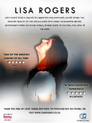
This is the final design that I have used and change. For this design, I changed the black soft brush light to white to send off a more positive vibe to the audience, and give emphasis on the liberated feeling I wanted them to feel when looking at the design. I also changed the artists font to a more curvatious and rounded text that gave a more modern and personalised feeling, and coloured the rest of the fonts in black to this time contrast with the white, also adding more of a drop shadow for emphasis on this. This time, below the artist, I included information about being able to download the album from Itunes, and below this added the icon on the bottom right, paired with the HMV logo on the far left for more iconic value and use of synergy. Overall I am pleased with the design, as I think it now contains more information for the reader to take in, giving opinions from other media, and linking companies to the artist for more promotion.
Tuesday, 15 March 2011
New flashback scene final shots.
These are the final shots we had taken for the new flashback that we had created, with the reasons why we chose these for our final composition.
This is a selection of our attempts for our first half of the first line of the verse, and is the first real introduction of my character's personality of the video so far, as in the opening the audience did not know much about her apart from the fact she was going out to meet her boyfriend. For this scene, we chose to have my character being artistic, sat on the floor of the marina to show she does not mind getting dirty outside, and looking up to sketch a picture in the wind, also showing that she will brave the weather for what she loves to do. We have decided to use the last shot of me moving my head up and down for our final outcome, as in previous attempts my hair can be seen being blowed over infront of my face by the wind. We are happy with these attempts and the final shot we have decided to use, as the shot itself is very clear for the audience to see, and the camera is still, ensuring the action to be seen without the focus of the camera moving away, or unsteady movement distracting any attention. The outside light is also very clear and light, and we did not have to use the light at all for this shot for this reason.
This is our sequence of attempts for the shot of the second half of the first line in our song. This shot shows a point of view of me drawing, followed in the next shot by another point of view to show what I am looking at for continuity. The attempts shown were good lightingwise, as they were still very visually bright and clear, however the wind was very strong when filming, meaning it was very hard for Taslima to keep the camera straight. The last attempt shown as I move the paper back down onto my knee is the one that we are using, as this is the most still attempt that we created, and is still very visually clear and from a good angle for the point of view shot effect.
This is the beginning half of the second line, showing a point of view of the large statue infront of me, showing what I am looking at as I am sketching. We decided to use the point in the attempts half way through the video, as before this we had trouble keeping the camera still, again because of the strong wind outside at the time. The shot is very clear and from a low angle to make it look dominant, which is why we designed it to look this way, and also to show it from the perspective of the character.
This is the second half of the second line, showing a medium shot of Jacob, introducing him into the story with him taking pictures of the view ahead of him of the river at the Marina. We chose to have him doing so to relate with Lisa in the way of them both having artistic interests, linking the characters in that way before they even meet, making the audience aware of this connection as they are the ones who see Jacob before Lisa does. For this shot, we did several practices as seen, ensuring that we left enough time before and after the action as this was only a short clip and we did not want it to be too short for editing. We chose to use the point nearer the end of the attempts as Jacob turns to a profile view towards the camera, as his face can be seen much more here, and the camera is also a lot more still despite the strong wind, which can be seen to make the camera slightly unsteady during the start of this shot. We are happy with this outcome, as it is clear, controlled camerawise, and is shot from a good angle to ensure his arms can be seen while taking the photographs.
This is the third line, which we decided to dedicate wholly to this shot, as there is slightly more action taking place than in the previous shots. In this scene, we bring the characters together for the first time, establishing their first meeting. This is done from a long shot in two shot form, showing Jacob backing up to take a photograph further into the distance as Lisa is shown on the floor looking up to do her sketch, unaware Jacob is behind her. Jacob then walks into Lisa, knocking her papers over that she is clutching and, realising what he has done, immediately turns to help her pick them up. Lisa is shown to be flustered and embarassed as she sees Jacob, and does not look at him properly as she is shy and instantly realises that she likes him. We wanted this to be clear to the audience from the expressions of the characters' face and body positions as she stays very closed in her posture. For this reason, this angle was a good choice, as it shows the body clearly whilst stil being close enough to see brief expressions on the characters' faces. We used the idea from stereotypical features of American tv shows, showing this method as it is a traditional feature that the audience recognise as being the first point in the romance genre, giving the characters vulnerability as they are unprepared for what will happen. This gives off the ideology of 'love at first sight' which we wanted to portray in our video, as it ties the audience into the action, making them feel a personal emotional attatchment to the characters as they feel they understand what they are feeling, perhaps from past experience in their own life. This is therefore a very strong feature to use, which is why we decided upon this when designing our flashback. We chose to use this shot, as it was very clear visually, and the camera was still throughout. We were happy with the posture of the characters and the run of the papers being dropped and picked up again, which we practiced before filming.
This is our final shoot of the last line of the song. This is the final point that makes it clear to the audience the couple like each other, as they are stood in a close up shot smiling at each other shyly as Jacob hands back Lisa's papers. We chose to use this shot so that the hands and arms could still be seen as the work is given back, and so that facial expressions could still be seen for emotional impact. We also decided to do the shot moving into it, to show continuity from the previous shot. We are happy with this shot, as the action can be seen clearly, despite the strong wind, and the facial expressions can still be seen to convey the narrative successfully to the audience.
Recording studio final shots.
Here are the final shots that we chose to use in the recording studio, and the reasons why we decided they were better than the others we used as tests.
This is the final shot of me testing the sound equippment at the beginning of the video. We chose to have me testing the piano, as this is heavily included in the music composition of the song, and can be heard throughout gently to give a sad yet romantic feel. This shot was very clear visually due to the daytime lighting which we filmed in, as in previous sessions during the night we found there was a dark orange glow that left shadows over my face and body whilst singing, taking away the professional effect that we hoped for. We chose to keep the sound in this shot, and is the only one we are leaving in this way, as the song that I am playing on the piano is 'A Thousand Miles' by Vanessa Carlton, and is one of the most well-known romantic songs used in films of all time. For this reason, we have chosen to use this as a code, as we are aware that the audience will recognise this from the start, giving a hint of what type of genre of music they are about to hear in our song.
This is the first time the artist is seen in the video, and is a method we are using to let the audience know that some form of action is about to begin as the story of the music and the couple is told. For this scene Taslima asks me 'Are you ready?', and I reply that I am. We chose to include these lines at this point rather than have just visual references to give a code to the audience that something is about to begin. We are very pleased with this shot, as the lighting appears natural giving a professional appearance, and the medium shot allows for the microphone and headphones to be seen to make the audience aware that the setting is a recording studio.
Here is our final shot of the hands moving up and down on the soundboard. We chose this shot, as it was the most successful after our previous practices where the buttons were moved too quickly. The timing in this attempt is a lot better, as the hand is moving the buttons slower so that the audience can see it is building up to some form of action about to take place by moving at this pace. The camera is straight as we used the tripod, and the lighting was natural and light as we wanted it to be. We are happy with the result, as it conveys the impression to the audience the action is about to begin.
This was our final shot of the first line of the first verse. We decided to use this as a final shot, as the lighting was bright and natural compared to the dark orange we previously had problems with during later filming time. The camera was also still, and included the microphone and soundshield at the end of the scene at the right time before the line was ended. The pan was also successful, as again it included enough of my face before the line ended, ensuring that the narrative could be told to the audience in time before cutting to the next scene. We are happy with this outcome, as it is visually clear to the audience and ensures they receive the narrative from the artist in enough time before cutting to the next shot.
This is our final shot of the second line, first verse. The lighting was again much brighter in this attempt as we filmed earlier in the daytime, and we managed to get a straighter balance with the angle, making it a smoother pan. The pan itself was also faster, therefore fitting enough of the narrative in so that it can be conveyed successfully to the audience. We are happy with this result, as there is a natural shadow but not too much to darken the face, a problem we also previously faced, and the pan was steady and accurate.
This is our final shot of the third line first verse. The main change to this was the bright lighting, as this time round it created a much more natural effect instead of the darker orange flare we could not get rid of. The time of filming radically effected this, therefore I am glad that we filmed earlier in the daytime. We are pleased with this result, as the pan is steady and smooth, the lighting is correct for the effect we wanted on the face, and the timing of the whole shot as a whole is as we wanted it.
This is the final shot of the last line which we filmed. The previous problem was keeping the camera steady and problems earlier with the dark back lighting, created a darker night time effect, when we wanted a very positive and natural light to contrast with the darker action scenes. We are very happy with this shot, as the camera is again steady and quick enough to make a smooth pan whilst leaving time for the narrative to be shown and conveyed to the audience, and the lighting leaves natural shadows that do not restrict emotional expressions on the face.
This is our final shot of the 'good street' verse, which we filmed as a whole in the studio and then outside so that we could use them both where appropriate, therefore this is not the only final outcome for this verse. We are happy with this footage, as the angle is straight and the camera is steady, giving a gradual pan so that the narrative can be given to the audience clearly and successfully. The lighting is also clear and bright, giving a gentle and natural glow over the face.
This is our final shoot of the 'good street' outside for the action aspect of the video, to give contrast and a mix between the studio sessions we filmed. We are happy with this outcome, as the camera is steady in a backwards tracking motion, and shows the narrative and the character delivering it clearly with the use of John's light, to reduce shadow and keep control over the lighting as a whole.
This is our final shot of the 'bad street' scene in the recording studio. We are happy with this outcome, as the light from this side of the room is natural and delicate, reducing shadow and allowing narrative to be seen clearly, also making a big contrast to the bad street scenes shown outside with the black background with little light at all. The camera is steady apart from the first few seconds preparation before the lines start, which we will try to cut down during editing so that this is seen as little as possible whilst still fitting with the timing of the music.
This is our final shot of the 'bad street' scene outside. We are happy with this outcome, as although the camera is slightly unsteady during the end, the narrative parts of the video are still shown clearly with a steady camera and a good use of medium shot to show that she is walking down a dark street on her own, the street itself giving the idea of loneliness and isolation to highlight this in the lyrics.
This is the very last scene after the narrative has ended and the video is coming to a close, which we chose to represent with tbe buttons being pushed back down and me taking off my headphones. In previous attempts at this the lighting was too dark and an offsetting orange colour which make shadows appear on my face where we did not want them. In this attempt however, as we shot during the daytime, the lighting is much clearer and more natural looking, meaning the shadows are drastically reduced because of this. The camera is once again very still giving a clear shot conveying the narrative directly to the audience, and the timing before and after the action is plenty so that we have extra time on the end of the shot if we need it.
Sunday, 13 March 2011
New photographs for digipack.
As I was struggling to use the recent photographs that I had as I felt they were too limited to experiment with, I decided to get some more photographs taken. Here are the new selection of photos which I have decided to experiment with.
NOTE: For my digipack I have now chosen a more positive and brighter theme to work on than the darker more depressing features I was working on, as I was limited with the imagery and colours that I could experiment with. I have decided from the result of the new pictures that I will refer my work back to my mariah carey digipack research, using brighter and softer tones and more positive and romantic aspects rather than sadness and depression, as this is not the only genre the video contains, and I think that the audience will be more attracted to a generally brighter looking cover. For this reason, I chose to change my costume half way through the photos, from the rose dress I was wearing (As seen above), to the white more flowing style top and shorts, more a more casual and liberating look, as a pose to a certain code of dress, showing that the artist is promoting freeness and a sense of happiness in her album or advertisement, the white connotating innocence and positivity. Although the song connotates sadness, I want the advertisement and digipack imagery to have a more positive and gentle approach to the audience, making them want to see more from the front cover and magazine ad.
New flashback storyboard.
Although we had our final flashback filmed and ready for editing, when we reviewed it next to other scenes when uploading it to the editing suite we found that the lines were too long and the action dragged, making the song seem slower than in previous scenes. The particular problem was that there wasn't enough action actually taking place in the scene, as the only main attention was on me trying to fix my umberella, which continued for a whole line. This meant that we had to think of a new flashback scene and plan for some more action to take place so that it would be more visually pleasing for the audience. Here is the picture storyboard of the new events that we came up with that take place in the new flashback, and reasons why we chose them and the shots that go with them.
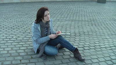 The first image is shown of me from a longshot sat down on the pavement where we meet (the same place as the original flashback), looking up and drawing a picture of the statue infront of me. We chose this shot as it shows my whole body and the props I am holding, making it clear of what I am doing from the start. This will continue for half of the first line before the transition to the next shot.
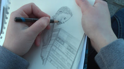 The next shot shows a point of view of what I am looking at, which is the sketch I am drawing (we may decide to change the order of this shot with the next, as it may look discontinuous when editing). We chose this shot for continuity and so that the audience can see that it is clear I am drawing a picture if they are unsure in the first shot. This will continue until the end of the first line.
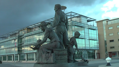 The next shot shows a low angle shot of the statue in long shot form, also showing my point of view as this is what I am using as a reference for my drawing. This will continue from the start of the second line to half way through it.
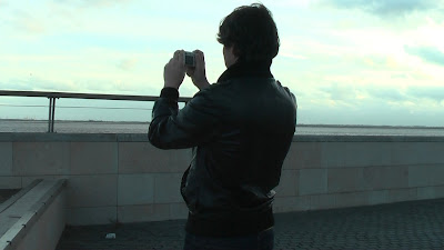 The next shot continues through the other half of the second line, showing the back of Jacob's body and face from a medium shot, so that his arms can be seen as he is shown to be taking a photograph of the sea and scenery around it. This shot is purely to establish Jacob's character in the story, showing he is in the same scene and surroundings as me, and giving a sense to the audience that some form of action is about to take place.
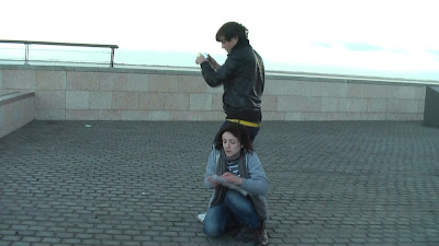 This shot is a two-shot which begins as the third line starts, showing Jacob backing up to take a photograph from a wider angle. He does not see me on the floor drawing, which we purposely chose to have in the scene, as it gives the feeling of 'love at first sight' and that it was an unexpected meeting, making it more romantic to the audience as it has the appeal of it being a meeting by chance. As he does not realise he is walking into me, my work that I am holding flies onto the floor, and he quickly, realising what has happened, goes to help me. This shot continues until half way through this line.
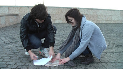
The next shot continues through the rest of the third line, showing a medium close up still in two-shot form of us both picking up the paper that has been knocked out of my hands by Jacob, before they stand up out of the shto. This establishes the stereotypical action seen in romantic films that gives a connection between a couple that are meeting for the first time, and is a code that we thought of from seeing romantic films in the past which would make the audience recognise this in the same way.
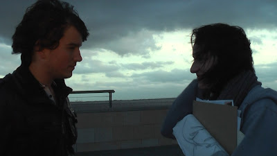 This is the final scene we shot, from a medium close up to show the couples' arms as they stand up out of the last shot to show continuity. Jacob then passes Lisa her work back as she takes is shyly and smiles at him to thank him as she realises they are in love. This shot lasts for the whole of the last line, as it is the most important of the whole verse. This shows the connection finally made between the couple as they smile and look into each other's eyes, something that is continuously broken up until this point. The line 'To make you feel my love' is also key, as it is reiterrating the fact that they are in love, and acts as a spoken narrative that they do not say between them. We thought that this was successful, as the audience are active and pick up the connection between the line and the action in this way, realising that the lyrics are telling the story for this part instead of the reverse.
 The first image is shown of me from a longshot sat down on the pavement where we meet (the same place as the original flashback), looking up and drawing a picture of the statue infront of me. We chose this shot as it shows my whole body and the props I am holding, making it clear of what I am doing from the start. This will continue for half of the first line before the transition to the next shot.
 The next shot shows a point of view of what I am looking at, which is the sketch I am drawing (we may decide to change the order of this shot with the next, as it may look discontinuous when editing). We chose this shot for continuity and so that the audience can see that it is clear I am drawing a picture if they are unsure in the first shot. This will continue until the end of the first line.
 The next shot shows a low angle shot of the statue in long shot form, also showing my point of view as this is what I am using as a reference for my drawing. This will continue from the start of the second line to half way through it.
 The next shot continues through the other half of the second line, showing the back of Jacob's body and face from a medium shot, so that his arms can be seen as he is shown to be taking a photograph of the sea and scenery around it. This shot is purely to establish Jacob's character in the story, showing he is in the same scene and surroundings as me, and giving a sense to the audience that some form of action is about to take place.
 This shot is a two-shot which begins as the third line starts, showing Jacob backing up to take a photograph from a wider angle. He does not see me on the floor drawing, which we purposely chose to have in the scene, as it gives the feeling of 'love at first sight' and that it was an unexpected meeting, making it more romantic to the audience as it has the appeal of it being a meeting by chance. As he does not realise he is walking into me, my work that I am holding flies onto the floor, and he quickly, realising what has happened, goes to help me. This shot continues until half way through this line.
The next shot continues through the rest of the third line, showing a medium close up still in two-shot form of us both picking up the paper that has been knocked out of my hands by Jacob, before they stand up out of the shto. This establishes the stereotypical action seen in romantic films that gives a connection between a couple that are meeting for the first time, and is a code that we thought of from seeing romantic films in the past which would make the audience recognise this in the same way.
 This is the final scene we shot, from a medium close up to show the couples' arms as they stand up out of the last shot to show continuity. Jacob then passes Lisa her work back as she takes is shyly and smiles at him to thank him as she realises they are in love. This shot lasts for the whole of the last line, as it is the most important of the whole verse. This shows the connection finally made between the couple as they smile and look into each other's eyes, something that is continuously broken up until this point. The line 'To make you feel my love' is also key, as it is reiterrating the fact that they are in love, and acts as a spoken narrative that they do not say between them. We thought that this was successful, as the audience are active and pick up the connection between the line and the action in this way, realising that the lyrics are telling the story for this part instead of the reverse.
The Recording studio test shots.
Here are our first attempts of filming in the studio, in which I will discuss why we decided not to use this footage and what we will change in future filming sessions.
This is our first beginning and end shoot, in which the buttons on the soundboard are moved up at the start and then back down at the end, establishing the opening and close of the story. We did this all in one shot, as it was a simple case of moving the buttons up and down and was not needed to be done in more than one shot, meaning we would then split this during editing. However, we decided not to use this take of the scene, as the model hand was shown to be moving the buttons too quickly, and we needed to have the timing just right to fit the amount of seconds we planned in our storyboard for the scene.
This was the scene in which I was waiting for my queue to start singing, just before a blackout into the first action scene, establishing that the action in the studio was also about to start before the song began. This shoot went well, as the action in it was simplistic and I simply had to wait for my queue to reply 'Yes' to the question 'Are you ready to start?', signifying that some form of action was about to take place. However, we did not use this as our final shoot, as we were not happy with the lighting in the room as we believed it looked too orange and dull, as this was meant to be bright and contrasting to the sad and isolated action scenes as the character sets off to meet her boyfriend.
This was the shot of the first line of the first verse, as the first real action in the studio is shown to the audience. In this shot, we planned to have a pan accross my face, showing the micrphone and sound sheild at the end of the shot, and have my lips chin and the end of my nose showing only, giving attention to my mouth to bring the lyrics out as the main focus to the audience upon the opening of this scene. However, we decided to use this shot as a test, as the pan was too quick and cut off the lyrics, which meant the audience could not understand the narrative as it was not wholly shown. The camera also missed off the micrphone sheild until the very last few seconds, meaning the camera showed the window behind and the construction outside for too long, which was not meant to be seen, as it was discontinuous to the scene. We were also unhappy with the again orange light and dark background as the camera was closer, therefore we needed to think of a way to get rid of this effect in future shots.
This was the shot of the second line, which was again a sidewards pan of the artist singing, so that her head and shoulders could this time be seen, to show performance and promote the artist. We liked this shot, as we thought it looked professional and was predominantely successful, however the camera was slightly unsteady which we thought looked too informal and unprofessional. For this shot we used John's light over the camrea to see if it would brighten up the studio, however it still looked orange though slightly lighter, so we had to re-think this idea again.
This was the third line of the song which we recorded as another pan, as the half-face shot we planned to do did not fit into the camera enough as the dimensions fitted a landscape view, therefore cutting off most of what we wanted from my face and showed a huge portion of background setting behind, giving the focus to that instead. Therefore, with the pan, this time showing mainly the middle section of my face for a different approach, we tried shooting to see the effect. Again, we used John's light for this, however it created lighter shadows over my eyes and nose which we were not happy with, so had to find a different way to shoot. We moved around the studio, which is unseen in footage of test shots, trying to see where the light would fall naturally onto my face, however as we had this session late at night, the light was only becoming darker by the minute. We therefore planned to film in the daytime early in a morning to see if the lighting would change and become more natural and warm.
This was our first daytime session in the studio, which showed a clear improvement in the lighting, as the quality became much clearer and brighter. For this shot, we had a medium close up of me smiling and moving away from the micrphone and out of the shot, representing that everything was okay at the end of the video as the couple reunited. This shot went well, as it was again very simple to film, so we decided to use this for our final shoot.
Note: For this shot and the past few in the studio, we decided that I should wear red lipstick to give emphasis on my mouth when filming close ups, so that narrative could be seen clearer as well as heard to give the correct delivery to the audience.
This was a test shot for the line 'To make you feel my love' which we had to shoot again, as we had changed the previous shots, and there was not enough time on the end of the shot before to make a transition into this line without a longer unnecessary blackout, which would look discontinuous as there was not a change in the action of the video. We were having problems with cutting our scenes too short frequently in editing, therefore we ensured that from shooting after this point we would leave a lot of time before and after the scene incase we needed it during the editing process. We decided not to use this shot, as the camera was too shakey, meaning the shot looked out of focus and distorted slightly. Therefore, we had to shoot this again to get the still camera that we needed, to give a more serious and professional effect.
This was a test shot of the first line of the 'good street'. We only did this line on its own as we had planned in our storyboards to have alternate scenes for alternate lines (the action and studio). However, due to scenes and angles changing in our development stages we decided this would not work and so decided we would next film the whole verse outside and in the studio so that we could use either of the footage in accordance to what would fit with the other scenes.
When filming this line, we found problems with the lighting as this was earlier on when the orange glow still appeared, therefore we decided to film earlier in the daytime to get a natural light through the whole verse. The shot was also limiting visually, as only a brief section of my face could be seen as it was from a profile view, therefore we decided next time we film we would move the camera around further towards the front of my face for a clearer view as the narrative was portrayed to the audience.
This is our test shot of the 'bad street' first two lines, as we originally planned to alternate between the studio and the action scenes every two lines to pace what was going on so it was not too fast for the audience to engage with and read the narrative successfully. However, after previous shots for other scenes were too long or short and did not fit as we'd planned, we had to extend the lines in this verse so decided to shoot the whole verse in both areas (The studio and outside down the street). For this reason we decided not to use this shot, although it was visually very clear and the camera was very steady, so we will attempt to do the same thing upon filming in our next session.
Thursday, 10 March 2011
Front cover designs.
Here are the multiple designs that I produced based on my notes and research for my front cover. I will discuss these, stating why I like/dislike them, and which I will be using as my final product and why.
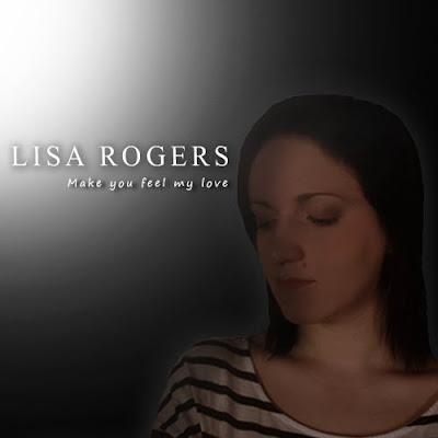
This is the first design I produced. For this concept I took reference from my research on Adele's album cover, which portrayed her from the soft lighting and colour combinations as very femenine. For my design, I used the idea of a spotlight over me to create this light, turning the opacity down on Photoshop to create a fading effect as it got further away. I did this to look like the light was chasing me and covering me, contrasting with the black background, which I chose to represent sadness and being alone, as that is what the heartbreak song represents. I wanted the two tones combined to show how I could not reach happiness until something had happened, which is the design of the plot in our video, as I go through a series of flashbacks before meeting Jacob to confess my love at the end.
The text that I chose was smart and similar to the font that Adele uses. It is easy to read by any audience and shows clearly the name of the artist. I also chose a text whilst experimenting with this for the album title, which I thought was an appropriate looking hand-rendered version, however I may edit this when choosing a final design. I coloured both titles in white to make it clear for the audience to read, and to represent the innocence of the character and the artist. I finally placed the chosen photograph of myself (in medium close up to show clear facial expression and emotion), just to the right of the design so that the light could be seen coming towards me, along with the title beside the image. I used the shadow effect over my face to again show that I am lonely and that perhaps an emotional shadow of guilt or loss is hanging over me. Overall, I am pleased with the effect of this design, as it portrays a clear message and is easy for an audience to read, however I do not think that the shadow idea is effective enough as it covers too much of my face, and also the image itself stands out too much from the rest of the design.

This is the second design that I created, using one of the photographs taken during our time in the recording studio. I thought this, already taken in black and white tone, looked professional and clear, and that the use of the microphone sound sheild and headphones also gave a very efficient and professional approach.
The text I used is again a type that I thought was clear for the audience to understand, which I decided to capitalise for a smarter effect. I also chose a hand-rendered text for a more personal feel, which I preferred to the previous hand-rendered font I used. I then coloured both of these gold, as in my research of Leona Lewis' album 'Spirit', as I thought this was eye-catching and gave an official type of effect on the album. The next touch that I added was a soft brush on Photoshop, which I lowered in opacity and flow to cut out the harsh outlines of the photograph to give a flawless and neverending feel, making the design more delicate. The last thing that I did was change the levels of the photograph so that it contained more depth and detail to my face so that it could be seen better to show expression and emotion clearer. I am very pleased with this outcome, as I feel it represents the artist in a very feminine and gentle manner, and also looks very professional as something you would expect to see in a music store on the shelf.
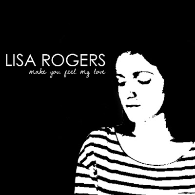 This is my third design for my CD, which was mainly experimental, however I had taken reference from this from The Script's black and white design for their CD 'The Script' and thought about ways that I could expand on this for my cover. I chose that design to look at, as it was bold and straight to the point, allowing the audience to see exactly what they are getting in a smart and simplistic format with no difficulty of reading the text.
For this design , I created a black background and placed my image again to the right to allow space for the text. The main theme was black and white, so I experimented with the Threshold tool on Photoshop to match this. I liked the effect, as it was simplistic yet created an iconic representation of the artist with this tool so that the audience would recognise it when seeing the cover to be my CD. I then chose a text which I thought looked very smart yet had an informal curvatious shape about it so that it did not look like a text used for office printing or a newspaper. Below this, I used a hand-rendered text that I thought was appropriate, and coloured them both white to contrast with the background and for easy reading for the audience. Overall, I am pleased with this design, as it is not complicated but still holds iconic representation of the artist to the audience. The only issue with this is keeping the theme throughout the rest of the digipack in a way that still represents romance and heartbreak in the correct way.
This is another design that I created, which I experimented with by keeping the same theme as the last design, but using a red colour in replacement of the white to represent love and romance. I like this design, however I think that with the change of colour it looks too modern and leans towards a dance or DJ genre for a CD cover, therefore I have decided not to use this for my final outcome.
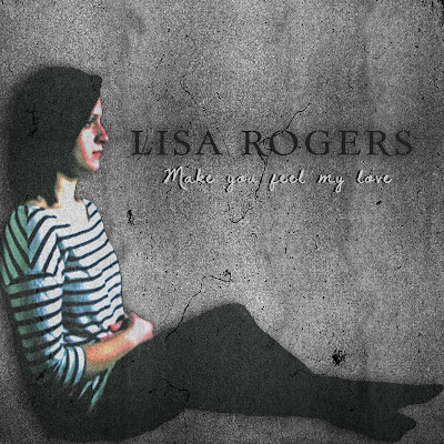
This is a design I created in reference to my original notes of planning, in which I said I would include a grey gradient/erroded background. I decided to experiment with this to see the outcome instead of using a predominantly black background. To do this, I uploaded a texture that I had saved, and experimented by lowering and heightening the depth using the levels tools on Photoshop. I lowered the texture more to get a more depressing, lonely and urban street kind of look, as this is what streets with the same type of walls represent and give off in videos and films to an audience. For this design I also used a different photograph to see the effect, this time one of me sat with my back against a wall and my legs out infront of me. My arms were loosely wrapped to represent loneliness, and I was looking ahead to show I was thinking of what would happen next in the story. For the development of this idea, I experimented with the opacity levels to give a slightly opaque effect to represent how the character's future in the video was unclear since her split with her boyfriend. The overall design represents depression and loneliness, to link with the similar conventions used in heartbreak videos. For the title I found and downloaded a font called 'Day Roman', which had serif qualities which I thought looked smart and easy for any audience to read. It also fitted well with the style of the background, which looked like an old stone building, and the text used for the title looked like an engravement font you would see on a building of the same type. This also indicates this theme of sadness and depression, as this is what old buildings stereotypically represent, aswell as emptiness and a sense of division from the world, which is what I am trying to show within the character's personality. The text that I used for the album title is named 'Dawning of a new day', which I used in previous designs above. I have decided to keep this font for my final design, as I like the warmth and personal approach it gives in contrast to the lonely and darker text and background, making the audience in this sense feel a connection to the artist. I chose to colour this white for easier reading and contrast with the rest of the design.
Overall, I am pleased with the result of this design, however I am worried that the colours are too dark to show enough of the artist's face and emotions. I like the use of the erroded texture, as it gives the representation of desolation towards the artist's feelings that I want, therefore I will still consider this for my final design.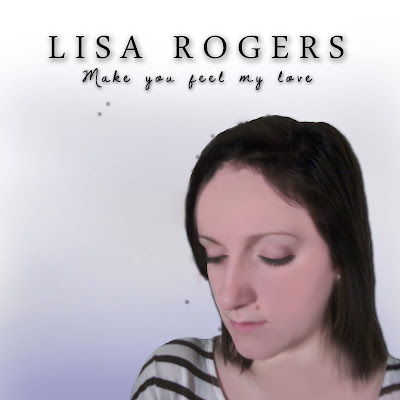
This is the next design that I created for my front cover, which I did by taking reference from Rihanna's CD design in my research. For this process, I first made a gradient background of a light blue and turned down the opacity and flow levels in order to create a seamless flowing design. I then, using the same fonts as in the previous design for my arist and album title, placed these into the top centre of my design to catch the audience's attention when viewing the CD. I also used the same image as in my previous designs and airbrushed my face to erase blemishes, giving a fresher more alert look to my face, and applied hints of makeup to my eyes for a smokier look using the colour brush, matching the background colour and again representing loneliness from doing so by using the blue shade. I finally placed the image slightly to the right and enlarged it in order to see facial and emotional expression. This design is simplistic and purposely follows similar conventions to Rihanna's design in order to see if similar effects could be created, as her design conveys depression and sadness from the shadows over her face and the colour combinations used for the background. I think that my background could have been made darker to convey this idea to the audience further. I also tried to add shadow over my face to represent loneliness, however I found this difficult, as I had not properly erased smaller parts of the background from the original image, and therefore ended up with large spots around the image after editing which I could not get rid of, which spoiled the simplistic design. I will not use this design for a final image, as I think it could have been developed further to create stronger genre conventions to be put accross to the audience.
NOTE: During my design process, I have found the images that I have used limiting for my designs, as there is not a very wide variety, making designing difficult as it is hard to expand when I feel some of the pictures do not express enough emotional impact through body language and facial expression. I also feel that the sad and depressing theme to highlight the genre of the song has been difficult to design for during the process, as it is hard to keep the pattern in different ways throughout the design. Therefore, I have decided that I will take more photographs to use for my overall digipack design, which may make the development easier. I have also decided to use Ellie Goulding and Mariah Carey as influences for my digipack design, as I have decided that a more positive approach will attract the audience more, focusing on the feeling given to the album as a whole instead of the particular genre of the song, as it is not a single and so the song is not the main focus. Their designs involve lots of soft light and warm colour, therefore I will try to represent this in my own digipack product as much as possible.


This is the first design I produced. For this concept I took reference from my research on Adele's album cover, which portrayed her from the soft lighting and colour combinations as very femenine. For my design, I used the idea of a spotlight over me to create this light, turning the opacity down on Photoshop to create a fading effect as it got further away. I did this to look like the light was chasing me and covering me, contrasting with the black background, which I chose to represent sadness and being alone, as that is what the heartbreak song represents. I wanted the two tones combined to show how I could not reach happiness until something had happened, which is the design of the plot in our video, as I go through a series of flashbacks before meeting Jacob to confess my love at the end.
The text that I chose was smart and similar to the font that Adele uses. It is easy to read by any audience and shows clearly the name of the artist. I also chose a text whilst experimenting with this for the album title, which I thought was an appropriate looking hand-rendered version, however I may edit this when choosing a final design. I coloured both titles in white to make it clear for the audience to read, and to represent the innocence of the character and the artist. I finally placed the chosen photograph of myself (in medium close up to show clear facial expression and emotion), just to the right of the design so that the light could be seen coming towards me, along with the title beside the image. I used the shadow effect over my face to again show that I am lonely and that perhaps an emotional shadow of guilt or loss is hanging over me. Overall, I am pleased with the effect of this design, as it portrays a clear message and is easy for an audience to read, however I do not think that the shadow idea is effective enough as it covers too much of my face, and also the image itself stands out too much from the rest of the design.

This is the second design that I created, using one of the photographs taken during our time in the recording studio. I thought this, already taken in black and white tone, looked professional and clear, and that the use of the microphone sound sheild and headphones also gave a very efficient and professional approach.
The text I used is again a type that I thought was clear for the audience to understand, which I decided to capitalise for a smarter effect. I also chose a hand-rendered text for a more personal feel, which I preferred to the previous hand-rendered font I used. I then coloured both of these gold, as in my research of Leona Lewis' album 'Spirit', as I thought this was eye-catching and gave an official type of effect on the album. The next touch that I added was a soft brush on Photoshop, which I lowered in opacity and flow to cut out the harsh outlines of the photograph to give a flawless and neverending feel, making the design more delicate. The last thing that I did was change the levels of the photograph so that it contained more depth and detail to my face so that it could be seen better to show expression and emotion clearer. I am very pleased with this outcome, as I feel it represents the artist in a very feminine and gentle manner, and also looks very professional as something you would expect to see in a music store on the shelf.
 This is my third design for my CD, which was mainly experimental, however I had taken reference from this from The Script's black and white design for their CD 'The Script' and thought about ways that I could expand on this for my cover. I chose that design to look at, as it was bold and straight to the point, allowing the audience to see exactly what they are getting in a smart and simplistic format with no difficulty of reading the text.
For this design , I created a black background and placed my image again to the right to allow space for the text. The main theme was black and white, so I experimented with the Threshold tool on Photoshop to match this. I liked the effect, as it was simplistic yet created an iconic representation of the artist with this tool so that the audience would recognise it when seeing the cover to be my CD. I then chose a text which I thought looked very smart yet had an informal curvatious shape about it so that it did not look like a text used for office printing or a newspaper. Below this, I used a hand-rendered text that I thought was appropriate, and coloured them both white to contrast with the background and for easy reading for the audience. Overall, I am pleased with this design, as it is not complicated but still holds iconic representation of the artist to the audience. The only issue with this is keeping the theme throughout the rest of the digipack in a way that still represents romance and heartbreak in the correct way.
This is another design that I created, which I experimented with by keeping the same theme as the last design, but using a red colour in replacement of the white to represent love and romance. I like this design, however I think that with the change of colour it looks too modern and leans towards a dance or DJ genre for a CD cover, therefore I have decided not to use this for my final outcome.

This is a design I created in reference to my original notes of planning, in which I said I would include a grey gradient/erroded background. I decided to experiment with this to see the outcome instead of using a predominantly black background. To do this, I uploaded a texture that I had saved, and experimented by lowering and heightening the depth using the levels tools on Photoshop. I lowered the texture more to get a more depressing, lonely and urban street kind of look, as this is what streets with the same type of walls represent and give off in videos and films to an audience. For this design I also used a different photograph to see the effect, this time one of me sat with my back against a wall and my legs out infront of me. My arms were loosely wrapped to represent loneliness, and I was looking ahead to show I was thinking of what would happen next in the story. For the development of this idea, I experimented with the opacity levels to give a slightly opaque effect to represent how the character's future in the video was unclear since her split with her boyfriend. The overall design represents depression and loneliness, to link with the similar conventions used in heartbreak videos. For the title I found and downloaded a font called 'Day Roman', which had serif qualities which I thought looked smart and easy for any audience to read. It also fitted well with the style of the background, which looked like an old stone building, and the text used for the title looked like an engravement font you would see on a building of the same type. This also indicates this theme of sadness and depression, as this is what old buildings stereotypically represent, aswell as emptiness and a sense of division from the world, which is what I am trying to show within the character's personality. The text that I used for the album title is named 'Dawning of a new day', which I used in previous designs above. I have decided to keep this font for my final design, as I like the warmth and personal approach it gives in contrast to the lonely and darker text and background, making the audience in this sense feel a connection to the artist. I chose to colour this white for easier reading and contrast with the rest of the design.
Overall, I am pleased with the result of this design, however I am worried that the colours are too dark to show enough of the artist's face and emotions. I like the use of the erroded texture, as it gives the representation of desolation towards the artist's feelings that I want, therefore I will still consider this for my final design.

This is the next design that I created for my front cover, which I did by taking reference from Rihanna's CD design in my research. For this process, I first made a gradient background of a light blue and turned down the opacity and flow levels in order to create a seamless flowing design. I then, using the same fonts as in the previous design for my arist and album title, placed these into the top centre of my design to catch the audience's attention when viewing the CD. I also used the same image as in my previous designs and airbrushed my face to erase blemishes, giving a fresher more alert look to my face, and applied hints of makeup to my eyes for a smokier look using the colour brush, matching the background colour and again representing loneliness from doing so by using the blue shade. I finally placed the image slightly to the right and enlarged it in order to see facial and emotional expression. This design is simplistic and purposely follows similar conventions to Rihanna's design in order to see if similar effects could be created, as her design conveys depression and sadness from the shadows over her face and the colour combinations used for the background. I think that my background could have been made darker to convey this idea to the audience further. I also tried to add shadow over my face to represent loneliness, however I found this difficult, as I had not properly erased smaller parts of the background from the original image, and therefore ended up with large spots around the image after editing which I could not get rid of, which spoiled the simplistic design. I will not use this design for a final image, as I think it could have been developed further to create stronger genre conventions to be put accross to the audience.
NOTE: During my design process, I have found the images that I have used limiting for my designs, as there is not a very wide variety, making designing difficult as it is hard to expand when I feel some of the pictures do not express enough emotional impact through body language and facial expression. I also feel that the sad and depressing theme to highlight the genre of the song has been difficult to design for during the process, as it is hard to keep the pattern in different ways throughout the design. Therefore, I have decided that I will take more photographs to use for my overall digipack design, which may make the development easier. I have also decided to use Ellie Goulding and Mariah Carey as influences for my digipack design, as I have decided that a more positive approach will attract the audience more, focusing on the feeling given to the album as a whole instead of the particular genre of the song, as it is not a single and so the song is not the main focus. Their designs involve lots of soft light and warm colour, therefore I will try to represent this in my own digipack product as much as possible.

This is Mariah Carey's front cover for her greatest hits that I decided to look at for reference now that I had changed my idea, as I had not studied her actual front cover previously. This contains much natural looking light and delicate shadows. The text is golden like in previous designs I have looked at to represent the artist as smart and classy. The font is serif to go with this, and the text is limited. I will use this for reference in my cover and try to get a similar design.
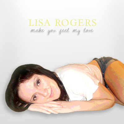 This is the next design that I created using the reference from my Mariah Carey research and album cover. For this design, I used the same light grey gradient background used in Mariah's cover, then placed the image of me into the centre. I tried using this pose to see the effect, however I preferred ones of me stood or sat straight as it looked more professional and less casual, therefore I decided I would use this in my next attempt. I then posterized the image and placed a light shadow over it to get the warm effect Mariah had in her cover. The next thing I did was place the artist name at the top in a large font named 'Day Roman' for a professional and eye catching approach, colouring this gold for a classy effect. I then used the same 'Dawning of a new day' font for the album title, giving a shadow below it for a delicate look, and coloured it grey to match the background.
The reason I am not using this design is because I have resized the picture in a way that my body looks unbalanced and distorted, and the use of the posterize tool made me look too orange and animated. The grey text for the album title was also too faint and the shadow made it look like it was wet ink running down the page, therefore I decided to use a fainter shadow and a different colour scheme for my next design.
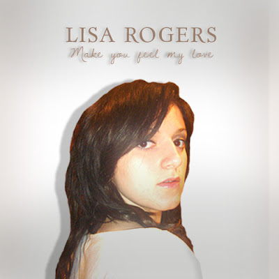 This is the next design that I created, using the same gradient technique and experimenting with the levels to make a light shadow over my face. I placed the image of me into the centre and enlarged it, cutting off some of my body for emphasis on my face, making it iconic so that the audience could remember what I looked like from the cover. I then placed a light shadow behind my head, representing the sadness that was hanging over me. At the top I added the artist and album titles in the same fonts as in the previous design, but this time used a brown sample colour taken from the image of me which I thought looked professional yet had a modern appeal to a younger audience. I placed the shadow fainter this time behind the album text, making it look softer and more delicate. I like this design, as it shows recognition of the artist to the audience, and as in my research gives off a very delicate approach.
 This is the next design that I created using the reference from my Mariah Carey research and album cover. For this design, I used the same light grey gradient background used in Mariah's cover, then placed the image of me into the centre. I tried using this pose to see the effect, however I preferred ones of me stood or sat straight as it looked more professional and less casual, therefore I decided I would use this in my next attempt. I then posterized the image and placed a light shadow over it to get the warm effect Mariah had in her cover. The next thing I did was place the artist name at the top in a large font named 'Day Roman' for a professional and eye catching approach, colouring this gold for a classy effect. I then used the same 'Dawning of a new day' font for the album title, giving a shadow below it for a delicate look, and coloured it grey to match the background.
The reason I am not using this design is because I have resized the picture in a way that my body looks unbalanced and distorted, and the use of the posterize tool made me look too orange and animated. The grey text for the album title was also too faint and the shadow made it look like it was wet ink running down the page, therefore I decided to use a fainter shadow and a different colour scheme for my next design.
 This is the next design that I created, using the same gradient technique and experimenting with the levels to make a light shadow over my face. I placed the image of me into the centre and enlarged it, cutting off some of my body for emphasis on my face, making it iconic so that the audience could remember what I looked like from the cover. I then placed a light shadow behind my head, representing the sadness that was hanging over me. At the top I added the artist and album titles in the same fonts as in the previous design, but this time used a brown sample colour taken from the image of me which I thought looked professional yet had a modern appeal to a younger audience. I placed the shadow fainter this time behind the album text, making it look softer and more delicate. I like this design, as it shows recognition of the artist to the audience, and as in my research gives off a very delicate approach.
Subscribe to:
Comments (Atom)


