I realised that I had not yet properly looked at back cover designs in detail, so this was a further step that I had to take before the final creation of my digipak design. Here are three different designs and key features that I have chosen to include in my final design.
This is the first design I have chosen to look at for Justin Timberlake's album 'Mr. Timberlake'. This design has a pale grey/white background, with mainly black and re
 d text, representing the conventions of a magazine/newspaper column to attract the audience's at tention and allow them to recognise this feature as being important. The layout is fairly basic, with an image of Justin dressed smartly to fit the continuing theme of the album facing behind, a reference to it being the back page, and to give any audience members only seeing the back page a feeling that he is mysterious and to make them want to see and hear more. The song titles are listed in bold yet simple curvy black text, to give a sense of animation rather than a thin and smart one. The people featured in the songs are also listed below the titles in slightly smaller red text, again repeating the newspaper convention. These titles are placed at either side of Justin, fitting around his figure to show he is the centre of attention and that things are being placed to fit him. At either side of the CD along the edges are also the rights and company logos of the music producers, along with Justin's title in the same font as the front cover, again also in black, red and grey. At the bottom of the CD underneath the image of Justin is the barcode and any other rights and information.
I liked the idea of having the artist included in the cover with the text, as it still promotes them and makes the audience want to see more. I also thought it was a good idea to have the album title repeated in the back page, so I will use this in my own design.
The next back cover that I am looking at is Taylor Swift's album 'Speak Now'. This is instantly eye-catching from the use of bright colour, clearly continuing a theme through out the album as this is such a strong composition that it cannot be discontinued without looking odd. Taylor is shown to the right, with her iconic hand-rendered text beside her going down the page. The text is not in line, giving a very free approach as though the text is animated. There are also colourful patterns to the left of the design, and smaller patterns above and below on either side. The text is written in pink for a very femenine approach, and the album title placed horizontally at either side of the deign matches this, although the text here is in a bolder type to attract the audience and make them more aware of the title when seeing it. Taylor's name before it is in black ink for a smart and simple approach, yet matches the album tracks as it is her same hand-rendered style. There are also music tradema rks and icons briefly at the bottom, along with a barcode, and the background is white to give emphasis on the other things on the page.
I really like this idea of using bright bold colours to attract the audience to the page, as it gives a more positive feeling to the audience from these colours, rather than giving off a more cold and depressive feeling with blues and browns. However, this design would not fit with my own, as the theme is a heartbreak song, meaning the colours would have to be more isolated to give the right effect to the audience. The idea of having the singer on the back page is a good idea, so I will experiment with this in my development stages.

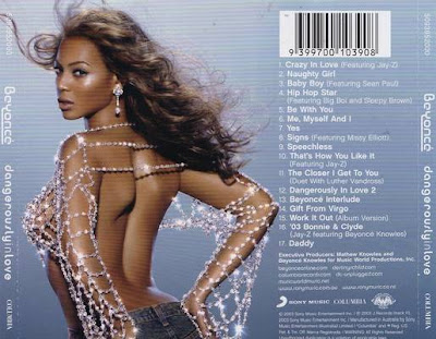
The final back cover design I am studying is Beyonce's album 'Dangerously In Love'. This contains a large picture to the left of the design of beyonce in a very revealing costume, accentuating her curvatious body, giving her more sexual appeal to a male audience. To the right are her tracks in her iconic curvy style white text, which is the same as the artist and album title stated at either side of the design. There is also a barcode above this, followed by copyright laws below the tracks, followed by the production rights and the music company's name and distribution date of the album. The background is a gradient sky blue going into a darker shade, giving a smart yet cool effect to the audience. Overall, this design is simplistic, and I like the use of imagery beside the text, as it looks equally proportioned and stands out when looking at the design. This also promotes the artist, giving recognition to the audience when turning to the back of the CD. I think this technique is important, therefore I will use this in my own designs.

No comments:
Post a Comment