In the production stages for our music video I worked in a group with Taslima. We looked at different music videos and films of the ‘heartbreak’ subgenre to see what conventional features are included and should be used for our own video. We began by researching the history of music videos to see the development and change over time.
Music videos began as a series of still images of a live performance, before Vitaphone shorts (short films) were produced by the Warner Bros. In 1926. This consisted of art-dec-style animations and a short film of the performer singing, and lasted for six minutes.
However, in the 1950s, performance clips emerged, as the Scopitone, a visual jukebox, was invented in France. At this point, many short films were made by French artists, and the popularity of this idea began to spread to America and the rest of the world. Directors everywhere after this began producing short films combined with music. One of the first performance clips was of the band ‘The Animals’ singing ‘House Of The Rising Sun’ in 1964, and was filmed in a studio with a specially built set showing the band lip-synching.
In the late 70s the BBC show ‘Top Of The Pops’ was introduced, playing popular music videos. At this time, the pop group ‘Devo’ began creating their own self-produced videos, and their single ‘The Day My Baby Gave Me A Surprise’ was one of the first to use computer and traditional animation, showing how the world was progressing into a postmodern society.
We then looked at the theories of production, narrative, and representation. Tim O’ Sullivan argued in 1998 that all media texts tell us some kind of story, and that they are not direct references to us individually, but as a culture or set of cultures. He said that narrative theory is designed to show us that when we ‘read’ a story, we are understanding a set of conventions, and that it is vital to know how these conventions are put together. This is a key feature for us in our video, as we wanted to make a construct that was clear to the audience, shown from the perspective of the artist who sings in the video. At this point, we began making mind maps of different narrative themes we could follow for our video. We wanted to base our story around a couple, one of them being the artist in the video, to personalise the narrative to them and allow us to see it from their point of view, in order to gain empathy from the audience, and to direct the lyrics to one central character. We had the idea based on what we recalled seeing in past music videos of the central woman featured singing wanting her boyfriend back, after being in a split. Our ideas from this point included the story of a love-triangle between the couple, and the idea that the central figure had been cheated on or replaced with another woman. We also thought about the story emerging where the couple are already separated, giving the chance for a narrative to develop throughout the video and allowing the audience to see the process of them growing apart. We decided to choose this idea, as it would form a personal bond from the audience to the characters, giving greater empathy and allowing them to look deeper into the characters’ relationship. We knew that this was a feature that was appealing to the audience, as many people now watch Soap operas on television such as ‘Coronation Street’ and ‘Eastenders’, where the audience get a chance to look into peoples’ lives through a ‘keyhole’ perspective.
We then had to decide upon a definite narrative structure for the story, therefore I began researching heartbreak videos to get an idea of the conventions used.
We then looked at Todorov’s narrative theory, which states that all narratives go through a series of stages. This is the order he suggested;
Stage 1- shows a point of stability and equilibrium, where everything is satisfied and calm
Stage 2- stability is disrupted by some kind of force, which creates disequilibrium
Stage 3- some form of recognition that the disruption has taken place
Stage 4- the only way to restore the equilibrium is through action directed against the disruption
Stage 5- Restoration of a new state of equilibrium. The consequences of the action are to change the world of the narrative and/or characters so that the final state is not the same as the initial state.
We believed that this was an interesting concept, therefore thought about the stages of progression and change between the characters and what the state would be at the end. To help me get a better idea of the narrative structure used in heartbreak videos, I began researching them on Youtube, a video sharing site that allows you to quickly browse and stream videos to your computer at your convenience, making a quick process of research for our group. I started by looking at the video ‘Hero’ by Enrique Iglesias (released 2001). The narrative concept in this video is based around a couple escaping with stolen money from a man who was trying to track them down. The conventions in this video show a non-linear narrative structure, cutting back from the couple to slow motion footage of the woman Enrique is with, isolated in a bright field or background, enhancing her beauty to show that he is in love and idolises her. There are also cuts to the man that is chasing the couple, the antagonist of the plot. He is shown from many low angle shots to show dominance, and as he draws closer to the couple the cuts become more fast paced to show the action is building and that something is about to happen. The location of the video is a desert, representing the ideology of a western film with a ‘showdown’ at the end between rivals, which is what happens at the end of the video. During the end as Enrique dies, the couple are shown together in the rain in a street with police cars behind them. Although this is a tragic ending, the lights and darkness with the rain combined all make a very romantic outlook to the audience, and a big impact at the end of the video, as it pulls the audience’s emotional heartstrings and makes them feel great empathy for the couple.
The next video that I looked at was the Goo Goo Dolls’ ‘Before It’s Too Late’ (released 2007), which was a combination of band promotion shots and footage from the new film ‘Transformers’, of which the song was part of on the soundtrack. This video showed two different worlds, cutting from different promotional shots of the band playing and singing, back to the action within the film, showing a couple that were escaping the war of the Transformers as the male character fought alongside the protagonist army. This video has lots of breathtaking sights because of its high-impact action based structure, showing skyscrapers that the Transformer armies are walking over to fight each other, and pieces of houses and buildings they are demolishing. In the middle of the video, the male rescues the female who is holding onto a skyscraper, and pulls her into his helicopter. The cuts show fast-paced action as multiple things are happening, and flashbacks are also brought into the Transformers narrative to show the romantic aspect of how the couple met. We liked the idea of using flashbacks, which helped us progress further with our narrative construct. We decided to have the couple already split at the start of the video, showing a series of flashbacks of their past throughout, to show how their relationship was constructed and then began to deteriorate, allowing emotional connection between the audience and characters.
I then began studying my chosen subgenre in more detail, looking at videos that contain the flashback conventions we wanted, and seeing how they were portrayed in a realistic and believable way to allow the audience to read this and believe they are going back to a memory of the past with the characters.
I next looked at The Script’s ‘Breakeven’, (released 2009) similar to ‘Hero’, which showed several flashbacks of a woman in a bright field to enhance her beauty and focus all attention to her, showing this is how the central male character saw her when he looked at her. There are then many shots of the present as he sings the video, shown in black and white, a convention to represent how everything is dark and lifeless without the female character he misses. This video starts with the couple separated as we wanted to show, however there is no resolution at the end of the video, which we wanted to have to grasp the audience’s emotions right at the end. Therefore, we decided to have a resolution at the end of our video, showing the couple reuniting in some way. We began doing further mind map ideas of the narrative, looking at the concept of a journey throughout the narrative towards the restoration of equilibrium at the end. In The Script’s ‘Breakeven’, the male is shown to be looking at pictures of the female on his phone. This gave us the idea of using a phone as the main point of connection through our narrative, establishing both characters in an easy way that the audience can read as a modern text used in society today. This postmodern feature helps us to establish the time the characters are living in, and the axis of action through the dialogue on the phone. However, we were still stuck for ideas on this, so kept on looking at heartbreak style videos.
The next video I looked at was Adele’s ‘Make You Feel My Love’, showing only her character throughout, allowing the subjectively imagine what the male looks like she is singing about. The video shows her in a dark room alone, through many long shots to make her look small and distant, perhaps embodying the male through these shots to show he is far away from her. High angle shots are used in certain lines to match the lyrics and show her vulnerability and loneliness. She also sits in a vulnerable position with her arms folded, emphasising her loneliness. Her flat is designed to look gloomy and isolated, and there are a series of tissues and ‘messy’ props scattered in her room. She uses her phone as the main device for connection to the male character in this video, texting him at the start from a point of view shot asking ‘Can we meet?’
This whole video gave us inspiration for our narrative ideas, as we now knew how to use the phone. We would reference Adele texting the male in our own video, and establish a meeting is going to happen between the couple. We then decided that Lisa would then begin a journey to meet the male, having several flashbacks on her way, allowing the couples’ past to be introduced to the audience, stating how they got to the point they are at, before the restoration of equilibrium at the end. We also decided at this point that this would be the song we would use, as it fitted our video as it was a direct reference of Adele’s, and contained many romantic lyrics that we thought would appeal to the audience and fit our chosen genre.
We then began planning our location and setting. For this point in our production, we referred back to genre theory, and looked at Rick Altman’s theory of the ‘set of pleasures’ an audience experiences when seeing a short film. He states there are three types of pleasures; emotional pleasures, visceral pleasures, and intellectual puzzles. We wanted to focus on giving the audience emotional pleasures, placing effective conventional features from similar videos of the same genre into our product to create a strong audience response. We also kept in mind the idea in genre theory that the characteristics across all similar texts share similar elements of mise-en scene, narrative, and generic types. This is a way of stereotyping the props used, using the same thing across the style as a whole to allow the audience to see what is used and read it as a convention of that style. This meant we had to think about what we would use to allow the audience to read it.
We came up with a prop list, stating what we wanted in which scene. For the outdoor scenes of Lisa walking on her journey to meet Jacob, we wanted her to wear a scarf and coat, a stereotypical costume designed in films for outdoor scenes, distinguishing the setting further. At the beginning of the video, we wanted to show her room in a mess as in Adele’s original version, showing the state her life had got to since the breakup. Therefore we decided to have tissues and clothes scattered, and a teddy on the floor, a prop symbolising Jacob, suggesting she has discarded their relationship. We also planned to have a laptop in the video, a postmodern feature, showing a wallpaper of the couple looking happy together, another sign of a past memory in contrast to the miserable present Lisa is in.
The next thing that we did was to think about locations for each scene based on our research and how the verses in the song are broken down. We decided to start in Taslima’s bedroom for the opening, however this later changed as the location was too small and did not contain the right conventional elements, having posters that did not fit the genre, and not enough space to place props in. We also had a ‘good’ and ‘bad’ street based on the wording of the middle verses that I would be walking down, and a romantic big impact location for the end scene as the couple meet for restoration of equilibrium. For the final location, we wanted a place that would pull the audience’s heartstrings and make them feel the emotional attachment to the characters we wanted. I had an idea from two films I had watched previously; ‘Sleepless in Seattle’ (1993), and ‘Love Actually’ (2003). I looked up both of these on Youtube, as I remembered from watching them that they had lots of romantic settings, full of bright lights and romantic views over buildings and of snowy surroundings, another convention of heartbreak videos audience recognise. From this, we had the idea of going somewhere easily accessible and romantic. We originally thought of queen’s gardens where there was a water fountain with lights, however the space in this location was awkward to film in, therefore we changed our idea to the Marina, overlooking the sea and the lights of the city in the distance. We believed this was a perfect romantic location that would create a big impact at the end of our video.
We then made our storyboard ideas based on our notes and mind maps, all of which we posted regularly onto our Blogger addresses. Blogger is an online file hosting site that allowed us to conveniently post work we had done and imagery collected quickly and easily, meaning we did not have to carry lots of printed work around all the time. The problem with our storyboards, however, was that we timed the shots wrong so that shots were sometimes 8 seconds at a time. This meant that lines would look out of time, as we did not time based on the timing of the lines in the video. This meant that when we came to filming, timing had to be rearranged and re-written into our plans and new storyboards had to be created. The main problems that occurred during filming were small things, such as being able to get through the intimate scenes without laughing, as Jacob and I were in close proximity of each other and it was difficult to keep the timing whilst doing this as we began to lose focus. Therefore, we had to have several attempts, which meant filming one scene took longer than expected. Other obvious problems that we experienced were things involving the weather conditions, for example the servere wind and rain at the Marina due to being close to the sea meant the camera became shakey and looked unprofessional. The lighting of outside areas was also problematic, as when I was walking through an area with many lights around, the lighting on my face kept distorting, making it hard to see expressions. This also made the camera go in and out of focus, so we therefore had to film in a different location. This made a chain, however, as we originally planned to film scenes in streets close to each other, and have me walking into the next space that would be shown in the next scene. Therefore, we had to completely re-design our area, and choose a place where the lighting was more controlled. We decided to use a light over the camera, borrowed from my teacher, to control this better, which did make a big difference, seen in my videos of our attempts which I posted on my blog. I uploaded the videos from our camera onto Youtube, where we made our own account by signing up, which was quick and easy and literally took seconds, and named it ‘TisaMedia’, which is our names combined. From there we used the embed code on the site to paste our videos into blog posts on Blogger. This was very convenient, as it meant that videos could be quickly uploaded in minutes with the click of a button, again another postmodern feature used to progress in our production stages.
As we continued to film, we had the idea of me singing the song myself, as singing is a hobby I enjoy. This meant that we had to book sessions in the college recording studio, and begin to plot scenes to be filmed there. We began arranging our sessions and drew up additional storyboard sheets to file between the action scenes, therefore giving a postmodern aspect of there being two different worlds in the video, as in the Goo Goo Dolls video I researched, showing features of artist promotion. Whilst doing this, I also began to research digipak designs by other established artists using Google, which was a quick and easy way to search in seconds by using the google search bad. I looked at Mariah Carey, Rihanna and The Script. All of the digipaks were designed in a similar format, with six panels and a main central image on the digipak front cover for audience attraction to them when first looking at the design. Inside was information about the artist and their music in the past, followed by personalised thankyou messages to the production company and members of their family for their support. I thought that this was a really good idea, as the artist makes a personal message to the audience, making them feel closer to the artist, and also more persuaded to listen to their music. The digipaks all had a main colour scheme, with either a soft white light across the whole design with imagery placed over this, or imagery as the actual background itself of a room featured in the hit track of the album, making a connection to the music and continuity of design. From this research, I began designing my own individual panels using Photoshop CS3, taking into consideration the colour schemes, placement of text and text type, and the position of imagery to attract the audience. These are all selling points that are conventions used in all digipak designs. Photoshop is a programme which allows you to edit imagery and text, editing the contrast, colours, font styles and breaking the image into layers to use and discard as you wish. This is a quick and easy feature to use, as before this was invented, design was very basic, using the same font types and imagery for designing all the time. Using Photoshop, I imported my CD template design and used the fill tool to apply cover over the top. I then used the text tool to select and apply a font type, referencing my research as I progressed, and experimented with effects by right clicking and adding drop shadows and outer glows, also experimenting with the brightness and opacity of the effects. Photoshop is an easy programme to use, allowing endless experimentation with image and text, with a huge range of tools to experiment with. I also used the same features and the polyganol tool to select and cut parts of the images I used, such as removing unwanted backgrounds from the image to be left with just the person in it. I found Photoshop a great help, and do not know what I would have done with such a quick and easy resource of experimentation. After I had chosen my final designs, I then imported a digipak template which I found on Google into Photoshop, and simply opened my CD designs, resized them using the Ctrl+T buttons, and then dragged them onto the template with my mouse.
The next step was researching magazine advertisements. I did this in the exact same way as my digipak, studying other artists’ advertisements, such as Ellie Goulding and Lady Gaga. These adverts contained bright colours and large text in order to gain attraction from the audience when first viewing, as from a distance the text needed a convention to enable it to be seen by the audience. I used these features in my own designs using Photoshop again. I applied large text and imagery, keeping the thought about it being seen from a distance in my mind. When I had created my final design, I looked again at my research, but realised that the black light effect behind my main image I had used using the brush tool looked too dark, making text harder to read and absorbing the image. Therefore, I changed the colour to white by simply changing the colour and applying the brush over my image again. I also realised after going back into my research that I had not included promotional elements such as a link to an online music site where the song could be bought. Therefore, I found the Itunes logo on Google and copied this into Photoshop, placing it at the bottom of my design so that the audience would recognise this as an element of synergy, combining and promoting other media to profit in all areas. I also referenced the Stone Roses poster which I had looked at, which contained quotes of people’s opinions on the album. I thought this was a great way to give a personal response from memebers of the public back to other members, as they are more likely to buy the music when it has good references.
When I had finally created and selected my design, I Photoshopped it onto a bus stop board, to show how it could still work as an enlarged public advertisement. I am happy with the result, as the text and imagery throughout is large enough to be seen from a distance, and the colours used are bright and eye-catching to people passing by, making them want to stop and read the advertisement. I again posted this onto my blog so that people could see the impact it had as a public campaign.
On the filming side of the production, we used our new storyboards which we ensured we timed in accordance to the length of the lines, which we tested by playing the track on Itunes and looking at the time in certain parts of the song. Itunes is a great feature that allows music to be played and moved onto Ipod music players by simply plugging the device into the computer and dragging the files into the Ipod folder. This meant that we could easily put our recorded version of the song onto a disc in seconds using this programme, as we simply imported the track from a memory stick into the programme, before putting a CD into the computer and dragging the file into the ‘Blank CD’ folder, double clicking on the folder title to rename it ‘Lisa Rogers-Make You Feel My Love’.
During the time in the studio, the actual recording of the track was simple and easy. We were aided by Adam, head of the music department, who showed us the quick and easy features of recording software, and how there were buttons that did almost everything you needed to record. I put the backing track of the song onto a CD at home, from which I bought online from ‘Www.Karaokeversion.com’. The CD was then put into the computer in the studio and the music file was imported into Cubase, a simple and free accessible editing software that allows you to mix and cut your own music from your own home. This device is a key development in our postmodern world, as before this and the invention of multitrack, things such as the harmonies included in our track, which literally took seconds to record and multitrack over the original, would have taken hours, even days to create. Cubase allows the cutting down and editing of a music file in seconds, allowing users to edit their music without complication at the click of a mouse.
The complications in the recording of our music video footage were the lighting. As we could only get into the studio at different times of the day, the lighting from the outside was constantly changing, meaning we were getting a different shadow over the face everytime we filmed. This caused real problems, as the shadows looked dull over the face, making parts lost in the dark patches of light, meaning that the narrative conveyed through the lyrics was lost to the audience. We therefore had to discuss times to go into the studio with Adam so that daytime sessions were available, when it was light outside, giving a natural light over the face and leaving a delicate, soft effect, a big contrast to the dark gloomy outside scenes that we shot at night for the streets. We did these in the dark for contrast, and because we wanted to show isolation of the character when walking alone, and also for romance to allow the night lights of the city to be lit at the end during the last scene, to resemble our previous video research of ‘Sleepless in Seattle.’
The digital camera that we used was very good, as it had a big space for storage, and was created to show footage in high definition. The camera was also useful because of its capacity to store without running out of space, where as before digital cameras were invented, footage was recorded onto many tapes, where footage could not be edited once it was placed there.
We filmed different scenes at different times, and ended up not having a direct shooting schedule because of this. The reason for this was either the weather conditions, or appropriate times when we could film, as we were using mine and Taslima’s house, with other members of our family living there. During the opening scene of me sat on my own, we developed our idea from the bedroom to me watching the television instead, which was not shown in the shot but I was placed in a way that gave this impression to the audience, on a chair looking out away from the camera, my phone on the arm to show it was a prop I would be using in the scene. We got the idea of the television from romantic films, where we recognised the convention of a woman sat alone eating a large tub of icecream for comic value. We decided not to use this aspect, but the television was a good way of showing that I had become passive since the split, and that I did not have anything to do with my life, and no energy to go out. During the filming, the problems we experienced were things like the light from the camera being reflected onto the phone in an over shoulder shot when I was looking at the message I received from Jacob. To solve this problem, Taslima had to experiment with where she placed herself behind me so that this would not be seen. We also had probems with the stillness of the camera whilst filming from a low angle point of view shot as I looked up to see the time on the clock. This was as Taz was stood at an awkward angle, therefore there is still slightly shakey movement seen even in our final version of our video. During this scene, however, we used a previously printed picture of me and Jacob at our school prom in reality, and placed this into a photo frame on a table that could be seen in the shot just behind the chair, linking past memories of us in with the present day, showing that Lisa has still not let go of their relationship. We knew that the audience would recognise this, and many have commented on how it is a good technique to use whilst watching the video. We did experience minor continuity issues, however, though we did not notice these until the very last editing stage of our video, as we were watching the opening scene many times. Others did not notice until we told them, meaning it was not a major problem, however the chocolates placed on my knee disappear through the following shots, and then reappear again during the end of the scene. This is due to use experimenting with shots many times, however we did not notice that we disregarded the prop at any time, therefore this is a small yet important feature I would improve on if given the chance to film this again.
We also had to re-shoot our flashback and end scenes due to discontinuous shots throughout and bad weather conditions, meaning things looked jumpy when watching the scene the whole way through with the shots combined as one. This is something I am glad we did again, as if we did not have time, we would have distinctly noticeable discontinuous footage which would have made the video unrealistic and make the audience disconnect from what was happening.
At this stage, we made a first whole version of our music video. Small parts were still missing, such as the space during the instrumental as we did not know how to combine the action and the studio scenes, however I created audience feedback using Microsoft Word, and gave it to people to see what they thought so far. The target audience that I was focusing on were teenagers and young adults, as they are the people that watch music channel and keep up to date with charts more than any other age group. I asked how continuous the video was from shot to shot, outlining below what defines each option the audience could select (e.g- ‘Very Continuous-Cuts fit perfectly in time with the music and shot smooth transition of action taking place to make it appear it is happening in real time). The second question I asked is how successful the audience thought the combination of the action and studio scenes were, and their reason why. The final question was what could be changed in their opinion to make the video more successful.
I then did the same with my CD designs, again using Word and pasting the images in from blogger, which I previously uploaded as I progressed with my work. For this feedback, I asked people which design was their favourite and why, and also what elements could be changed from their favourite design to make it more eye-catching to the audience.
I then did exactly the same with my magazine advertisement designs with the same questions.
The final feedback sheet that I created featured the final digipak design and my two ancillary texts, followed by a print screen of me in the recording studio, representing our music video as it cannot be watched on paper. I asked ‘After seeing the digipak, how effective do you think it is in terms of artist promotion (1 being poor and 10 being very effective)’. Below this, I asked ‘How effective is the main product (music video) and ancillary texts?’, also asking their reasons why and any other comments.
When our shots and scenes were finalised and were ready to be edited, we used Premier Pro, an editing suite designed for easy use and to quickly and effectively edit media clips, making it possible to add effects and titles to create an attractive composition. We had to time the distance from where one clip ended and the next started so that we could work out how much time in between there was to cut or use. This was made easy by the timer below the video, which could be viewed constantly and could me moved back and forth between clips with the edit bar, which could be dragged over clips with the mouse. We also used effects in Premier Pro, including fades and crossfades over the start and end of two clips to create an illusion of one scene fading into the other, a convention also featured in my research video 'Hero' to show time passing. We added black and white effects over our flashback scenes to show the past, a code used in The Script's video 'Breakeven' that I looked at. This was all simply done, as there was a bar of effects beside the editing section where clips were cut and changed, and effects could simply be clicked and dragged onto the desired clip. We could also add a title at the beginning and end of our video using Premier Pro, by clicking on the 'Add title' button on 'Tools'. This was a simple screen showing a selection of texts and text sizes that could be chosen and moved around the screen. This was again a simple technique that we found easy to use. As people that had never used the program before, we found it incredibly simple, quick and effective, giving a professional look to all of our scenes. Without this use of quick and easy technology, the editing process would have taken much longer and would have been much more complicated.
During our editing process, we found problems with the footage, such as the clips were too short in some places, meaning we had to replace it with longer clips or put an effect over the two to cover the mistake. An example of this is at the end of our video, where me and Jacob walk into the scene. The problem with this is that during filming of this we lost the timing, so ended up miming too late into the scene, even though we had walked in at the right time. To fix this to line up with the audio track, we tried to edit out the middle section of the clip where there is too much time where we are stood still. However this looked jumpy, as we both slightly moved whilst stood opposite each other as I prepared to sing. To solve this problem, we put a cross fade on the previous scene of the argument to cover the mistake and bridge the gap as the fade expired. However, this meant that by the time the fade had faded from the end scene, we were seen stood opposite each other at a still point again instead of walking into the scene. This was something that we found could not be avoided unless we filmed the scene again, but due to lack of time during the approaching deadline to edit, this was not possible, however this is something we would change if given the chance in the future.
At the end of the editing, we simply saved the file and selected the embed code on the options menu that allowed us to paste this into a blog post to show the audience. This took seconds and was so much quicker than in previous times before similar technology emerged, where footage had to be stored on several tapes. Premier Pro allows you to export the file onto Youtube and other devices such as DVDs, giving freedom of use and a quick saving process. We are very glad that we used this, as it greatly helped us speed up our editing process, and aided us well as we did not know how to edit clips previous to this.
The last thing I did on my blog at this point was post my finished music video, and showed the audience the final version, giving them back the same audience feedback on the music video to see how effective it was now that everything was done. This time, people said that the video was very effective in terms of continuity, and that the combination of the recording studio and action scenes made the video on whole look more professional and more generic of a heartbreak music video. The audience believed it made the video more aesthetically pleasing, giving more variety and making the narrative structure more interesting. Finally, people said that the video looked more believable with the two worlds, one representing reality in the studio, and one being a fictional world based around a central character. They also said that the idea of me actually singing on the track made the miming and video as a whole more believable. The criticism that the audience gave was that the final scenes in the dark could have been made to be more visually clear, which we could improved by filming near more controlled lights, however there would still be the same risk that the lighting would affect the expression on the face because of shadows. They also said in feedback that the embrace between the couple could’ve been longer to make the union at the end more believable.
During my time producing the music video, I have learnt that every small detail must be planned carefully in accordance to the weather and appropriation of filming and other elements in order for continuity of shooting. I have learnt to use the editing suite, which I never knew how to use previous to this, and how to place transitions and effects onto shots. I have learnt that audience read theories more than they realise when looking at a text, and that without following genre and narrative theory, and placing clues and links to the characters in the video, some of the emotion and significance is lost, and pieces of the story are missing. In a video, everything matters, from the lighting to the props and positioning of the props and characters within the scene. The way the camera is held is vital, and the duration that the camera continues to film for is vital. I have learned that a key tip when filming is to always leave excess time on the end of shots, so that if needed they can be used to ensure you are not left with a clip that is too short. To convey a certain genre, much research is needed, and understanding of the codes and conventions constructed for the audience to read is vital. New media such as a digital camera, Photoshop, Premier Pro and Blogger are all great and helpful features of our postmodern society, and without these, production would take far longer. Overall, I have found the production a challenge, as everything needs much detailed thought, and every aspect of the genre must be explored and covered in every area of filming in order to make a successful product. I have thoroughly enjoyed producing my video, and am very glad that I could use something that I enjoy doing to create it. Given the chance to film again, however, I would change the steadiness of the camera, the quality of the lighting in outdoor areas, and make greater planning into each scene that we planned to film, doing more mind maps, including the advantage and disadvantages of each, in order to gain a better perspective of the possibility of filming there before going and having to re-film multiple times after. I have enjoyed this project, and would not rule it out as something I would explore again in the future.
Friday, 15 April 2011
Thursday, 14 April 2011
New Last scene final shots.
This is the final shot of the first line of the song. We changed this to us both walking into the shot to show that we are meeting, as previously we were stood in the shot from the opening of the scene, which gave no clue to the audience as to why we were there. We are happy with this outcome, as the lighting is clear and bright enough to show facial expression, and the timing that we walk into the shot is correct.
This is the first half of the second line, which we shot over Lisa's shoulder to show me singing as Jacob is listening, stating his reaction to the audience. We are happy with this shot, as the lighting is again clear enough to show expression from both characters, and the timing is again correct.
This is the footage for the end of the second line, showing an over shoulder shot again, this time from Jacob's perspective to show Lisa as she is singing and Jacob's reaction to her again. We are again happy with this shot for the lighting and continuity of the lyrics and action.
This is the third line of the song, showing a 360 circle of the characters as Lisa is singing, showing the romantic location they are in and their reactions to each other. This enhances the romance of the video and pulls the audience in closer with this intimate shot. We are pleased with the outcome of this scene, as the circle is timed slowly and steadily enough to evenly show the characters' expressions and body positions in time with the length of the line.
This is the last line and tagline at the end, shot from a straight on view of a medium close up of the couple stood facing each other as at the start of the scene. In this shot, Lisa is finishing singing to Jacob, before he suddenly goes to hug her, showing they have reunited as a couple, bringing the story to an end. We are pleased with this scene after practising the timing previously, as the timing between the characters going for the hug at the end leaves enough room to finish the lyrics and for a break before the closure of the video.
Tuesday, 29 March 2011
Public awareness of advertisement.
This is the public advertisement I created, the purpose being to attract and allow the audience to become aware of what is being advertised through the conventions used within the design, and the convention of using the bus stop advertisement itself to do this. I placed my image onto a picture of a bus stop to show how it can fit and look successful as a public advertisement that would attract and promote the album successfully. I am happy with this outcome, as the text and image are large and attractive to catch the audience's attention upon first sight, and is bright and bold enough to make them want to read more and hold potential for them to buy and listen to the album.
Saturday, 19 March 2011
Digipak construct pictures.
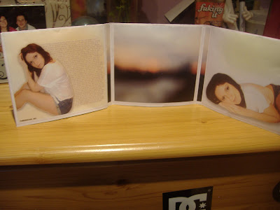
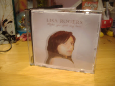
This is my digipak construct, which I have taken pictures of to show how it works in a CD case as a professional product album. I am very happy with this result, as I believe the design is conventional to be appealing to the audience using appropriate type and imagery to look professional and believable as a real product.


Friday, 18 March 2011
New CD Design.
Album promoted on Itunes
Other Digipak designs.
These are the digipack designs I only did one or two attempts of and did not post the individual process for on my blog. Below I will state why I designed these in the way that I did and why I decided to use them for my final product.
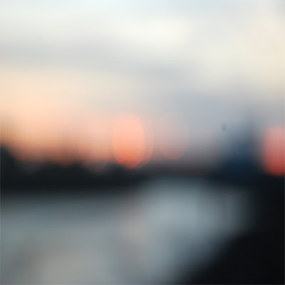 The first design is for the inside central cover, which would have the CD placed over it. Therefore, this would have to be very simplistic, yet still stay within the generic style that I was working with. I chose to use the out of focus image of the marina, as this showed much colour and light, following the pattern of the rest of my design. It also looks very soft, connotating romance and emotion, therefore representing the genre that I wanted to portray in my digipak and designs. I am happy with this image, as it contains the codes and convention of a romantic song, yet is still simplistic enough for the CD to be placed over the top of it without taking away too much attention.
 The first design is for the inside central cover, which would have the CD placed over it. Therefore, this would have to be very simplistic, yet still stay within the generic style that I was working with. I chose to use the out of focus image of the marina, as this showed much colour and light, following the pattern of the rest of my design. It also looks very soft, connotating romance and emotion, therefore representing the genre that I wanted to portray in my digipak and designs. I am happy with this image, as it contains the codes and convention of a romantic song, yet is still simplistic enough for the CD to be placed over the top of it without taking away too much attention.
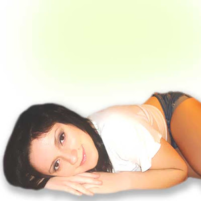
This is the design for the inside right of the digipak, showing a medium close up of me laid down and looking into the camera. I experimented with the levels on photoshop for this outcome, and was happy with the light effect that it gave the edges of the photograph, making it look delicate and gentle like I wanted throughout my design, as this connotates love and affection, aswell as positivity when looking at the image, giving a good light on the artist. I also played around with the blur tool and slightly blurred the image to give a much rounder and softer appeal to the face and body, again emphasising the gentle elements of the design. I am happy with this outcome, as it reflects positivity and the gentle and warm effect I wanted the audience to feel when opening the digipak. The image does not have any text beside it, as I wanted the focus to be on the artist and promoting them, as this is the main element of my designs that I wanted to make clear to the audience.
Completed Digipak.
Here is my completed digipack design which I fitted onto the digipak template I had found. I am very happy with this design, as with the covers combined, it looks very professional and believable as a CD that has come from a well-known artist in the charts, which is the effect I was trying to create based on my research of signed and popular artists.
Thursday, 17 March 2011
Back Cover Designs.
Here are my designs for my back cover that I created for my digipack. I will state below which I will be using for my final product and why.
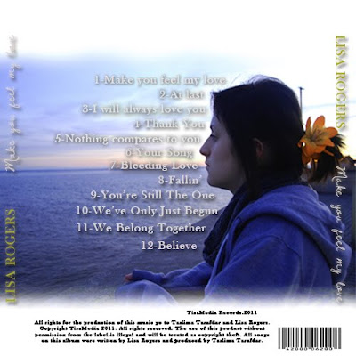
This is the first design that I created, using a medium shot of me stood at the wall seen at the end of our video and in the flashback scene, which is why I chose this shot, looking out at the sea. I liked this shot as it was clear and looked professional from the lighting, and was also iconic to the audience as it was something taken directly from the video which I knew they would recognise. I then took reference from the Justin Timberlake back cover design I had researched. I placed the song title, coloured in gold for a professional look, and the album title, in the hand-rendered white font for clarity and a personal effect, down the side of the cd to the right and left for recognition to the audience so that they remember the name of the album even by just reading the back cover. I also experimented with the levels of the picture to give a deeper and more romantic effect, before using the 'Dawning of a new day' font to create the song titles for the design. For this process, I looked up 'greatest heartbreak songs' on the internet and found lots of titles that related to the same genre. I then named the tracks from these titles, and placed them in the centre around the figure of me, rehiterating the idea that the artist comes before the text and is the most important feature. I added drop shadows to make the text stand out over the background, and added a barcode and terms and conditions at the bottom of th design. I like the appearance of the darkened image and drop shadows over the text, as it gives a deeper more emotional feeling from the blue colour connotating sadness. However, I think that the text at the side of the design makes it look tacky and does not match with the colour codes as a whole. I have also considered the rest of the design, and I realise that this blue colour will not match the bright white backgrounds predominantly used in the rest of the digipak, therefore I have decided not to use this cover, and to instead create something bright to fit the colours and match the rest of the design to develop continuity further.
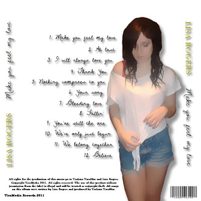
This is the second design that I created, this time using a white background to fit with the theme of my digipak. I used the hand-rendered text for the track titles, giving a shadow underneath for clarity of the text on such a contrasting background. I spaced these again around the large image of me which I placed slightly to the right of the design to allow space for the album titles to be placed. I experimented with the blur of this image on Photoshop, creating a very computerised animated effect. I liked this, as it was a different approach to the design and was very unique compared to previouus pages. I then placed the artist and album title headings on either side as before, and placed the music rights and barcode beside the image at the bottom. I like this design for its unique effect, however I do not think the animated effect fits enough with the rest of the design and looks odd in comparison. I also dislike the album headings at either side, as I still think that they look too bold and tacky, therefore I will design another cover and will not include this in it.
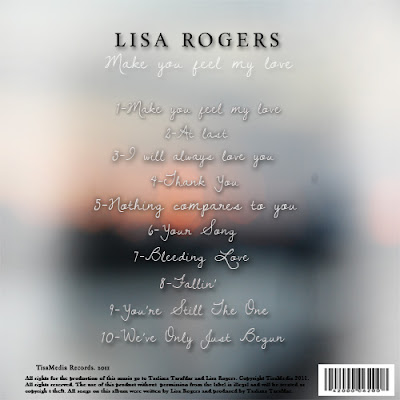 This is my final design I created. For this product, I debated about which image I should use to create the correct romantic effect that I wanted. After searching my images and experimenting with text over the background, I decided that the out of focus image I had previously used for the CD panel would be the most successful, as the soft effect of the poor focus connotates affection and emotion in a romantic way that will bring this idea accross to the audience when viewing the design. I then placed the album titles down the centre of the page in the same hand-rendered text as in previous designs, giving a drop shadow for clarity when reading. I also placed the artist and album titles at the top of the design as in the front cover, giving continuity and easier recognition to the audience. I like this better than in previous designs where the text was placed vertically at either side, as the colours in the image made the text difficult to see. I placed the rights and record producer name at the bottom again in black text along with the barcode. I decided not to use an image of the artist in this cover, as I thought that it would take away from the main romantic ideology of the background, and was finding it hard to make previous imagery fit in a way that would make this idea clear to the audience, and fit with the overall design. I like this outcome, as it conveys the correct ideas to the audience about the genre of the album, and is presented in a way that delivers a clear message of what is contained in the album to the audience when looking at it. For these reasons I have decided to use this in my final product.

This is the first design that I created, using a medium shot of me stood at the wall seen at the end of our video and in the flashback scene, which is why I chose this shot, looking out at the sea. I liked this shot as it was clear and looked professional from the lighting, and was also iconic to the audience as it was something taken directly from the video which I knew they would recognise. I then took reference from the Justin Timberlake back cover design I had researched. I placed the song title, coloured in gold for a professional look, and the album title, in the hand-rendered white font for clarity and a personal effect, down the side of the cd to the right and left for recognition to the audience so that they remember the name of the album even by just reading the back cover. I also experimented with the levels of the picture to give a deeper and more romantic effect, before using the 'Dawning of a new day' font to create the song titles for the design. For this process, I looked up 'greatest heartbreak songs' on the internet and found lots of titles that related to the same genre. I then named the tracks from these titles, and placed them in the centre around the figure of me, rehiterating the idea that the artist comes before the text and is the most important feature. I added drop shadows to make the text stand out over the background, and added a barcode and terms and conditions at the bottom of th design. I like the appearance of the darkened image and drop shadows over the text, as it gives a deeper more emotional feeling from the blue colour connotating sadness. However, I think that the text at the side of the design makes it look tacky and does not match with the colour codes as a whole. I have also considered the rest of the design, and I realise that this blue colour will not match the bright white backgrounds predominantly used in the rest of the digipak, therefore I have decided not to use this cover, and to instead create something bright to fit the colours and match the rest of the design to develop continuity further.

This is the second design that I created, this time using a white background to fit with the theme of my digipak. I used the hand-rendered text for the track titles, giving a shadow underneath for clarity of the text on such a contrasting background. I spaced these again around the large image of me which I placed slightly to the right of the design to allow space for the album titles to be placed. I experimented with the blur of this image on Photoshop, creating a very computerised animated effect. I liked this, as it was a different approach to the design and was very unique compared to previouus pages. I then placed the artist and album title headings on either side as before, and placed the music rights and barcode beside the image at the bottom. I like this design for its unique effect, however I do not think the animated effect fits enough with the rest of the design and looks odd in comparison. I also dislike the album headings at either side, as I still think that they look too bold and tacky, therefore I will design another cover and will not include this in it.
 This is my final design I created. For this product, I debated about which image I should use to create the correct romantic effect that I wanted. After searching my images and experimenting with text over the background, I decided that the out of focus image I had previously used for the CD panel would be the most successful, as the soft effect of the poor focus connotates affection and emotion in a romantic way that will bring this idea accross to the audience when viewing the design. I then placed the album titles down the centre of the page in the same hand-rendered text as in previous designs, giving a drop shadow for clarity when reading. I also placed the artist and album titles at the top of the design as in the front cover, giving continuity and easier recognition to the audience. I like this better than in previous designs where the text was placed vertically at either side, as the colours in the image made the text difficult to see. I placed the rights and record producer name at the bottom again in black text along with the barcode. I decided not to use an image of the artist in this cover, as I thought that it would take away from the main romantic ideology of the background, and was finding it hard to make previous imagery fit in a way that would make this idea clear to the audience, and fit with the overall design. I like this outcome, as it conveys the correct ideas to the audience about the genre of the album, and is presented in a way that delivers a clear message of what is contained in the album to the audience when looking at it. For these reasons I have decided to use this in my final product.
Audience Feedback.
Before I could evaluate my work, I needed to get audience feedback to get an insight on their opinion and how my designs and knowledge of production have developed over the course. Here are the different questionnaires that I created based on the effectiveness of the designs.
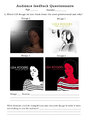
This is the first questionnaire that I created to look at to initiate how appealing my CD designs were to the audience and which they preferred. I also asked the reasons for their preferred design and any other comments to improve it so that I could use this for my evaluation and further development.
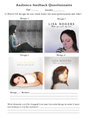
This is the next sheet formatted in a similar structure for the rest of the CD designs I have produced. I placed the same questions as previous onto this questionnaire to see any constructive advice that people could give to help me develop the designs.
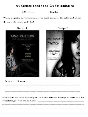
This is the magazine feedback questionnaire I produced, again stating the designs, but this time asking which design the audience thought promoted the artist in the best way, as that is essentially what the advertisement is about as well as promoting the CD, and is a key feature in previous research advertisements that I have referred to in my designs. I then asked what could be changed in order to make the designs more eyecatching to the audience.
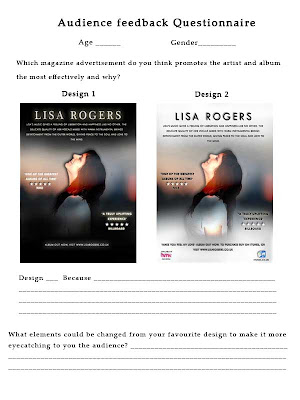
This questionnaire is formatted in the same way as the previous one, asking which design promotes the artist in the most successful way as the rest of the designs are shown.
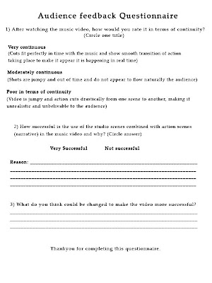
This is the questionnaire I created to ask about how continuous the cuts were in the music video, as we aimed to create a smooth transition as possible. I also asked how successful the use of the studio and action scenes combined were, as this was a process which could go either way in terms of continuity and clarity to the audience when following the story.
This is the final questionnaire I created to ask about the effectiveness of promoting the artist in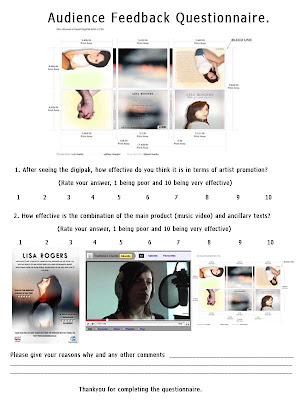 the digipack design overall, as again this is a key feature we used from previous research. I also asked how effective the combination of the music video and ancillary texts were, as I wanted to see how successful the advertisements were in catching the audience's attention and making them want to go on to watch the video or listen to the artist's CD.

This is the first questionnaire that I created to look at to initiate how appealing my CD designs were to the audience and which they preferred. I also asked the reasons for their preferred design and any other comments to improve it so that I could use this for my evaluation and further development.

This is the next sheet formatted in a similar structure for the rest of the CD designs I have produced. I placed the same questions as previous onto this questionnaire to see any constructive advice that people could give to help me develop the designs.

This is the magazine feedback questionnaire I produced, again stating the designs, but this time asking which design the audience thought promoted the artist in the best way, as that is essentially what the advertisement is about as well as promoting the CD, and is a key feature in previous research advertisements that I have referred to in my designs. I then asked what could be changed in order to make the designs more eyecatching to the audience.

This questionnaire is formatted in the same way as the previous one, asking which design promotes the artist in the most successful way as the rest of the designs are shown.

This is the questionnaire I created to ask about how continuous the cuts were in the music video, as we aimed to create a smooth transition as possible. I also asked how successful the use of the studio and action scenes combined were, as this was a process which could go either way in terms of continuity and clarity to the audience when following the story.
This is the final questionnaire I created to ask about the effectiveness of promoting the artist in
 the digipack design overall, as again this is a key feature we used from previous research. I also asked how effective the combination of the music video and ancillary texts were, as I wanted to see how successful the advertisements were in catching the audience's attention and making them want to go on to watch the video or listen to the artist's CD.
Wednesday, 16 March 2011
Magazine advert designs.
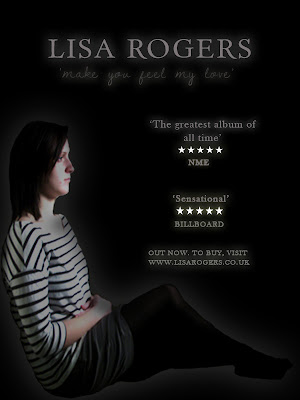 This is the first design that I created using my original pictures. For this, I followed the rule of my digipack initial designs and used a black background to represent sadness and isolation. I then placed the image of my sat folding my arms, again to reference loneliness, into the image, changing the levels on Photoshop to give more of a shadow over my face to give this impact further. I also added a white outer glow to give emphasis on the artist. I placed a serif style font that I had previously used in my digipack designs into the design for the artist title to give a professional look, and used the same style hand-rendered font named 'Dawning of a new day' for the album title. I coloured these both a light grey and added an outer glow for emphasis. I used the same colour technique for the quotes from magazines about the album below this, an idea I decided to use from the Stone Roses magazine advert I had looked at. They also had star ratings which I placed into the advertisement, colouring them white to contrast with the black background, and gave an outer glow again for a bold emphasis to catch the audience's attention when looking at this. Below, I wrote a short statement about visiting the artist's website to buy the album which had been released.
Overall, this design is eyecatching and conveys the correct emotions about the genre of the music to the adience by using contrasting tones rather than colour, however, I do not think it contains enough of these codes to really attract someone and make them want to buy it, as the image is not eye-catching enough and the information on the page is limited. I think that the image needs to be brighter so as not to get lost between the bold text and quotes, and the background could perhaps be different rather than one plain colour for more attraction to the advert when opening the page.
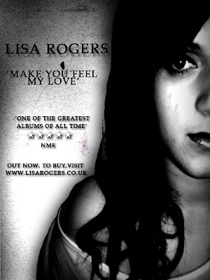
This is the next attempt that I created, this time using the new imagery of me that I had taken, as I felt that my original images were few and limiting for designing. I chose this picture as it was visually clear and expressed emotion well. I enlarged this image to make it instantly eye-catching when opening the page, placing it on the right hand side so that text could be placed beside it. I then placed a grainy texture behind it that I downloaded to again connotate sadness and depression. The next thing I did was experiment with the levels to darken the image drastically, giving darker shadows over my face and making my eyes look darker, again emphasising the depression and darkness of the genre of the song and the advert. I next placed all of my text the left of the image and used the same serif font as previous, as I thought this looked professional. I coloured it all black as the background was a lighter grey which I thought still allowed the text to be seen, and added a drop shadow for emphasis on the font. As the space for text was limited due to the image being so large, I added only one quote this time, and placed the star rating once again between this and the magazine it came from.
Overall, I like this design as the darkness and the use of drop shadow captures its boldness and emphasises the genre of the video and advert. However, I think that the image was too large, and that there could have been more space allowed for more information on the album, as it looks quite brief to an audience reading it who would want to find out more. I therefore decided that my next design should include more information using my research to create a successful and eye-catching advertisement to promote as much as possible.
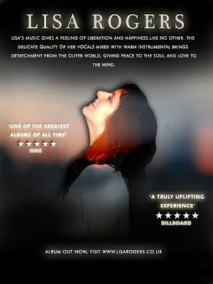
This is the next design that I created. For this design, I had begun to change my ideas, as the dark and erroded style I had decided to use was becoming difficult to develop successfully. I wanted a more positive and striking approach to my designs to capture the audience's attention to the album and more importantly the artist, rather than focusing on the genre of the one song. I looked back on my research for my digipack designs and saw Mariah Carey's album, filled with natural light and warm colours, giving attraction to the audience from the delicate tones and professional look overall. I then thought back to the new images I had taken of me, and a particular pose that I had chosen in reference to the Ellie Goulding research that I had done, where I was smiling up to the sky to represent liberation and positivity. I wanted this sense of 'letting go' to appeal and become the theme of my advertisement, changing the perspective of my music and making the audience feel that it does not all follow the same heartbreak genre, but genreally creates a relaxing feeling that conveys passion through the vocals and instrumental used. I looked back again to my Ellie Goulding research and realised the them of her and Mariah carey's designs were similar, using soft white light and images predominantly featuring the artist. I still wanted to show aspects of romance in my own designs, using the images Jacob and I holding hands, but wanted to do this in a way that showed love in a positive light rather than all negative, as I thought this would not get enough positive feedback from an audience on an entire digipack design showing just heartbreak and depression. I decided that from now on that my work would be heavily influenced by these two designs in order to create this liberal feeling, and successfully conduct positive feedback from the consumer audience.
The first thing that I did to create this design was look at the style of background Ellie Goulding used in her advertisement. This was a simple scene which was shown to be slightly out of focus to draw attention to the artist. I had previously taken pictures at the marina of the sea, but had them out of focus to give the audience a warm relaxed feeling as they look at the image. I decided that this would be a good image to use for my background, so placed this underneath the image of me in the Ellie Goulding pose in her advertisement. I then used the soft brush to blend a black light over the top and botton thirds of the design in reference to Ellie's design, before adding a black drop shadow over the image of me. I experimented with the levels of the image of me, which I placed in the centre for direct attention to the artist as the first thing the adience sees, however it did not look fitting with either a lighter or darker level, as I wanted to have brighter colours rather than contrasting shades in this attempt. Therefore I tried posterising the image, which brightened sections, giving it more of a subtle burst of colour to make it more eye-catching and positive. The next step was to add the artists name, which I did using the previous serif font as I thought it looked professional, and coloured this white, giving it a white outer glow for emphasis. I made this large to catch the audience's eye and make them remember the artist's name. I then looked at Ellie's advert and noticed she had a brief summary from a listener's point of view of how the music makes them feel and the consumer. I thought that this was a good technique to use, as it is explaining what you will get in the album and makes it more likely for a consumer to listen to this and decide to try it for themself. Therefore, I came up with a brief synopsis and placed it below the title. I did not include the album title as I wanted this advertisement, like Ellie's, to be more if a promotion to the artist rather than the song or album itself. I then added quotes about the album around the image, colouring them white for emphasis with the outer glow, and adding my star ratings below them as in previous designs. The last thing that I did was place a relevant line about the album release and website adress below the image as in the previous designs.
Overall, I think this design looks a lot more professional and informative than other designs, as the soft brush effect behind the text and posterising of the image gives a positive and colourful approach, making the audience feel happy just looking at the advertisement. I like the idea of using the synopsis, as it is informative and gives the audience an insight on what they will hear, and the star ratings are good for another person's point of view as it is all promotion of the artist and album.
Despite this, I have decided to change this design, as I think the black light, although successful in Ellie's design, makes the overall impact duller and leaning towards a negative approach. I also think that the text for the artist's title is too much in a serif style and needs to be made more casual as Ellie's font is designed, making it more personal to the audience and breaking the serious undertone they would pick up when reading this. I have also decided to use promotion of stores where the album can be bought as in Madonna's advertisement and that of The Stone Roses, using synergy to link the companies to the artist for attraction and more promotion of the overall product.
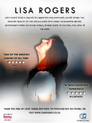
This is the final design that I have used and change. For this design, I changed the black soft brush light to white to send off a more positive vibe to the audience, and give emphasis on the liberated feeling I wanted them to feel when looking at the design. I also changed the artists font to a more curvatious and rounded text that gave a more modern and personalised feeling, and coloured the rest of the fonts in black to this time contrast with the white, also adding more of a drop shadow for emphasis on this. This time, below the artist, I included information about being able to download the album from Itunes, and below this added the icon on the bottom right, paired with the HMV logo on the far left for more iconic value and use of synergy. Overall I am pleased with the design, as I think it now contains more information for the reader to take in, giving opinions from other media, and linking companies to the artist for more promotion.
Tuesday, 15 March 2011
New flashback scene final shots.
These are the final shots we had taken for the new flashback that we had created, with the reasons why we chose these for our final composition.
This is a selection of our attempts for our first half of the first line of the verse, and is the first real introduction of my character's personality of the video so far, as in the opening the audience did not know much about her apart from the fact she was going out to meet her boyfriend. For this scene, we chose to have my character being artistic, sat on the floor of the marina to show she does not mind getting dirty outside, and looking up to sketch a picture in the wind, also showing that she will brave the weather for what she loves to do. We have decided to use the last shot of me moving my head up and down for our final outcome, as in previous attempts my hair can be seen being blowed over infront of my face by the wind. We are happy with these attempts and the final shot we have decided to use, as the shot itself is very clear for the audience to see, and the camera is still, ensuring the action to be seen without the focus of the camera moving away, or unsteady movement distracting any attention. The outside light is also very clear and light, and we did not have to use the light at all for this shot for this reason.
This is our sequence of attempts for the shot of the second half of the first line in our song. This shot shows a point of view of me drawing, followed in the next shot by another point of view to show what I am looking at for continuity. The attempts shown were good lightingwise, as they were still very visually bright and clear, however the wind was very strong when filming, meaning it was very hard for Taslima to keep the camera straight. The last attempt shown as I move the paper back down onto my knee is the one that we are using, as this is the most still attempt that we created, and is still very visually clear and from a good angle for the point of view shot effect.
This is the beginning half of the second line, showing a point of view of the large statue infront of me, showing what I am looking at as I am sketching. We decided to use the point in the attempts half way through the video, as before this we had trouble keeping the camera still, again because of the strong wind outside at the time. The shot is very clear and from a low angle to make it look dominant, which is why we designed it to look this way, and also to show it from the perspective of the character.
This is the second half of the second line, showing a medium shot of Jacob, introducing him into the story with him taking pictures of the view ahead of him of the river at the Marina. We chose to have him doing so to relate with Lisa in the way of them both having artistic interests, linking the characters in that way before they even meet, making the audience aware of this connection as they are the ones who see Jacob before Lisa does. For this shot, we did several practices as seen, ensuring that we left enough time before and after the action as this was only a short clip and we did not want it to be too short for editing. We chose to use the point nearer the end of the attempts as Jacob turns to a profile view towards the camera, as his face can be seen much more here, and the camera is also a lot more still despite the strong wind, which can be seen to make the camera slightly unsteady during the start of this shot. We are happy with this outcome, as it is clear, controlled camerawise, and is shot from a good angle to ensure his arms can be seen while taking the photographs.
This is the third line, which we decided to dedicate wholly to this shot, as there is slightly more action taking place than in the previous shots. In this scene, we bring the characters together for the first time, establishing their first meeting. This is done from a long shot in two shot form, showing Jacob backing up to take a photograph further into the distance as Lisa is shown on the floor looking up to do her sketch, unaware Jacob is behind her. Jacob then walks into Lisa, knocking her papers over that she is clutching and, realising what he has done, immediately turns to help her pick them up. Lisa is shown to be flustered and embarassed as she sees Jacob, and does not look at him properly as she is shy and instantly realises that she likes him. We wanted this to be clear to the audience from the expressions of the characters' face and body positions as she stays very closed in her posture. For this reason, this angle was a good choice, as it shows the body clearly whilst stil being close enough to see brief expressions on the characters' faces. We used the idea from stereotypical features of American tv shows, showing this method as it is a traditional feature that the audience recognise as being the first point in the romance genre, giving the characters vulnerability as they are unprepared for what will happen. This gives off the ideology of 'love at first sight' which we wanted to portray in our video, as it ties the audience into the action, making them feel a personal emotional attatchment to the characters as they feel they understand what they are feeling, perhaps from past experience in their own life. This is therefore a very strong feature to use, which is why we decided upon this when designing our flashback. We chose to use this shot, as it was very clear visually, and the camera was still throughout. We were happy with the posture of the characters and the run of the papers being dropped and picked up again, which we practiced before filming.
This is our final shoot of the last line of the song. This is the final point that makes it clear to the audience the couple like each other, as they are stood in a close up shot smiling at each other shyly as Jacob hands back Lisa's papers. We chose to use this shot so that the hands and arms could still be seen as the work is given back, and so that facial expressions could still be seen for emotional impact. We also decided to do the shot moving into it, to show continuity from the previous shot. We are happy with this shot, as the action can be seen clearly, despite the strong wind, and the facial expressions can still be seen to convey the narrative successfully to the audience.
Recording studio final shots.
Here are the final shots that we chose to use in the recording studio, and the reasons why we decided they were better than the others we used as tests.
This is the final shot of me testing the sound equippment at the beginning of the video. We chose to have me testing the piano, as this is heavily included in the music composition of the song, and can be heard throughout gently to give a sad yet romantic feel. This shot was very clear visually due to the daytime lighting which we filmed in, as in previous sessions during the night we found there was a dark orange glow that left shadows over my face and body whilst singing, taking away the professional effect that we hoped for. We chose to keep the sound in this shot, and is the only one we are leaving in this way, as the song that I am playing on the piano is 'A Thousand Miles' by Vanessa Carlton, and is one of the most well-known romantic songs used in films of all time. For this reason, we have chosen to use this as a code, as we are aware that the audience will recognise this from the start, giving a hint of what type of genre of music they are about to hear in our song.
This is the first time the artist is seen in the video, and is a method we are using to let the audience know that some form of action is about to begin as the story of the music and the couple is told. For this scene Taslima asks me 'Are you ready?', and I reply that I am. We chose to include these lines at this point rather than have just visual references to give a code to the audience that something is about to begin. We are very pleased with this shot, as the lighting appears natural giving a professional appearance, and the medium shot allows for the microphone and headphones to be seen to make the audience aware that the setting is a recording studio.
Here is our final shot of the hands moving up and down on the soundboard. We chose this shot, as it was the most successful after our previous practices where the buttons were moved too quickly. The timing in this attempt is a lot better, as the hand is moving the buttons slower so that the audience can see it is building up to some form of action about to take place by moving at this pace. The camera is straight as we used the tripod, and the lighting was natural and light as we wanted it to be. We are happy with the result, as it conveys the impression to the audience the action is about to begin.
This was our final shot of the first line of the first verse. We decided to use this as a final shot, as the lighting was bright and natural compared to the dark orange we previously had problems with during later filming time. The camera was also still, and included the microphone and soundshield at the end of the scene at the right time before the line was ended. The pan was also successful, as again it included enough of my face before the line ended, ensuring that the narrative could be told to the audience in time before cutting to the next scene. We are happy with this outcome, as it is visually clear to the audience and ensures they receive the narrative from the artist in enough time before cutting to the next shot.
This is our final shot of the second line, first verse. The lighting was again much brighter in this attempt as we filmed earlier in the daytime, and we managed to get a straighter balance with the angle, making it a smoother pan. The pan itself was also faster, therefore fitting enough of the narrative in so that it can be conveyed successfully to the audience. We are happy with this result, as there is a natural shadow but not too much to darken the face, a problem we also previously faced, and the pan was steady and accurate.
This is our final shot of the third line first verse. The main change to this was the bright lighting, as this time round it created a much more natural effect instead of the darker orange flare we could not get rid of. The time of filming radically effected this, therefore I am glad that we filmed earlier in the daytime. We are pleased with this result, as the pan is steady and smooth, the lighting is correct for the effect we wanted on the face, and the timing of the whole shot as a whole is as we wanted it.
This is the final shot of the last line which we filmed. The previous problem was keeping the camera steady and problems earlier with the dark back lighting, created a darker night time effect, when we wanted a very positive and natural light to contrast with the darker action scenes. We are very happy with this shot, as the camera is again steady and quick enough to make a smooth pan whilst leaving time for the narrative to be shown and conveyed to the audience, and the lighting leaves natural shadows that do not restrict emotional expressions on the face.
This is our final shot of the 'good street' verse, which we filmed as a whole in the studio and then outside so that we could use them both where appropriate, therefore this is not the only final outcome for this verse. We are happy with this footage, as the angle is straight and the camera is steady, giving a gradual pan so that the narrative can be given to the audience clearly and successfully. The lighting is also clear and bright, giving a gentle and natural glow over the face.
This is our final shoot of the 'good street' outside for the action aspect of the video, to give contrast and a mix between the studio sessions we filmed. We are happy with this outcome, as the camera is steady in a backwards tracking motion, and shows the narrative and the character delivering it clearly with the use of John's light, to reduce shadow and keep control over the lighting as a whole.
This is our final shot of the 'bad street' scene in the recording studio. We are happy with this outcome, as the light from this side of the room is natural and delicate, reducing shadow and allowing narrative to be seen clearly, also making a big contrast to the bad street scenes shown outside with the black background with little light at all. The camera is steady apart from the first few seconds preparation before the lines start, which we will try to cut down during editing so that this is seen as little as possible whilst still fitting with the timing of the music.
This is our final shot of the 'bad street' scene outside. We are happy with this outcome, as although the camera is slightly unsteady during the end, the narrative parts of the video are still shown clearly with a steady camera and a good use of medium shot to show that she is walking down a dark street on her own, the street itself giving the idea of loneliness and isolation to highlight this in the lyrics.
This is the very last scene after the narrative has ended and the video is coming to a close, which we chose to represent with tbe buttons being pushed back down and me taking off my headphones. In previous attempts at this the lighting was too dark and an offsetting orange colour which make shadows appear on my face where we did not want them. In this attempt however, as we shot during the daytime, the lighting is much clearer and more natural looking, meaning the shadows are drastically reduced because of this. The camera is once again very still giving a clear shot conveying the narrative directly to the audience, and the timing before and after the action is plenty so that we have extra time on the end of the shot if we need it.
Subscribe to:
Comments (Atom)


