Tuesday, 29 March 2011
Public awareness of advertisement.
This is the public advertisement I created, the purpose being to attract and allow the audience to become aware of what is being advertised through the conventions used within the design, and the convention of using the bus stop advertisement itself to do this. I placed my image onto a picture of a bus stop to show how it can fit and look successful as a public advertisement that would attract and promote the album successfully. I am happy with this outcome, as the text and image are large and attractive to catch the audience's attention upon first sight, and is bright and bold enough to make them want to read more and hold potential for them to buy and listen to the album.
Saturday, 19 March 2011
Digipak construct pictures.
This is my digipak construct, which I have taken pictures of to show how it works in a CD case as a professional product album. I am very happy with this result, as I believe the design is conventional to be appealing to the audience using appropriate type and imagery to look professional and believable as a real product.


Friday, 18 March 2011
New CD Design.
Album promoted on Itunes
Other Digipak designs.
These are the digipack designs I only did one or two attempts of and did not post the individual process for on my blog. Below I will state why I designed these in the way that I did and why I decided to use them for my final product.
The first design is for the inside central cover, which would have the CD placed over it. Therefore, this would have to be very simplistic, yet still stay within the generic style that I was working with. I chose to use the out of focus image of the marina, as this showed much colour and light, following the pattern of the rest of my design. It also looks very soft, connotating romance and emotion, therefore representing the genre that I wanted to portray in my digipak and designs. I am happy with this image, as it contains the codes and convention of a romantic song, yet is still simplistic enough for the CD to be placed over the top of it without taking away too much attention.
This is the design for the inside right of the digipak, showing a medium close up of me laid down and looking into the camera. I experimented with the levels on photoshop for this outcome, and was happy with the light effect that it gave the edges of the photograph, making it look delicate and gentle like I wanted throughout my design, as this connotates love and affection, aswell as positivity when looking at the image, giving a good light on the artist. I also played around with the blur tool and slightly blurred the image to give a much rounder and softer appeal to the face and body, again emphasising the gentle elements of the design. I am happy with this outcome, as it reflects positivity and the gentle and warm effect I wanted the audience to feel when opening the digipak. The image does not have any text beside it, as I wanted the focus to be on the artist and promoting them, as this is the main element of my designs that I wanted to make clear to the audience.
Completed Digipak.
Here is my completed digipack design which I fitted onto the digipak template I had found. I am very happy with this design, as with the covers combined, it looks very professional and believable as a CD that has come from a well-known artist in the charts, which is the effect I was trying to create based on my research of signed and popular artists.
Thursday, 17 March 2011
Back Cover Designs.
Here are my designs for my back cover that I created for my digipack. I will state below which I will be using for my final product and why.
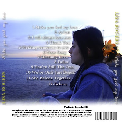
This is the first design that I created, using a medium shot of me stood at the wall seen at the end of our video and in the flashback scene, which is why I chose this shot, looking out at the sea. I liked this shot as it was clear and looked professional from the lighting, and was also iconic to the audience as it was something taken directly from the video which I knew they would recognise. I then took reference from the Justin Timberlake back cover design I had researched. I placed the song title, coloured in gold for a professional look, and the album title, in the hand-rendered white font for clarity and a personal effect, down the side of the cd to the right and left for recognition to the audience so that they remember the name of the album even by just reading the back cover. I also experimented with the levels of the picture to give a deeper and more romantic effect, before using the 'Dawning of a new day' font to create the song titles for the design. For this process, I looked up 'greatest heartbreak songs' on the internet and found lots of titles that related to the same genre. I then named the tracks from these titles, and placed them in the centre around the figure of me, rehiterating the idea that the artist comes before the text and is the most important feature. I added drop shadows to make the text stand out over the background, and added a barcode and terms and conditions at the bottom of th design. I like the appearance of the darkened image and drop shadows over the text, as it gives a deeper more emotional feeling from the blue colour connotating sadness. However, I think that the text at the side of the design makes it look tacky and does not match with the colour codes as a whole. I have also considered the rest of the design, and I realise that this blue colour will not match the bright white backgrounds predominantly used in the rest of the digipak, therefore I have decided not to use this cover, and to instead create something bright to fit the colours and match the rest of the design to develop continuity further.
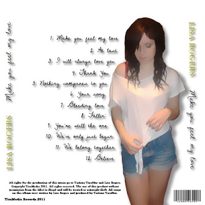
This is the second design that I created, this time using a white background to fit with the theme of my digipak. I used the hand-rendered text for the track titles, giving a shadow underneath for clarity of the text on such a contrasting background. I spaced these again around the large image of me which I placed slightly to the right of the design to allow space for the album titles to be placed. I experimented with the blur of this image on Photoshop, creating a very computerised animated effect. I liked this, as it was a different approach to the design and was very unique compared to previouus pages. I then placed the artist and album title headings on either side as before, and placed the music rights and barcode beside the image at the bottom. I like this design for its unique effect, however I do not think the animated effect fits enough with the rest of the design and looks odd in comparison. I also dislike the album headings at either side, as I still think that they look too bold and tacky, therefore I will design another cover and will not include this in it.
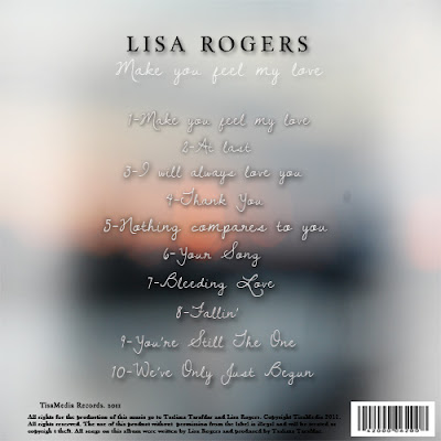
This is my final design I created. For this product, I debated about which image I should use to create the correct romantic effect that I wanted. After searching my images and experimenting with text over the background, I decided that the out of focus image I had previously used for the CD panel would be the most successful, as the soft effect of the poor focus connotates affection and emotion in a romantic way that will bring this idea accross to the audience when viewing the design. I then placed the album titles down the centre of the page in the same hand-rendered text as in previous designs, giving a drop shadow for clarity when reading. I also placed the artist and album titles at the top of the design as in the front cover, giving continuity and easier recognition to the audience. I like this better than in previous designs where the text was placed vertically at either side, as the colours in the image made the text difficult to see. I placed the rights and record producer name at the bottom again in black text along with the barcode. I decided not to use an image of the artist in this cover, as I thought that it would take away from the main romantic ideology of the background, and was finding it hard to make previous imagery fit in a way that would make this idea clear to the audience, and fit with the overall design. I like this outcome, as it conveys the correct ideas to the audience about the genre of the album, and is presented in a way that delivers a clear message of what is contained in the album to the audience when looking at it. For these reasons I have decided to use this in my final product.

This is the first design that I created, using a medium shot of me stood at the wall seen at the end of our video and in the flashback scene, which is why I chose this shot, looking out at the sea. I liked this shot as it was clear and looked professional from the lighting, and was also iconic to the audience as it was something taken directly from the video which I knew they would recognise. I then took reference from the Justin Timberlake back cover design I had researched. I placed the song title, coloured in gold for a professional look, and the album title, in the hand-rendered white font for clarity and a personal effect, down the side of the cd to the right and left for recognition to the audience so that they remember the name of the album even by just reading the back cover. I also experimented with the levels of the picture to give a deeper and more romantic effect, before using the 'Dawning of a new day' font to create the song titles for the design. For this process, I looked up 'greatest heartbreak songs' on the internet and found lots of titles that related to the same genre. I then named the tracks from these titles, and placed them in the centre around the figure of me, rehiterating the idea that the artist comes before the text and is the most important feature. I added drop shadows to make the text stand out over the background, and added a barcode and terms and conditions at the bottom of th design. I like the appearance of the darkened image and drop shadows over the text, as it gives a deeper more emotional feeling from the blue colour connotating sadness. However, I think that the text at the side of the design makes it look tacky and does not match with the colour codes as a whole. I have also considered the rest of the design, and I realise that this blue colour will not match the bright white backgrounds predominantly used in the rest of the digipak, therefore I have decided not to use this cover, and to instead create something bright to fit the colours and match the rest of the design to develop continuity further.

This is the second design that I created, this time using a white background to fit with the theme of my digipak. I used the hand-rendered text for the track titles, giving a shadow underneath for clarity of the text on such a contrasting background. I spaced these again around the large image of me which I placed slightly to the right of the design to allow space for the album titles to be placed. I experimented with the blur of this image on Photoshop, creating a very computerised animated effect. I liked this, as it was a different approach to the design and was very unique compared to previouus pages. I then placed the artist and album title headings on either side as before, and placed the music rights and barcode beside the image at the bottom. I like this design for its unique effect, however I do not think the animated effect fits enough with the rest of the design and looks odd in comparison. I also dislike the album headings at either side, as I still think that they look too bold and tacky, therefore I will design another cover and will not include this in it.
This is my final design I created. For this product, I debated about which image I should use to create the correct romantic effect that I wanted. After searching my images and experimenting with text over the background, I decided that the out of focus image I had previously used for the CD panel would be the most successful, as the soft effect of the poor focus connotates affection and emotion in a romantic way that will bring this idea accross to the audience when viewing the design. I then placed the album titles down the centre of the page in the same hand-rendered text as in previous designs, giving a drop shadow for clarity when reading. I also placed the artist and album titles at the top of the design as in the front cover, giving continuity and easier recognition to the audience. I like this better than in previous designs where the text was placed vertically at either side, as the colours in the image made the text difficult to see. I placed the rights and record producer name at the bottom again in black text along with the barcode. I decided not to use an image of the artist in this cover, as I thought that it would take away from the main romantic ideology of the background, and was finding it hard to make previous imagery fit in a way that would make this idea clear to the audience, and fit with the overall design. I like this outcome, as it conveys the correct ideas to the audience about the genre of the album, and is presented in a way that delivers a clear message of what is contained in the album to the audience when looking at it. For these reasons I have decided to use this in my final product.
Subscribe to:
Posts (Atom)


