Wednesday, 15 December 2010
End scene final shoot.
This is the final shoot of me and Jacob in the end scene of our video. For this scene, we had to rehearse many times before filming to ensure we could go straight through the scene successfully without stopping. This was very difficult at first, because of eye contact between us putting Jacob off, therefore I had to look past his eyes as much as possible. This shows in the video, however we believe that it makes the female character look more emotional and in thought by doing so, and so that when she does look into his eyes, she does so when expressing important parts of the lyrics to him. Jacob also avoids contact with me, showing it is awkward and still sensitive between the pair since they have been apart for a long time. He does keep eye contact at the end of the lyrics, however, showing that he has forgiven the female character, and is willing to listen to what she has to say.
For the lighting in this scene, we stood in the same places, as we felt that the light picked up well the last time we filmed. However, we decided to swap places, as Jacob was distracted by the bright scenery behind me, whereas when I was stood in his place there was nothing to keep his attention. The lighting in the area was also a lot better with our teacher John's camera, as it brought out a clearer effect on the camera, compared to the previous test video shown where the wind and lighting combined gave a very foggy and unsteady approach.
We are both pleased with this final result, as the camrea is steady and clear, the lighting is bright enough and focused to express the right parts of the characters' faces, and with the warmth of the back setting, gives off a very romantic feeling to the audience.
Tuesday, 14 December 2010
Digipak research.
For the start of my digipak design, I researched and found different other digipaks by established artists to reference in my own design.
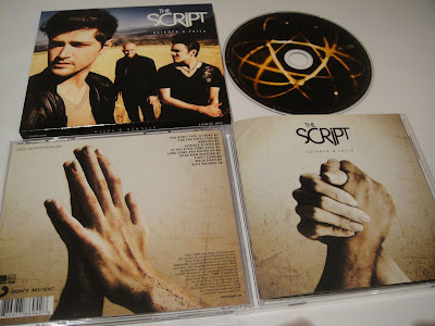
This is the first digipak I looked at, from The Script's new album, 'Science and Faith'. This is an alternative digipak, as I found it incredibly difficult to find any images of them on the internet. The front cover for this digipak contains a close up image of the lead singer, with a medium close up and medium shot getting further away of the other two members. The design is all in colour, and has a high contrast for both the background and the image. The background shows an outside area, looking like an old beach with land around it from the golden coloured ground they are stood on.
On the top right is the band's name in large white text, using their iconic font for audience recognition, followed underneath by the album title in smaller, more spaced out white text. This presentation shows that the band are the important feature, suggesting the singer is even more important as he is shown in a closer up shot. The large title font is used combined with their iconic type to give recognition to the audience, and to make it stand out after the image as one of the first things the audience sees. I like this use of large text, placed in an area that does no overlap anything, including the image or background, and can be seen amonst the other colours. I will use this idea in my own design.
The actual cd design is black with a series of lights around the centre. This gives a warm and romantic feel, as the lights and the black background represents the night and street and road lights on the street, stereotypically seen and portrayed in heartbreak videos as a romantic location, as the lights give off and represent warmth. The end scene of our video is also located in an area like this, therefore this idea would link into our video. The effect is done with a camera when the shutter speed is set to close quicker to get this effect. This means that with a suitable camera I could create this if I wanted to in my own design, as it is an easy proceedure that I could create myself.
The back design for this cd has a coffee colour background merging into a central white light, perhaps to represent a higher power like that of God. There is a large image placed into the centre of this of the palms of two people's hands coming together, as though they are making a romantic connection for the first time. On the top right in small black font, the tracks are established, with the title and track number after. On the bottom right is also credits to the producers and the record label and any other rights. The way that this is done in small text, also parallel to the other contents of text at the top, gives a very neat and precise layout, with a very straight to the point design of what tracks are where on the cd, and any producing information the audience want to see. The bottom left also contains a barcode to scan the cd for proof of authenticity, followed beside it with the record label's stamp to show it is a true copy of the album, and to give recognition of their brand to the audience. Overall, the layout is simple yet effective, giving the right information in convenient places, and a powerful central image to give the idea of connection and what the songs entail, being romance and people coming together.
This is Rihanna's digipak that I am using for my research. The front is not shown on this pack, however the middle and inside designs are, showing the front to have a certain shape when closed, as the inner front design is worked around this shape. The first part of the digipak is this inner cover, and shows text besides a picture of rihanna, giving the impression that this is information on her music and what is included in the CD. The background used shows a room or scene which could be either from a music video of one song, or a theme throughout the digipak. The text over is white as black and red are the dominant colours used in the background, therefore making white the easier text to read over the top, also coordinating with the dress Rihanna is wearing in the image beside. There are also smaller images below the text of her other albums that she has produced, drawing the audience in and making them want to purchase others. Overall, this design gives a very warm yet smart impression from the combination of darks and lights, and the coordination of the colours with what Rihanna is wearing. It is also good promotion of her previous records to the audience.
The central design for the CD itself is done quite simply, using a blue and brown background, again perhaps from a scene in a video, and a navy blue colour cd with white text for the branding and rights on the cover of the cd. This overall looks simplistic and allows the audience to find the right information on the cd without complicated designs or pattern. The colours used also match those of the previous design, and give a warm approach.
The final cover is just a large image of Rihanna, with no text or other design. This simple form attracts the audience straight to the image upon opening, allowing them to notice the beauty and sexuality of Rihanna, as she is wearing a white silk dress connotating innocence, with missing parts at the front to reveal a bikini underneath. The pose also gives the impression that she is looking out of the image to the audience, giving them a feeling she is trying to reach out to them with her music.
Overall, the design is presented to be very smart with corresponding colours. The idea of the large image as you turn is a good method to use, as it instantly attracts the audience, making them notice the artist upon opening of the digipak, and is something that I plan to use in my own design.
The last image I will use for my research is Mariah Carey's digipak design. This is in a two-disc format, meaning less text and imagery is visible.
The first inner cover design shows an image of Mariah at the bottom of the page in her underwear, to instantly draw the audience's attention to this risque and sexual photograph. The colours are also edited so that everything looks very brown and golden, and with the white background and soft light around her, this gives a very angelic approach.
The information about the cd is in small grey font, wrapped around her body to give more focus on the image itself, however looks smart and compact in this format.
The other two sides are similar, showing body parts beneath the cds of Mariah, giving a mystery and suggesting there is more of her underneath the cds to view, like a hidden picture. There is white light in the background of these designs too, matching the first page. The cds are grey and black with small white font spelling out the artists' name and the album name below it. There are also icons and trademarks on the cd at the bottom.
Overall, this design is simplistic and concise, giving an uplifting and heavely feeling from the white lighted background and the golden editing of Mariah's main image. The idea of shaping text around the image is another good idea, which I will use in my own design of my album.

This is the first digipak I looked at, from The Script's new album, 'Science and Faith'. This is an alternative digipak, as I found it incredibly difficult to find any images of them on the internet. The front cover for this digipak contains a close up image of the lead singer, with a medium close up and medium shot getting further away of the other two members. The design is all in colour, and has a high contrast for both the background and the image. The background shows an outside area, looking like an old beach with land around it from the golden coloured ground they are stood on.
On the top right is the band's name in large white text, using their iconic font for audience recognition, followed underneath by the album title in smaller, more spaced out white text. This presentation shows that the band are the important feature, suggesting the singer is even more important as he is shown in a closer up shot. The large title font is used combined with their iconic type to give recognition to the audience, and to make it stand out after the image as one of the first things the audience sees. I like this use of large text, placed in an area that does no overlap anything, including the image or background, and can be seen amonst the other colours. I will use this idea in my own design.
The actual cd design is black with a series of lights around the centre. This gives a warm and romantic feel, as the lights and the black background represents the night and street and road lights on the street, stereotypically seen and portrayed in heartbreak videos as a romantic location, as the lights give off and represent warmth. The end scene of our video is also located in an area like this, therefore this idea would link into our video. The effect is done with a camera when the shutter speed is set to close quicker to get this effect. This means that with a suitable camera I could create this if I wanted to in my own design, as it is an easy proceedure that I could create myself.
The back design for this cd has a coffee colour background merging into a central white light, perhaps to represent a higher power like that of God. There is a large image placed into the centre of this of the palms of two people's hands coming together, as though they are making a romantic connection for the first time. On the top right in small black font, the tracks are established, with the title and track number after. On the bottom right is also credits to the producers and the record label and any other rights. The way that this is done in small text, also parallel to the other contents of text at the top, gives a very neat and precise layout, with a very straight to the point design of what tracks are where on the cd, and any producing information the audience want to see. The bottom left also contains a barcode to scan the cd for proof of authenticity, followed beside it with the record label's stamp to show it is a true copy of the album, and to give recognition of their brand to the audience. Overall, the layout is simple yet effective, giving the right information in convenient places, and a powerful central image to give the idea of connection and what the songs entail, being romance and people coming together.
This is Rihanna's digipak that I am using for my research. The front is not shown on this pack, however the middle and inside designs are, showing the front to have a certain shape when closed, as the inner front design is worked around this shape. The first part of the digipak is this
 inner cover, and shows text besides a picture of rihanna, giving the impression that this is information on her music and what is included in the CD. The background used shows a room or scene which could be either from a music video of one song, or a theme throughout the digipak. The text over is white as black and red are the dominant colours used in the background, therefore making white the easier text to read over the top, also coordinating with the dress Rihanna is wearing in the image beside. There are also smaller images below the text of her other albums that she has produced, drawing the audience in and making them want to purchase others. Overall, this design gives a very warm yet smart impression from the combination of darks and lights, and the coordination of the colours with what Rihanna is wearing. It is also good promotion of her previous records to the audience.
The central design for the CD itself is done quite simply, using a blue and brown background, again perhaps from a scene in a video, and a navy blue colour cd with white text for the branding and rights on the cover of the cd. This overall looks simplistic and allows the audience to find the right information on the cd without complicated designs or pattern. The colours used also match those of the previous design, and give a warm approach.
The final cover is just a large image of Rihanna, with no text or other design. This simple form attracts the audience straight to the image upon opening, allowing them to notice the beauty and sexuality of Rihanna, as she is wearing a white silk dress connotating innocence, with missing parts at the front to reveal a bikini underneath. The pose also gives the impression that she is looking out of the image to the audience, giving them a feeling she is trying to reach out to them with her music.
Overall, the design is presented to be very smart with corresponding colours. The idea of the large image as you turn is a good method to use, as it instantly attracts the audience, making them notice the artist upon opening of the digipak, and is something that I plan to use in my own design.
The last image I will use for my research is Mariah Carey's digipak design. This is in a two-disc format, meaning less text and imagery is visible.

The first inner cover design shows an image of Mariah at the bottom of the page in her underwear, to instantly draw the audience's attention to this risque and sexual photograph. The colours are also edited so that everything looks very brown and golden, and with the white background and soft light around her, this gives a very angelic approach.
The information about the cd is in small grey font, wrapped around her body to give more focus on the image itself, however looks smart and compact in this format.
The other two sides are similar, showing body parts beneath the cds of Mariah, giving a mystery and suggesting there is more of her underneath the cds to view, like a hidden picture. There is white light in the background of these designs too, matching the first page. The cds are grey and black with small white font spelling out the artists' name and the album name below it. There are also icons and trademarks on the cd at the bottom.
Overall, this design is simplistic and concise, giving an uplifting and heavely feeling from the white lighted background and the golden editing of Mariah's main image. The idea of shaping text around the image is another good idea, which I will use in my own design of my album.
Images used for props in opening intro.
For our opening instrumental after the first few shots of the recording studio, we chose to have a scene showing the female texting the male and awaiting his reply, as in the original planning of our video. As me and Jacob are friends in real life, we had many pictures together in many different places. Me and Taslima recovered these pictures from various albums we owned, and decided to use these for this scene as props, putting them in frames nearby the female to show the past and the close relationship that they had, and the fond memories they shared together.
Here are the images that we are going to use;
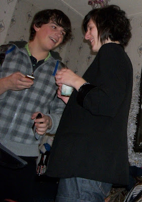
This image shows Jacob and I at a party together smiling and laughing happily, possibly
exchanging numbers shown from the phone in his hand, a suggestion of the very starting point of our relationship.
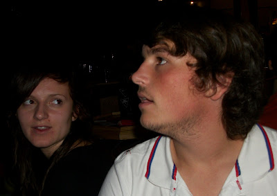
This image shows me and jacob sat together, possibly in a bar from the dark background. Our expressions are open and relaxed, as though we are having a conversation.
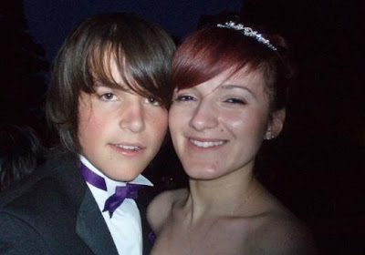
This image shows me and jacob at a ceremony or special event somewhere ,from the formal dress that we are wearing. We are stood very closely together and are both smiling, showing our intimate relationship together. This could be some time into the relationship.
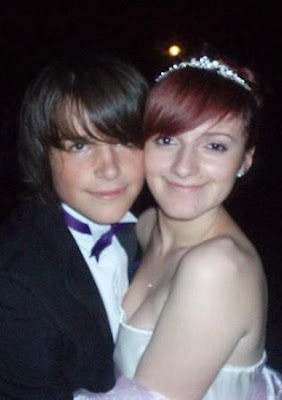 The last image is similar to the previous, showing us again in the same formal dress. We are both showing obvious smiles here, and are stood even closer than the last image. We decided that this would be the one that we would use in our props, are the close proximity of the way that we are stood shows that we are in love and happy together, from our facial expressions, whereas in other images we are not stood as close, and do not look as happy as in this image.
Here are the images that we are going to use;

This image shows Jacob and I at a party together smiling and laughing happily, possibly
exchanging numbers shown from the phone in his hand, a suggestion of the very starting point of our relationship.

This image shows me and jacob sat together, possibly in a bar from the dark background. Our expressions are open and relaxed, as though we are having a conversation.

This image shows me and jacob at a ceremony or special event somewhere ,from the formal dress that we are wearing. We are stood very closely together and are both smiling, showing our intimate relationship together. This could be some time into the relationship.
 The last image is similar to the previous, showing us again in the same formal dress. We are both showing obvious smiles here, and are stood even closer than the last image. We decided that this would be the one that we would use in our props, are the close proximity of the way that we are stood shows that we are in love and happy together, from our facial expressions, whereas in other images we are not stood as close, and do not look as happy as in this image.
Tuesday, 7 December 2010
Filming-day 4-Final meeting scene
This is the final ending scene, 'the meeting place', where the two characters finally complete their journey, and their story that the audience have been brought through, as the female expresses her feelings to the male. For this scene, we wanted to give a big impact as it was the final climax of the whole video, therefore needed the right settings and lighting to make it the perfect romantic location, gripping the audience and pulling their emotional heartstrings, making them wonder what will happen. We wanted this scene to take all of the emotions of the previous scenes and completely break them down, leaving no walls or barriers of the past to hide behind, making the characters stand face to face in complete honesty and openness with each other for the first time in the video.
We chose to film this at the water's edge at the marina, as there are many backlights of the city behind, and with this combined, we are making a stereotypical romantic convention, used in many other films and videos in the same genre, such as the film 'Sleepless in Seattle'.
However, when filming this, we found that the lighting would sometimes cut underneath our faces, making a scary undertone, and giving off the wrong feeling to the video. We then tried to stand over the lights, as our feet could not be seen anyway as we were filming in a medium close up. This helped to dim out the right parts of light during the scene. The wind was also a problem, as it was hard for us to properly look at each other as it was constantly blowing in our eyes. The last problem that occured, was that me and jacob found it hard to look into each other's eyes, so had to keep re-filming this scene until we found a way around it, which was for me to divert my eyes around him rather than straight at him. Next time we film, we aim to try to work when it is not so windy, and also practice many times before filming, incase me and jacob find it hard to act out the scene without feeling nervous and laughing.
Monday, 6 December 2010
Thursday, 25 November 2010
The Recording Studio.
Although we had not yet completed all of our filming, we had deadlines approaching fast, therefore decided to be proactive until the time we were all available to film the next scene (The opening scene with the first stanza at Taslima's house). Although the brief stated to use an original track for our video, my teacher Tim told me and Taslima that we would get more marks if I actually sang and recorded the song myself, as outside of college I do singing as a hobby. This meant that we would have an original track of our own, but also meant we would have a lot more work to do in little time, and would have to try to get into a recording studio in order to get a professional sound. I emailed the music teacher at our college, as I knew there was a studio at Wyke, and we arranged for me and Taslima to have an hourly session a week in the studio during our media lessons. (We ensured consent was given from our teachers beforehand). Whilst talking to our teacher John about our ideas and the recording, he suggested we also film in the studio for promotion to the artist. We decided this was a good idea, and decided that our new idea would be to cut between scenes in the studio and the acted narrative within our video. Although this would be challenging with approaching deadlines, and mean we would have to rearrange some of our video, it worked to our advantage. The reason for this, was that we realised that we had a long instrumental in the video that we did not have enough footage or ideas to shoot for. Therefore, we changed our plans for the instrumental, and decided to show the narrative with the female walking without singing as part of the journey to meet the male, whilst also cutting back to me singing in the studio, showing different shots of the musical equippment and the band playing for more promotion. This filled the filming gap, making it easier for us. We also decided that we would insert parts of this into the first action clips as the video opens, and that we would shorten the action, showing only the texting before the female starts to put away the trousers and tissues in the bin. We had this idea, as it would establish the 'other world' inside the studio from the start, as there were now two completely different things happening within the video.
Plan of tasks to be completed.
This is a timetable given by our teacher, showing things that should be completed on our blogs by the dates shown beside them, in order to help us spread our time equally and efficiently through each task.
Week 1 (September 13th) - Brief | History of the ‘Music Video’
Week 2 (September 20th)- Codes and conventions
Week 3 (September 27th)- Textual analysis of 3 videos
Week 4 (October 4th)- Textual analysis of 3 videos
Week 5 (October 11th)- Ideas for the ‘chosen song’
Week 6 (October 18th)- Planning
Week 7 (October 25th)- Video shoot | Story board pictures
Week 8 (November 1st)- Animatic
Week 9 (November 8th)- Video shoot | Upload video
Week 10 (November 15th)- Video shoot | Upload video
Week 11 (November 22nd)- Edit | 2 ancillary texts | Reshoot video
Week 12 (November 29th)- Edit | 2 ancillary texts | Reshoot video
Week 13 (December 6th)- Edit | 2 ancillary texts
Week 14 (December 13th)- Evaluation | Upload video via YouTube
Week 15 (December 20th)- Feedback
Filming-Day 3-The 'good' street.
For this day of filming, we chose to shoot the 'good street' scene. We planned for this scene to be well lit and have lights shown as I pass by, to give a warm, safe feeling as she sings, displaying the stereotypical romantic conventions shown in love videos. This was filmed at marina, between Barclays Commercial Bank and some flats, as planned. The purpose of this scene was to explain the narrative to the audience, and to promote the artist. Therefore, we had the female walking down a street, purely just singing and walking through the scene to show this.
However, whilst filming this scene, the following problems occurred;
The night was very cold as the sea nearby was rising, therefore the camera was very shakey. The next shoot would have to be at a time when the weather was better.
The lighting in this section was also hard to fathom, as although the smaller lights as I passed lit up the environment, they were not bright enough to highlight my face to show my expressions as I sang. Therefore, we decided we would use John's light for the next shoot to solve this problem.
We also wanted to have a cut of me walking out of the shot at the very end of this scene, in order to show me walking down the 'bad' street in the next, expressing continuity and a sense of a different environment, although the next street was very close to this area. However, the street that we filmed on for this scene was too long for me to reach the end to walk out of the shot, therefore we had to practice me starting further down in order to get there in time, so that in the next shoot we knew exactly where to go from. We wanted to get right to the end of the road, as the next street could be seen from this point, therefore establishing continuiting again linking the two, and making it look like I am not suddenly in a completely different place, which would break this and make the audience disbelieve in the story.
A final issue that kept reoccurring in our filming generally, was that the tracking was too unsteady, as Taz had difficulty keeping the camera still enough, especially during cold weather. We therefore decided that we would use a pram/trolley for this scene to balance the camera on. However, after discussion on this, we decided against these and to use a bicycle instead, as the trolley and pram would pick up the cracks of the pavement easier because of the design of the wheels, therefore still giving an unsteady visual approach. We planned that we would use Jacob's bike, as the tyres are designed to defy the cracks in pavements for the rider, therefore giving a smooth and controlled movement, which would show in our filming.
Wednesday, 24 November 2010
Filming-day 2-'The Bad Street'
This is the second scene that we filmed, and was the 'bad street' in the video. This scene was outlining the extent that the female would go to for the love of the male character, and had to look as scary and isolated as possible to outline this theme.We chose the location of a road leading to the marina for this, as it was an isolated area, containing only bins and old houses. However, when arrived, the lighting was very dark and the character could barely be seen. We then saw a partially lit up area on the marina itself near some flats, so did a test there (shown below).
We thought this would be good, as there was a gate at the end of the road behind me, showing many old plants and rubbish behind it, resembling an isolated graveyard or generally scary place with the darkness of the sky adding to this. However, the issues we found with this location were that there were still a lot of bright lights in the background, which we noticed later on, meaning it still looked too bright and generally 'safe', taking away the vulnerability of the character, and making the audience disbelieve what is happening. We also realised that the camera, although hand held, was too shaky, cutting off some of the female's hair and face as it tracked whilst she walked, therefore not giving a smooth enough conventional look that still worked in a romantic video. We also realised that some of the lights on the ground below the female as she passed made bright lines on the camera, distracting to the viewer and unattractive in the shot.
We then did another shoot on a path approaching the end of marina. This was lit briefly, with street lights on either side as I walked up, and contained backlights of the rest of the marina in the background. This was dark and isolated, so was ideal for filming, as there were no people or obstacles in the way, and was a direct route to the end location where Jacob and I would meet.
However, when filming in this area, we found that the street lights at either side were not bright enough to pick up certain facial features showing me singing, cutting off the narrative given from the character to the audience. Instead of filming on another location, as we thought this one had the ideal space to use, we borrowed a small battery light that would fit onto the camera from our teacher John. When re-shooting this scene, the light picked up the face much better, and made expressions much clearer. We then kept this location and filmed our scene with the light there.
Filming-day 1-'The Argument'
For our filming stages, we had to do different parts at different times, as sometimes due to weather conditions or prior arrangements with our group, we could not film at our houses or at the marina for the end scenes and flashbacks. The first place that we filmed was at my house, for the argument scene. We had the characters sat on the sofa, which contained blue cushions showing sadness, and a red wall behind to show both love and anger. We only filmed on one half of the room, as this was where the key props and features of the room were placed. We included part of the other sofa, as it was inevitably in the shot because of the type of shots that we chose, and the door that jacob walks out of.
This scene shows the second flashback before the very end of the video as the couple finally meet. As timed in our storyboard, we planned that this would last around 28 seconds, as each line was around 7 seconds each. However, we had to make a cut before the last scene began from this, with time for the emotional build up of the female singing in the last scene. Therefore, we had to cut this video short by three seconds, to allow the cuts to be made. For the filming of the video, as shown in the playback, Taslima, who did the filming, held the lyrics in her hand, and told us when to go and directed us around the room so that the timing was prompt and accurate.
As this scene contains an argument, we had to think of an idea relating to us in real life that would work for a sufficient argument to take place. We had the idea, as Jacob plays football, about him questioning me as to why I had not washed his kit for a match the next day. I reacted suprised and angry as he had not given me enough notice. As this story could also be comical, we found it hard at first to stay serious whilst arguing, so had to film this a few times over. We also had to practice before filming, to ensure that we were directed correctly by Taslima during the scene.
The problems that we experienced with this shoot, was that the quality of the camera was fuzzy and kept going out of focus, therefore Taslima decided to use another one she had which she knew would film with a better quality. We also decided to change some of the shots to medium close ups, as it was all originally filmed from one shot, though we decided this was not right, as it would not portray the right emotions for the characters to get the right message accross to the audience. The final problem, was that the acting did not fit correctly in time with the lines sung in the stanza. We needed this to flow and fit correctly in order to move the action on and begin the next scene, the most vital of the video.
For future filming of this scene, we would ensure that we included the right shots in the scene, and that the timing was more accurate during the lines sung.
Tuesday, 23 November 2010
Genre of our chosen video.
The genre of the video we have chosen is love, and more specifically, 'heartbreak'. Heartbreak songs began predominantly in the 1950s, following hits such as 'Cry', by Johnny Ray, which was considered to be the pioneering song of the heartbreak genre, and 'The First Cut Is The Deepest' (Cat Stevens). Heartbreak songs outline the idea of lovers falling out of love, and relationships failing. Stereotypical features of heartbreak videos, are the central character (usually the band/artist's lead singer) shown in a number of different shots in their bedroom or living room, through a black and white shot to show sadness and depression, and to give a sense of the past, or with a black background to show isolation and loneliness since the failing of the relationship. Many videos use slow motion images of the person that the character is without, usually a female character, as generally males are the ones that sing heartbreak songs about the female, showing them in colourful scenery looking happy, to contrast with their sad and lonely feelings, and to show aspects of their past relationship together. Examples of this are in 'The Script's' 'Breakeven', which I have chosen to in my textual analysis, as it contains many conventions such as this which are repeated throughout the video, and are alike in many other heartbreak videos.
Another convention used is a central character shown in the rain in different scenes and areas in a video. This is used to give an emotional representation of the central character braving the weather conditions to go and see/share their feelings with their loved one. This makes them look brave and strong, despite the sadness they are feeling, and pulls the audience in with this, making it personal to them as though they are in the video, and making them give empathy to the character singing. This is a powerful method of conveying emotions to the audience and making them feel part of the song and the actions within it, therefore drawing them into future videos by that company/artist. An example where this is used is in Enrique's 'Hero', showing him at the end of the video in the rain as he is dying after a showdown with an enemy, singing to his love as he does this, saying that he can be her hero. This is a powerful and overwhelming scene which is iconic to the audience from the whole video, as it gives a direct reaction to an audience, making them instantly feel empathy for him, and emotional themself, as they begin to think about a time in their life when a similar situation happened, as they have a personal response to it.
A final convention used, is that there are usually two central characters; one male and one female, and a common narrative plot from the selection within heartbreak videos. This could be that the character's love has cheated on them, or that they themself have cheated, or that the couple could not work out their problems, or even that the other character has found a new love. The lyrics usually create a moral from this idea, either that the person's new lover will not treat them as good, or that the main character is sorry for the arguments or for cheating. A similar theme is shown in Justin Timberlake's 'What Goes Around Comes Around', showing him with a female companion throughout the video, who eventually cheats on him. The moral of this video is clear from the lyrics and the actions, that, as in the title, 'What goes around comes around.' Justin is saying in the lyrics that she will get what she deserves, which is shown in the video by her being in a car crash at the end, with justin running to her side in shock.
Heartbreak is a common genre in the music industry now, but always uses similar conventions as these, to convey a powerful and emotional impact from the audience on a personal level, as they can understand the meaning of the lyrics from a combination of different actions and shots shown in the video, giving subliminal messages to the audience to create a certain mood. They are successful, which is why they are repeated throughout heartbreak videos alike.
Research and planning checklist.
This is a checklist of things we must do by the deadline, aswell as other things that we must upload ourselves, such as images, videos, and any other evidence we can give in our blog of our video production.
-New Blog
-History of chosen medium
-Range of textual analysis of existing texts of a similar purpose (atleast three and to include visuals)
-Audience research (Define target audience-Questionnaires)
-Brief
-Analysis of music video lyrics (music promo)
-Storyboard
-Script/screenplay
-Animatic (video)
-Prop list
-Location list
-Cast list
-Shooting schedule
-Mind map of details of production (LIIAR, Genre, Narrative)
-Drafts (hand and ICT)
-Evaluation
-Summary of medium conventions (for each of your different texts)
-Edit log sheet
-Main product
-Subsidiary product 1
-Subsidiary product 2
-Script/screenplay
-Shooting schedule
-Drafts (hand and ICT)
-Edit log sheet
Planning of the action sequence before the video.
At the start of our video, we wanted to have an already strongly established plot that the audience could follow, as the lyrics made it hard for us to have a set story in place from the words used within them, as the female is singing about an already established male character. For this idea, we looked at the original video featuring 'Adele', and tried to resemble aspects within it for the creation of our own. In her version, there are 14 seconds of action, showing a birds eye view of the tall sky-scraper style building she is located in, with many other buildings around it, slowly panning over to show the lights and the beautiful view of all of this, to set a romantic and visually attractive setting for the female to be placed in, also giving a brief idea to the audience of the genre of video they are about to see. As the instrumental starts, Adele is shown sat on her bed looking at her phone, before picking it up and texting her boyfriend. She then replaces the phone back to where it was, before another text in reply is signaled. She then reads and answers this, all shown in a point of view close-up, and replaces it again. We considered this gap for action in our own video, and the action taking place in the instrumental. We decided to use the sequence of her texting with her phone in our own at the beginning, which would establish the male character and the journey of her going out to meet him. We would then have the process of her clearing away things that showed the state she was in since the split to highlight her emotions as the instrumental played, so that this was all done and clear to the audience before the lyrics began. Here are the images that we had taken as we planned this sequence, going from the very first shot shown in the video, up until the beginning of the instrumental, as we bring the audience right in to the story.
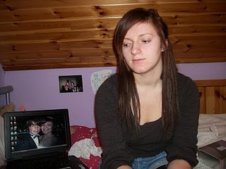
This shows firstly the opening from a medium shot
of the female sat on her own on her bed looking around, before glancing over at her phone, to show she is thinking about sending a text, and also about the male character in the video.
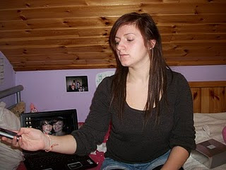
The next part of the video shows me picking up the phone to send a text to the male, again from a medium shot.
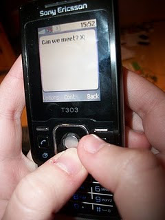
The next scene shows a point of view of the female's phone
as she sends a text to the male, asking 'Can we meet?', to show what she is looking at and doing, and to add continuity to the scene from the previous shots of her looking at her phone and picking it up.
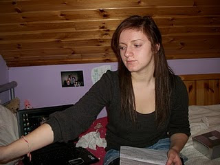
The next shot shows a medium close up again of her putting her phone back down for continuity.
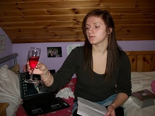
We then stay at a medium shot, to show the female then picking up a glass of wine half empty which she finishes off, to show the habits she has gotten into since her breakup.
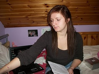
The female then replaces the glass and looks around the room, showing she is thinking about the situation, and also waiting for a reply from her previous text.
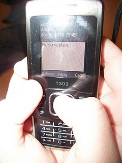
The female's phone then alerts she has a message, and she goes to answer in the previous shot, followed by this point of view shot to again show continuity, and also allowing the audience to read it. The text states 'Ok, same place.', to show they are meeting up somewhere they both know and have been frequently before.
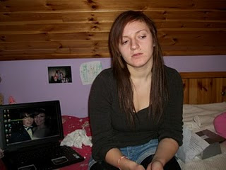
The female then places her phone down, and looks around at the mess in the room. At this point, the instrumental begins, as the camera slowly moves out into a wide shot, showing the surrounding mess in the female's room, to express the state she has got in since the split.
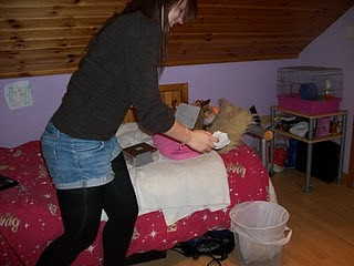
The next part of the scene shows her getting up, still in wide shot, and putting a selection of tissues from upon her bed into the bin, showing she is clearing up her life aswell as her room, as she is changing the habits she has been in a for a long time since the breakup.
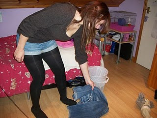
The next stage of her clearing up is still from a wide shot, as this enables much action to be seen, the vital thing in this sequence of events, and shows her picking up some crumpled trousers from her bedroom floor, again representing how she was getting into a messy state in her mind and her way of life, and now how she is changing it.
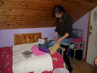
This scene continues in wide shot to show the female placing the trousers neatly over the side of her bed, before moving over to the right side of the shot to walk towards her wardrobe and mirror, establishing that action is about to take place.
 This final shot is from a side, and shows a long shot of the female putting on a coat from her wardrobe, symbolising she is about to leave, before approaching her mirror before the lyrics begin.
Note: This location was only for test shooting, and will not be used in our actual outcome for our video. The location we will be filming at is Taslima's house, as it is much bigger than this location, and has bare walls without posters up of things that can be seen here, which do not fit with the conventions or genre of our video.

This shows firstly the opening from a medium shot
of the female sat on her own on her bed looking around, before glancing over at her phone, to show she is thinking about sending a text, and also about the male character in the video.

The next part of the video shows me picking up the phone to send a text to the male, again from a medium shot.

The next scene shows a point of view of the female's phone
as she sends a text to the male, asking 'Can we meet?', to show what she is looking at and doing, and to add continuity to the scene from the previous shots of her looking at her phone and picking it up.

The next shot shows a medium close up again of her putting her phone back down for continuity.

We then stay at a medium shot, to show the female then picking up a glass of wine half empty which she finishes off, to show the habits she has gotten into since her breakup.

The female then replaces the glass and looks around the room, showing she is thinking about the situation, and also waiting for a reply from her previous text.

The female's phone then alerts she has a message, and she goes to answer in the previous shot, followed by this point of view shot to again show continuity, and also allowing the audience to read it. The text states 'Ok, same place.', to show they are meeting up somewhere they both know and have been frequently before.

The female then places her phone down, and looks around at the mess in the room. At this point, the instrumental begins, as the camera slowly moves out into a wide shot, showing the surrounding mess in the female's room, to express the state she has got in since the split.

The next part of the scene shows her getting up, still in wide shot, and putting a selection of tissues from upon her bed into the bin, showing she is clearing up her life aswell as her room, as she is changing the habits she has been in a for a long time since the breakup.

The next stage of her clearing up is still from a wide shot, as this enables much action to be seen, the vital thing in this sequence of events, and shows her picking up some crumpled trousers from her bedroom floor, again representing how she was getting into a messy state in her mind and her way of life, and now how she is changing it.

This scene continues in wide shot to show the female placing the trousers neatly over the side of her bed, before moving over to the right side of the shot to walk towards her wardrobe and mirror, establishing that action is about to take place.
 This final shot is from a side, and shows a long shot of the female putting on a coat from her wardrobe, symbolising she is about to leave, before approaching her mirror before the lyrics begin.
Note: This location was only for test shooting, and will not be used in our actual outcome for our video. The location we will be filming at is Taslima's house, as it is much bigger than this location, and has bare walls without posters up of things that can be seen here, which do not fit with the conventions or genre of our video.
Friday, 19 November 2010
Planning stages of music video
Wednesday, 17 November 2010
Picture Storyboard
This is the storyboard with real pictures of me and Jacob acting out the scenes in the video (including the first few seconds of action included before the song starts) that we discussed and tested for our final video outcome, to give us more of a shaped idea of what things would look like before we filmed. We did storyboard pictures before every filmed scene so that we had an idea in mind of what we would be doing when it came to the filming of the video. (Note: the storyboard has been annotated here by me differently to what is portrayed in some images, as we changed some ideas, as shown through this.)
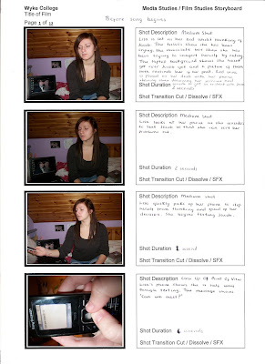
For this scene, the first few seconds of action, like in the drawn storyboard, we went in from a medium shot of me sat looking very sad and upset. The medium shot allowed my arms to be shown as they would be in use through the scene, and also the messon my bed behind me to show her physical state, including a picture of me and Jacob on my laptop, an idea we came up with to show the contrast from a happier past that we shared. This shot also allowed for facial expressions to be seen by the audience.
The next shot, again from a medium shot, shows me looking over at my phone and going to pick it up, showing I am thinking about it, and gives the audience the impression I am about to use it.
The next scene shows a point of view shot of my phone as I have picked it up, to give continuity, and to show me sending a text. This shot was ideal, as it was close enough to see the message I was sending, asking 'Can we meet?', explaining the narrative to the audience through actions rather than lyrics.
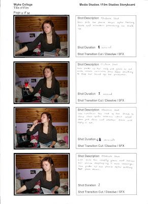
The next shot shows me from a medium shot puting my phone back down, looking at the wine glass beside it.
The next two shots show, again from a medium shot, me picking up the glass and downing the drink. The half content of the glass shows I have already been drinking it, and that I am using it to esccape issues between me and jacob, and the fact that we have split up.
The next scene shows from a medium shot, me putting the glass down and picking the phone back up again. We planned to add a sound insert of a text at this point, showing the phone is going off to show that there is a new message.
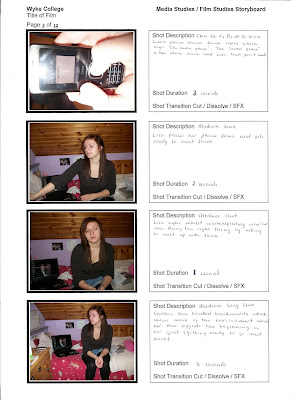
We then go back to a point of view of the phone to reveal the message and to show what I was looking at. This also establishes the narrative to the audience, as the close up displays the message in detail from the male character, which says 'Okay, same place.' This place will be the original meeting place of the couple, to show the romantic aspect, and makes the audience aware that this is a special place that they are both aware of visiting in their past.
There is then a medium shot back out for me placing the phone back down. This medium shot is then held as a starting point for a backwards tracking camera as the piano instrumental begins, and I look around sighing at the room that I am in, showing I am both aware of the state it has got in since the breakup, and thinking about the conversation just had between myself and the male character I am about to meet up with. The camera then backwards tracks, revealing the mess within the room, going into a wide shot, and also establishes the whole scene I am in, whilst giving the impression that the action has now moved from just the central character, as the journey begins to meet Jacob.
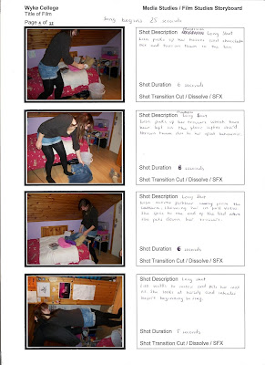
This scene is all filmed from a medium shot to show the action without having to focus on the emotional aspects, so that bodylanguage is clear and references this, as there is much happening in the scene. The next few sections show me to be clearing away tissues from the bed, showing her emotions have overcome her since their split, picking up jeans from the floor which are crumpled, again to show her lazy physical state since the split, reflecting her sadness and emotion, and finally putting on my coat, showing I am about to set off on the journey. This is the last part of the action to the instrumental before the song begins.
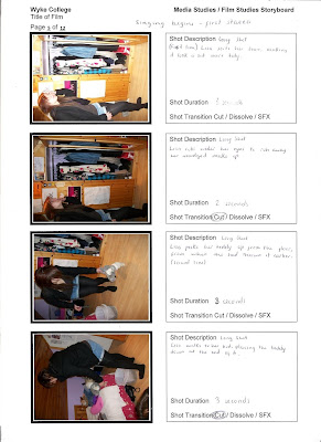
The first two shots of this scene is a long shot, showing me from a side looking into the mirror and wiping my makeup that was smudged on my face, showing that I had been crying, expressing previous emotions since the breakup.
The next shot is again a longshot, showing me picking up a teddybear from the floor, a romantic token of our relationship symbolising our past, giving emotive representation to the audience.
A long shot finally follows for the end section, as I place the teddy back onto the bed, showing it still has sentimental value, as does the relationship.
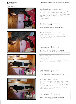
The previous long shot continues as I walk accross to my laptop on my bed, before a medium shot of me approaching it as I look at it. A close up then follows, showing a picture of us as the background on the laptop. This shows as it is still present on the wallpaper, that it is still sentimental to me, and by it still being there, I have not yet given up on the relationship.
We then go back to a medium shot as I close the latpop, showing both that I am ready to leave, and that it is painful at this time for me to look at, as the breakup is still raw and I am still unsure of the upcoming events that are about to happen as I go to meet Jacob.
I then turn away out of the shot to leave, as I sing the final line 'To make you feel my love'. The shot then cuts to a long shot as I am besides the door as this happens, looking around the room, showing I am remembering and thinking about the past, before switching off the light, making a blackout into the next scene. This blackout establishes a cut into the next sequence of events, giving continuity but also using the light switch in the previous scene to do this.
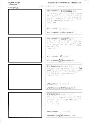
(Images have not been taken for this scene yet)
This scene contains the first flashback in our video of when the couple first met. We wanted it to be a very tender, romantic moment between the couple, and for this to reflect on the audience as they watch it.
We begin with a wide shot, showing me stood near a wall, overlooking the lights and the river in the distance, to establish a very romantic setting, and also to put both characters in the shot, as we planned to have Jacob stood almost out of the shot, right at the side looking at me. This shot is also wide enough to establish action in the scene, as I am struggling to control my umberella due to windy weather conditions in the scene.
We stay in the long shot for this next section, as Jacob sees me struggling and embraces me from behind to try to turn the umberella the right way around. By this close position of contact, there is more romance established, as the naivety of the characters meeting for the first time shows that they are both a little nervous and shy around each other, though this intimate and bold movement shows there is affection from the male, and that he is protecting the female by helping her in this way. To the audience, this shows that he is the strong, protective and loving figure that we desire in our lives, and is seen commonly in a romantic film.
We then cut to a medium shot to show the expression of both characters whilst this action is happening, seeing the female looking very shy and happy as she finds the male attractive, and did not expect what happened, and showing the male smiling too as the chemistry is clear between the two, although they have just met, establishing the theme of 'love at first sight', another typical convention seen in love and romance videos and films. The medium shot is held as they look at each other, showing a connection has been established between them, leaving this as the last point before the next scene.
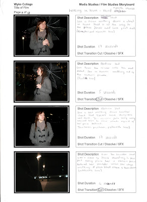
This scene cuts back to the future, shown by a medium shot of the female walking down a street, showing her journey to meet Jacob, and shows enough emotion and body language for the audience to get the idea of what is happening in the scene. (We had the idea of shooting flashbacks with a blurry enfringement around the shots to represent this.)
In this scene, I am walking down a 'good' street, with lights seen as I pass them singing. This portrays a more positive, romantic environment, showing warm lights and colours, portraying a stereotypical scene shown in other romantic videos. This shot continues as I walk out of the shot into the next street, establishing continuity of the narrative.
The next shot is a medium shot of me walking into a more dangerous street, as the lyrics 'I'd go crawling down the avenue' are sung, to give a literal meaning to this. The lights in the previous scene are now gone, showing a black background to represent loneliness and isolation. This referrs to my research videos, one being 'The Script's 'Breakeven', as this is a convention used a lot to portray loneliness and heartbreak since the central character's breakup. It also gives vulnerability, like in the video for 'Before It's too Late', showing high-angle shots of central characters to give emphasis on this. We wanted to use this in these scenes, however, we found it difficult to get onto a high enough level in the chosen area to do this successfully.
During the end of this scene, the camera slowly pans around the female, as she stops and looks up at something. This is done in the style of a point of view shot, establishing what she is looking at, and giving continuity through to another type of shot. An over-shoulder-shot is also used, to show her looking at Jacob from her perspective, who is waiting to meet her. This shot also gives the audience a feeling that this is the final confrontation, as they have finally both arrived at their meeting place, and gives a feeling that something is about to happen between them, as a final climax in the video.

For this scene, the first few seconds of action, like in the drawn storyboard, we went in from a medium shot of me sat looking very sad and upset. The medium shot allowed my arms to be shown as they would be in use through the scene, and also the mess
The next shot, again from a medium shot, shows me looking over at my phone and going to pick it up, showing I am thinking about it, and gives the audience the impression I am about to use it.
The next scene shows a point of view shot of my phone as I have picked it up, to give continuity, and to show me sending a text. This shot was ideal, as it was close enough to see the message I was sending, asking 'Can we meet?', explaining the narrative to the audience through actions rather than lyrics.

The next shot shows me from a medium shot puting my phone back down, looking at the wine glass beside it.
The next two shots show, again from a medium shot, me picking up the glass and downing the drink. The half content of the glass shows I have already been drinking it, and that I am using it to esccape issues between me and jacob, and the fact that we have split up.
The next scene shows from a medium shot, me putting the glass down and picking the phone back up again. We planned to add a sound insert of a text at this point, showing the phone is going off to show that there is a new message.

We then go back to a point of view of the phone to reveal the message and to show what I was looking at. This also establishes the narrative to the audience, as the close up displays the message in detail from the male character, which says 'Okay, same place.' This place will be the original meeting place of the couple, to show the romantic aspect, and makes the audience aware that this is a special place that they are both aware of visiting in their past.
There is then a medium shot back out for me placing the phone back down. This medium shot is then held as a starting point for a backwards tracking camera as the piano instrumental begins, and I look around sighing at the room that I am in, showing I am both aware of the state it has got in since the breakup, and thinking about the conversation just had between myself and the male character I am about to meet up with. The camera then backwards tracks, revealing the mess within the room, going into a wide shot, and also establishes the whole scene I am in, whilst giving the impression that the action has now moved from just the central character, as the journey begins to meet Jacob.

This scene is all filmed from a medium shot to show the action without having to focus on the emotional aspects, so that bodylanguage is clear and references this, as there is much happening in the scene. The next few sections show me to be clearing away tissues from the bed, showing her emotions have overcome her since their split, picking up jeans from the floor which are crumpled, again to show her lazy physical state since the split, reflecting her sadness and emotion, and finally putting on my coat, showing I am about to set off on the journey. This is the last part of the action to the instrumental before the song begins.

The first two shots of this scene is a long shot, showing me from a side looking into the mirror and wiping my makeup that was smudged on my face, showing that I had been crying, expressing previous emotions since the breakup.
The next shot is again a longshot, showing me picking up a teddybear from the floor, a romantic token of our relationship symbolising our past, giving emotive representation to the audience.
A long shot finally follows for the end section, as I place the teddy back onto the bed, showing it still has sentimental value, as does the relationship.

The previous long shot continues as I walk accross to my laptop on my bed, before a medium shot of me approaching it as I look at it. A close up then follows, showing a picture of us as the background on the laptop. This shows as it is still present on the wallpaper, that it is still sentimental to me, and by it still being there, I have not yet given up on the relationship.
We then go back to a medium shot as I close the latpop, showing both that I am ready to leave, and that it is painful at this time for me to look at, as the breakup is still raw and I am still unsure of the upcoming events that are about to happen as I go to meet Jacob.
I then turn away out of the shot to leave, as I sing the final line 'To make you feel my love'. The shot then cuts to a long shot as I am besides the door as this happens, looking around the room, showing I am remembering and thinking about the past, before switching off the light, making a blackout into the next scene. This blackout establishes a cut into the next sequence of events, giving continuity but also using the light switch in the previous scene to do this.

(Images have not been taken for this scene yet)
This scene contains the first flashback in our video of when the couple first met. We wanted it to be a very tender, romantic moment between the couple, and for this to reflect on the audience as they watch it.
We begin with a wide shot, showing me stood near a wall, overlooking the lights and the river in the distance, to establish a very romantic setting, and also to put both characters in the shot, as we planned to have Jacob stood almost out of the shot, right at the side looking at me. This shot is also wide enough to establish action in the scene, as I am struggling to control my umberella due to windy weather conditions in the scene.
We stay in the long shot for this next section, as Jacob sees me struggling and embraces me from behind to try to turn the umberella the right way around. By this close position of contact, there is more romance established, as the naivety of the characters meeting for the first time shows that they are both a little nervous and shy around each other, though this intimate and bold movement shows there is affection from the male, and that he is protecting the female by helping her in this way. To the audience, this shows that he is the strong, protective and loving figure that we desire in our lives, and is seen commonly in a romantic film.
We then cut to a medium shot to show the expression of both characters whilst this action is happening, seeing the female looking very shy and happy as she finds the male attractive, and did not expect what happened, and showing the male smiling too as the chemistry is clear between the two, although they have just met, establishing the theme of 'love at first sight', another typical convention seen in love and romance videos and films. The medium shot is held as they look at each other, showing a connection has been established between them, leaving this as the last point before the next scene.

This scene cuts back to the future, shown by a medium shot of the female walking down a street, showing her journey to meet Jacob, and shows enough emotion and body language for the audience to get the idea of what is happening in the scene. (We had the idea of shooting flashbacks with a blurry enfringement around the shots to represent this.)
In this scene, I am walking down a 'good' street, with lights seen as I pass them singing. This portrays a more positive, romantic environment, showing warm lights and colours, portraying a stereotypical scene shown in other romantic videos. This shot continues as I walk out of the shot into the next street, establishing continuity of the narrative.
The next shot is a medium shot of me walking into a more dangerous street, as the lyrics 'I'd go crawling down the avenue' are sung, to give a literal meaning to this. The lights in the previous scene are now gone, showing a black background to represent loneliness and isolation. This referrs to my research videos, one being 'The Script's 'Breakeven', as this is a convention used a lot to portray loneliness and heartbreak since the central character's breakup. It also gives vulnerability, like in the video for 'Before It's too Late', showing high-angle shots of central characters to give emphasis on this. We wanted to use this in these scenes, however, we found it difficult to get onto a high enough level in the chosen area to do this successfully.
During the end of this scene, the camera slowly pans around the female, as she stops and looks up at something. This is done in the style of a point of view shot, establishing what she is looking at, and giving continuity through to another type of shot. An over-shoulder-shot is also used, to show her looking at Jacob from her perspective, who is waiting to meet her. This shot also gives the audience a feeling that this is the final confrontation, as they have finally both arrived at their meeting place, and gives a feeling that something is about to happen between them, as a final climax in the video.
This scene is the last flashback of the past, contrasting with the first as a more negative memory of their relationship, showing a variety of emotions from the female's perspective. We start in wide shot, showing both characters sat together, appearing to be watching the television from their location, their comfortable-looking and intimate positions together, and the point of focus in both of their eyes. The pair then begin to argue as Jacob makes a comment about something. The argument gets more and more heated, with both of them using hand jestures, the wide shot clearly displaying this, with facial expression included. There is no dialogue heard in this scene, as we wanted to have the song over the top with the music, but to make it clear through bodylanguage to the audience that an argument was taking place. The red wall was also a key feature for us, as it represented love and danger, both displayed within the scene. This section finishes with the female jumping up out of the comfortable position, to show she is angry and does not want to be near him, and is in a state of disbelief from this isolated position and facial expression.
There is then a medium close up as the female rises, to show continuity from the previous section, before jacob is then shown in a two-shot form with the female as he gets up in rage too. He then rises his hands over his head to show his frustration as the argument continues in this shot, before moving out of the shot in what appears from his expressions to be an angry rage.
The previous shot is then continued in another wide shot, showing Jacob grabbing his jacket before approaching the door to leave, with the female following him in disbelief, hands outwardly displayed to outline her amazement that he is leaving after the argument. The female is then shown to go back to the sofa to sit down as the male closes the door.
The next cut into a medium close up shows continuity of the previous shot of the female sitting down. This shot bridges the gap, and also allows for facial expressions to be seen, the image of sadness portrayed in this particular section after the sequence of events that have just happened, leaving the female looking alone and vulnerable.
The next section (no image shown), shows the two characters in a wide two-shot, taking the last few steps toward each other before they finally have conversation. This is a cut back into the present again, and the final chapter of the video. There are many lights behind the two in this scene, with the river from the start shown once again, giving a feeling of remeniscing and visiting past memories to the audience, making them feel mixed emotions as the characters do, and involved personally in the scene. This romantic scene also gives the feeling of a final climax to the video, and that something important will happen in this scene. The intimate two-shot shown also gives a final feeling about it all, as the couple have never been this close together through the whole video, and have never been face to face in such close proximity, also representing them facing up to their problems as a couple. This also gives a feeling that they have been stripped of all of the arguments and complications that have been shown throughout the video previously, and are being forced to now speak openly and honestly for the first time.
During these scenes, the female sings her emotions, as it is a music video and is a convention used in every song, and gives a more powerful emphasis on the emotions she shares reluctantly to the male. This shows them both looking and feeling very vulnerable after the previous argument scene shown, as though they have approached each other very humbly, and are ready to be open and true to one another. All of this gives even more of a romantic aspect to the video, and makes the audience feel this personally whilst watching the video, also making them revisit past personal experience themselves whilst watching. We wanted all of this to come accross, and I believe that the conventions we used did this successfully.
In the last part of the video, after the female has shared all of her feelings openly, she bows her head as though in a state of being in doubt of the male's feelings, as he responds seemingly cold and isolated towards her, making her feel as though he no longer feels the same way about her.
The last section, still in a medium close-up, shows a contrast to the previous scene, as Jacob finally smiles and gently lifts the female's chin up to face him. This delicate and intimate position symbolises he still cares and wants to be with the female, as he is showng loving jestures towards her and is still very gentle with her, in contrast with the body language he showed in the argument.
Realising that Jacob has forgiven her and that the couple are at peace and have another chance, the female smiles happily and contentedly, as though she appreciates this, and sings the last line of the song looking into Jacob's eyes. This gives powerful emphasis on this line, if anything more than any other, as she is stating she wants him to 'feel her love' again, giving the impression to the audience that peace is finally present between the couple, and that they have both matured and want to love each other rather than arguing. The way that this is portrayed visually will give the audience this feeling, and will give them a warm, emotional, yet positive feeling, as they have been brought through so many emotions on a personal level with the couple, and are at last brought to feeling a sense of peace and enlightenment, leaving them feeling happy and loved. We wanted our video to give off this feeling, and give an overwhelming sense of love and togetherness, despite all other emotions displayed, at the end of the video, leaving the audience feeling as though they are wrapped up in love and happiness, a 'feel good' video, as shown in many others alike.
Tuesday, 16 November 2010
Storyboard.
To construct our video and the action that would happen within it, we drew and discussed a storyboard of ideas from our mindmap of ideas for the video.
We chose to fade in from a blackout to the first scene, as this is what is done in the original video, and we wanted to reference this in our own work. We also used the medium close up shot of her to start, and point of view shot of her looking at her phone, as she also uses this idea in her video. We wanted it to be clear to the audience that we were using intertextual referencing from the original video in our own to give iconic value and recognition of this to the audience.
For this scene, we chose a medium shot as it captured the basic features of her face and body, as there was no in depth emotion at this point, and also enabled her arms to be shown as she grabs her phone. We then used a point of view shot to show what she was looking at, which was her phone, as she sends a text message.
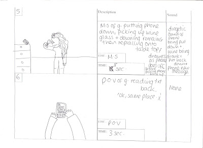
For this scene, we chose a medium shot of her putting her phone down to show action all from a distance to save us having point of view and close up shots, as this would be time consuming within the video. We then stayed within this shot as she picked up a glass of wine on her drawers beside her, the shot also being successful as the drawer can be kept in view. She then downs the wine, still in medium shot, before putting it down and picking her phone back up as the 'text message' tone goes off.
The next scene shows a point of view for continuity after she picks up her phone to show what she is looking at , and revealing the text she has received to the audience.
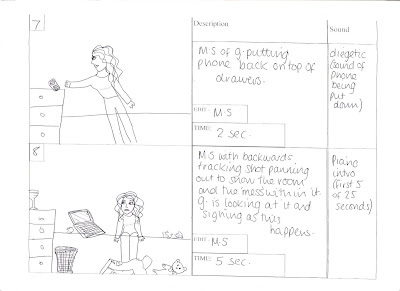
For these scenes, we again focus from a medium shot of the girl putting her phone back upon her drawers. After this point, the instrumental for the start of the song starts. For this point, we went in from a medium shot to show the girls' basic body language and facial expression, as she is looking depressed and sad since her breakup with her boyfriend, and then slowly moved out backwards tracking as the music plays, to reveal the mess she is surrounded by on her bed, again to illustrate the physical state she, and her room are in since her breakup.
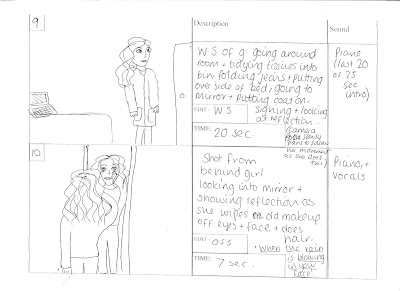 This scene lasts for the remaining 20 seconds of the instrumental. We timed this as there is much action going on within it, but we wanted it to fit well before the lyrics began. We decided as there is lots of action, to shoot from a wide shot to capture everything together. This is whilst the female is doing various jobs, such as folding a pair of jeans, tidying tissues into a bin from on top of her bed, and walking towards the mirror, as the camera pans towards a side view of this.
 The last scene lasts for the 7 seconds, and is the start of the lyrics in the song. For this short scene, there is a shot from behind the female looking into the mirror, also showing her reflection in the camera as she wipes off old smudged makeup, suggesting she has been crying from the breakup, and that she has become in a lazy passive state since the split.
Tuesday, 9 November 2010
Analysis of music video lyrics (Music promo)
Lyrics to 'Make You Feel My Love' by Adele
When the rain is blowing in your face
And the whole world is on your case
I could offer you a warm embrace
To make you feel my love
The lyrics begin showing a blue light over the room and the video is shot through a hand held camera,showing sadness, emotion and realism from these devices, with a point of view shot of the main female character texting someone on her mobile phone. The next line 'And the whole world is on your case', is shown in a medium close up of the female to show her expressions as she sings the line. We are then brought back to a point of view of her sending the first text shown at the start, as the line 'I could offer you a warm embrace' is sung, before showing a side perspective shot of a medium close up to show emotion, followed by a long shot of the back of the female as the finishes the last line.
When the evening shadows and the stars appear
And there is no one there to dry your tears
I could hold you for a million years
To make you feel my love
These lyrics begin through a medium shot of the female singing, with the hand held camera moving slowly closer as she sings. The blue lighting is still shown as sadness is the female's constant state of emotion in this scene. These features continue to be shown until the line 'I could hold you for a million years', where midway through the line, we are brought from a medium shot into a side perspective medium shot to show expression again, showing the hand held camera moving to show realism, before a long shot again of the female's back. This is an exact repetition of the first scene, as there are two verses before the third main stanza/chorus, so the director has decided to replicate them to represent this.
I know you haven't made your mind up yet
This line shows a close up of her mobile, followed by a slow plan through a close up and with a hand held camera of the female's face as she sings, showing her emotions and from the previous close up of the phone, suggesting she is thinking about the male, of whom she is texting.
But i would never do you wrong
This scene shows a wide shot of the building she is in, whilst slowly moving in with the camera as she sings.
I've known it from the moment that we met
No doubt in my mind where you belong
These lines firstly show a medium close up of the female with a hand held camera to express her emotions on her face as she sings the lines ,followed by a side view of her face through a close up to show expression, then showing the camera following her body down to show her hand placing the phone down on a table. This is possibly referencing the line 'No doubt in my mind where you belong' to show that by her putting the phone down next to her, that she believes that the male should also be beside her.
I'd go hungry i'd go black and blue
This line shows a medium close up to begin with to express her emotions in the line, before going again to a side shot through close up of her singing the words 'black and blue' as she rubs her arm, to give a literal meaning of what she is singing about, and to make her look vulnerable in this scene.
I'd go crawling down the avenue
This line begins with a medium close up, before the camera begins to rise slowly above her as she sings the line, to show her vulnerability as she is saying she would go into a dangerous place for him. We then finally see a side view of her in close up, again to express her emotions. This is a very tender moment in the video, as she is showing her vulnerability towards him, and showing the lengths she would go to to be with him to show how much he means to her.
No there's nothing that i wouldn't do
This line shows a close up of the female, showing her makeup is smudged and that she has been crying to outline her sadness, before the close up rises and moves over her head into a high angle shot to again show her vulnerability as she again rubs her arm, to show she is cold and alone, before being brought into a long shot behind her, to show her sat on her bed, giving emphasis on how alone she is. The environment in the room has blue lights, and she is wearing a blue top to give more representation on her feelings and emotions in the song.
To make you feel my love
This scene shows a medium close up as the female looks accross at something in the room. We are then shown what she is looking at with a point of view shot of the phone, suggesting she is thinking about the texts that were sent and the male character she misses, before being brought back to the medium close up of her as she gets up out of the shot.
The storms are raging on the rolling sea
This shows her through a close up as she looks out of her window. Her face is in a dark silhouette to show the loneliness and darkness she feels without the male, however the lighting still shows her eyes for emotion in the lyrics.
And on the highway of regret
This shows a pan around the back of the female to show the outside of the building, showing many bright lights and roads, refering to the lines 'and on the highway of regret'. We also see her in close up from this perspective pulling her cardigan over her body, something she was not wearing before. This expresses her coldness and loneliness without him again, giving her more vulnerability and empathy from the audience.
Though winds of change are blowing wild and free
You ain't seen nothing like me yet
These lines show the black silhouette once again, but keeping some light on her face to show her eyes and aspects of her face to show her emotions when singing the lyrics. This is the first time in the video that she sings with wider and more open facial expressions, giving a powerful impact on her feelings and the lyrics she is singing to the audience.
I could make you happy make your dreams come true,
This line shows firstly a long shot of the female's back, showing her stood up looking out of the window, followed by the black silhouette form again with the brief lighting on her face as she sings the last part of the line for expression. The camera is hand held for realism and goes slightly in and out of focus, representing how she sees life since she has parted with him.
Nothing that I wouldn't do
This line shows the female looking out of her window, showing blurry reflections of light over her face from the outside, with a dark background behind her to represent the isolation and loneliness she is feeling, also through a hand held camera. For the last few words; 'Nothing that I wouldn't do', we are brought back to the silhouette of her in extreme close up form showing her lips as she sings this, giving emphasis on the line as she is speaking it.
Go to the ends of the earth for you
To make you feel my love
To make you feel my love
For these last few lines, we are again shown the female looking out of the window with the outside lights reflected on her face, also showing how she is isolated by the black background. We often see a black shadow moving over the scene in this section, representing her figure that is looking into the window from our perspective. This is all a point of view shot of her looking at her reflection, as she is perhaps reflecting herself on what has happened, and how she can see that she is alone. This is all again with a hand held camera, before we are finally brought out into the same wide shot of the building as earlier on in the video, as the music quietens and is played softly whilst we hear ambient sound from within her flat. We can also hear a sound of her receiving a text, and she is shown very small through the window to be going to answer this. This leaves her at the end of the video still looking vulnerable, leaving the audience with the peacefulness at the end to reflect on what has happened, and to wonder what the future will hold for the female, and her relationship with the male character.
Cast List
The first stages of deciding a cast list for us, was to establish the storyline, and the different scenes of what we wanted within our video. Once we decided this (show in the 'initial planning' post), and decided that we wanted two central characters, one male and one female, we decided to ask our friends who would be reliable to do the video. Unfortunately, we struggled to find the right people who would be reliable enough. Taslima was going to play the role originally in light of this, however she decided that she would struggle to play the part in the right way, and would not be able to be serious enough when under the pressure of being filmed. I decided that I would be able to do this, as I had had the practice at college in my previous drama lessons of getting into character, so volunteeered to play the role. We also chose Taslima's boyfriend Jacob to play the male role, as we found that he was the most reliable source for this part.
Prop List.
Here is a mindmap of what we came up with for our prop list, after discussing the storyline, and the different flashbacks and future scenes involved in the video.
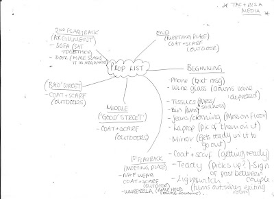
We decided to use most of these ideas, as we began to develop ideas for each scene. For the start, we decided to have the female sat among a jumble of mess in her room, such as tissues spread accross the bed and clothes/a pair of jeans strewn around the room, as well as a half-full glass of wine. We used these props, as we wanted to portay the character as emotional and upset/changed since her split with her boyfriend, and thought this was an effective way to show the physical deterieration of her as a person since the split.
We also decided to use a mobile phone in this scene for when she is texting the male, and a laptop on the bed with a picture of them as the background for emotional impact, showing her looking at it before leaving. We also decided to include a teddybear and a mirror in which she is preparing herself to go out in, before noticing the teddy on the floor, perhaps through reflection in the mirror, which is again for sentimental value to the character, before showing her picking it up and putting it back on her bed, to show she does not want it to be hurt and mistreated, as she perhaps is, as it is precious to her, like her relationship. The final props we included were a coat and scarf which she puts on before exiting the room, giving the impression she is going outdoors and that it is cold, and then a lightswitch as she turns it off to cut into the next scene as she looks around the room, perhaps remeniscing a final time and collecting herself before leaving.
In the next scene, showing a flashback of their meeting place, we included coats and scarves for both characters, again to show that it was cold when they met. However, a different coat would be needed for the female, to show it is a memory of the past, and not still in the present. We also included an umberella, as we decided to put in a mini-storyline of the female being in the rain as the umberella gets stuck inside out, before the male notices and comes to help her out, making way for his entrance and their meeting through this, and also establishing the first aspect of romance in the storyline. This contrasts to the sad, emotional impact from the opening first scene.
The next scenes which we thought about props for, was the female walking down the 'good' and 'bad' streets. We decided to use only a coat and a scarf for this scene, to show she is braving cold weather to go and meet him, again giving a romantic aspect, and also to link with the previous scenes where she is wearing a similar costume.
The props we decided to use for the second flashback of the argument, was the sofa that we would have the couple sat on in the room, as we wanted them to look comfortable at the start, as they do not start off arguing, and portray a portrait to the audience of a happy couple. We also used a door, as after the argument the male slams a door and walks out, leaving the female looking upset and in thought alone.
The final scene which we would use props in is the end scene located at their first meeting place. We decided we would only need the coats and scarves of the characters in this scene, as the focus would be on the lyrics and emotional expressions of the characters.
Monday, 8 November 2010
Locations list.
Here is a list of our locations that we chose for our video:
First scene with girl texting (20 sec. action and music) -Bedroom (Taz's house)
Meeting place and end scene-Marina
'Good' street- Marina- Lit up area near flats
'Bad' street- Road leading to end of Marina
Argument scene- Lisa's house
We chose all of these places as they were all suitable areas for lighting, timing within the video (Travelling into the next cuts/scenes), and showed strong representation of each place that we would show, for example, the lights were brightly lit in the 'good street', making a positive atmosphere to reflect this environment.
We decided to choose Taslima's room for the opening of the girl singing and texting her boyfriend, as it was a larger area, which was more suitable for filming certain angles, such as long shots and point of view shots.
We also changed our meeting place to the Marina instead of Queen's Gardens, as we decided that the space would be limited because of the layout of the area, and thought that Marina was a more romantic location to film after taking a visit there to decide what we thought, as the location showed the sea over the marina, with small lights of the city in the distance, again like in 'Love Actually' and 'Sleepless In Seattle'.
We chose my house for the argument scene, as I have a red wall in my living room, which the couple would be sat infront of on the sofa, representing love at the start of the argument when they are sat together, followed by anger and danger as the begin to argue.
We also changed the 'good' and 'bad' street locations to areas not shown on our mindmap, as when we began filming, the original places we had chosen were too long in distance to film on meaning we could not reach the next scene in time, and the lighting was too dark over the characters' faces to be seen properly. In light of this, we chose to shoot the street scenes in the same location as the meeting place and end scenes- at the marina, in two small areas where the lighting was appropriate and outlined the faces of the characters in the way that we wanted them to.
Subscribe to:
Posts (Atom)


