Wednesday, 15 December 2010
End scene final shoot.
This is the final shoot of me and Jacob in the end scene of our video. For this scene, we had to rehearse many times before filming to ensure we could go straight through the scene successfully without stopping. This was very difficult at first, because of eye contact between us putting Jacob off, therefore I had to look past his eyes as much as possible. This shows in the video, however we believe that it makes the female character look more emotional and in thought by doing so, and so that when she does look into his eyes, she does so when expressing important parts of the lyrics to him. Jacob also avoids contact with me, showing it is awkward and still sensitive between the pair since they have been apart for a long time. He does keep eye contact at the end of the lyrics, however, showing that he has forgiven the female character, and is willing to listen to what she has to say.
For the lighting in this scene, we stood in the same places, as we felt that the light picked up well the last time we filmed. However, we decided to swap places, as Jacob was distracted by the bright scenery behind me, whereas when I was stood in his place there was nothing to keep his attention. The lighting in the area was also a lot better with our teacher John's camera, as it brought out a clearer effect on the camera, compared to the previous test video shown where the wind and lighting combined gave a very foggy and unsteady approach.
We are both pleased with this final result, as the camrea is steady and clear, the lighting is bright enough and focused to express the right parts of the characters' faces, and with the warmth of the back setting, gives off a very romantic feeling to the audience.
Tuesday, 14 December 2010
Digipak research.
For the start of my digipak design, I researched and found different other digipaks by established artists to reference in my own design.
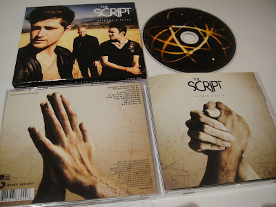
This is the first digipak I looked at, from The Script's new album, 'Science and Faith'. This is an alternative digipak, as I found it incredibly difficult to find any images of them on the internet. The front cover for this digipak contains a close up image of the lead singer, with a medium close up and medium shot getting further away of the other two members. The design is all in colour, and has a high contrast for both the background and the image. The background shows an outside area, looking like an old beach with land around it from the golden coloured ground they are stood on.
On the top right is the band's name in large white text, using their iconic font for audience recognition, followed underneath by the album title in smaller, more spaced out white text. This presentation shows that the band are the important feature, suggesting the singer is even more important as he is shown in a closer up shot. The large title font is used combined with their iconic type to give recognition to the audience, and to make it stand out after the image as one of the first things the audience sees. I like this use of large text, placed in an area that does no overlap anything, including the image or background, and can be seen amonst the other colours. I will use this idea in my own design.
The actual cd design is black with a series of lights around the centre. This gives a warm and romantic feel, as the lights and the black background represents the night and street and road lights on the street, stereotypically seen and portrayed in heartbreak videos as a romantic location, as the lights give off and represent warmth. The end scene of our video is also located in an area like this, therefore this idea would link into our video. The effect is done with a camera when the shutter speed is set to close quicker to get this effect. This means that with a suitable camera I could create this if I wanted to in my own design, as it is an easy proceedure that I could create myself.
The back design for this cd has a coffee colour background merging into a central white light, perhaps to represent a higher power like that of God. There is a large image placed into the centre of this of the palms of two people's hands coming together, as though they are making a romantic connection for the first time. On the top right in small black font, the tracks are established, with the title and track number after. On the bottom right is also credits to the producers and the record label and any other rights. The way that this is done in small text, also parallel to the other contents of text at the top, gives a very neat and precise layout, with a very straight to the point design of what tracks are where on the cd, and any producing information the audience want to see. The bottom left also contains a barcode to scan the cd for proof of authenticity, followed beside it with the record label's stamp to show it is a true copy of the album, and to give recognition of their brand to the audience. Overall, the layout is simple yet effective, giving the right information in convenient places, and a powerful central image to give the idea of connection and what the songs entail, being romance and people coming together.
This is Rihanna's digipak that I am using for my research. The front is not shown on this pack, however the middle and inside designs are, showing the front to have a certain shape when closed, as the inner front design is worked around this shape. The first part of the digipak is this inner cover, and shows text besides a picture of rihanna, giving the impression that this is information on her music and what is included in the CD. The background used shows a room or scene which could be either from a music video of one song, or a theme throughout the digipak. The text over is white as black and red are the dominant colours used in the background, therefore making white the easier text to read over the top, also coordinating with the dress Rihanna is wearing in the image beside. There are also smaller images below the text of her other albums that she has produced, drawing the audience in and making them want to purchase others. Overall, this design gives a very warm yet smart impression from the combination of darks and lights, and the coordination of the colours with what Rihanna is wearing. It is also good promotion of her previous records to the audience.
The central design for the CD itself is done quite simply, using a blue and brown background, again perhaps from a scene in a video, and a navy blue colour cd with white text for the branding and rights on the cover of the cd. This overall looks simplistic and allows the audience to find the right information on the cd without complicated designs or pattern. The colours used also match those of the previous design, and give a warm approach.
The final cover is just a large image of Rihanna, with no text or other design. This simple form attracts the audience straight to the image upon opening, allowing them to notice the beauty and sexuality of Rihanna, as she is wearing a white silk dress connotating innocence, with missing parts at the front to reveal a bikini underneath. The pose also gives the impression that she is looking out of the image to the audience, giving them a feeling she is trying to reach out to them with her music.
Overall, the design is presented to be very smart with corresponding colours. The idea of the large image as you turn is a good method to use, as it instantly attracts the audience, making them notice the artist upon opening of the digipak, and is something that I plan to use in my own design.
The last image I will use for my research is Mariah Carey's digipak design. This is in a two-disc format, meaning less text and imagery is visible.
The first inner cover design shows an image of Mariah at the bottom of the page in her underwear, to instantly draw the audience's attention to this risque and sexual photograph. The colours are also edited so that everything looks very brown and golden, and with the white background and soft light around her, this gives a very angelic approach.
The information about the cd is in small grey font, wrapped around her body to give more focus on the image itself, however looks smart and compact in this format.
The other two sides are similar, showing body parts beneath the cds of Mariah, giving a mystery and suggesting there is more of her underneath the cds to view, like a hidden picture. There is white light in the background of these designs too, matching the first page. The cds are grey and black with small white font spelling out the artists' name and the album name below it. There are also icons and trademarks on the cd at the bottom.
Overall, this design is simplistic and concise, giving an uplifting and heavely feeling from the white lighted background and the golden editing of Mariah's main image. The idea of shaping text around the image is another good idea, which I will use in my own design of my album.

This is the first digipak I looked at, from The Script's new album, 'Science and Faith'. This is an alternative digipak, as I found it incredibly difficult to find any images of them on the internet. The front cover for this digipak contains a close up image of the lead singer, with a medium close up and medium shot getting further away of the other two members. The design is all in colour, and has a high contrast for both the background and the image. The background shows an outside area, looking like an old beach with land around it from the golden coloured ground they are stood on.
On the top right is the band's name in large white text, using their iconic font for audience recognition, followed underneath by the album title in smaller, more spaced out white text. This presentation shows that the band are the important feature, suggesting the singer is even more important as he is shown in a closer up shot. The large title font is used combined with their iconic type to give recognition to the audience, and to make it stand out after the image as one of the first things the audience sees. I like this use of large text, placed in an area that does no overlap anything, including the image or background, and can be seen amonst the other colours. I will use this idea in my own design.
The actual cd design is black with a series of lights around the centre. This gives a warm and romantic feel, as the lights and the black background represents the night and street and road lights on the street, stereotypically seen and portrayed in heartbreak videos as a romantic location, as the lights give off and represent warmth. The end scene of our video is also located in an area like this, therefore this idea would link into our video. The effect is done with a camera when the shutter speed is set to close quicker to get this effect. This means that with a suitable camera I could create this if I wanted to in my own design, as it is an easy proceedure that I could create myself.
The back design for this cd has a coffee colour background merging into a central white light, perhaps to represent a higher power like that of God. There is a large image placed into the centre of this of the palms of two people's hands coming together, as though they are making a romantic connection for the first time. On the top right in small black font, the tracks are established, with the title and track number after. On the bottom right is also credits to the producers and the record label and any other rights. The way that this is done in small text, also parallel to the other contents of text at the top, gives a very neat and precise layout, with a very straight to the point design of what tracks are where on the cd, and any producing information the audience want to see. The bottom left also contains a barcode to scan the cd for proof of authenticity, followed beside it with the record label's stamp to show it is a true copy of the album, and to give recognition of their brand to the audience. Overall, the layout is simple yet effective, giving the right information in convenient places, and a powerful central image to give the idea of connection and what the songs entail, being romance and people coming together.
This is Rihanna's digipak that I am using for my research. The front is not shown on this pack, however the middle and inside designs are, showing the front to have a certain shape when closed, as the inner front design is worked around this shape. The first part of the digipak is this
 inner cover, and shows text besides a picture of rihanna, giving the impression that this is information on her music and what is included in the CD. The background used shows a room or scene which could be either from a music video of one song, or a theme throughout the digipak. The text over is white as black and red are the dominant colours used in the background, therefore making white the easier text to read over the top, also coordinating with the dress Rihanna is wearing in the image beside. There are also smaller images below the text of her other albums that she has produced, drawing the audience in and making them want to purchase others. Overall, this design gives a very warm yet smart impression from the combination of darks and lights, and the coordination of the colours with what Rihanna is wearing. It is also good promotion of her previous records to the audience.
The central design for the CD itself is done quite simply, using a blue and brown background, again perhaps from a scene in a video, and a navy blue colour cd with white text for the branding and rights on the cover of the cd. This overall looks simplistic and allows the audience to find the right information on the cd without complicated designs or pattern. The colours used also match those of the previous design, and give a warm approach.
The final cover is just a large image of Rihanna, with no text or other design. This simple form attracts the audience straight to the image upon opening, allowing them to notice the beauty and sexuality of Rihanna, as she is wearing a white silk dress connotating innocence, with missing parts at the front to reveal a bikini underneath. The pose also gives the impression that she is looking out of the image to the audience, giving them a feeling she is trying to reach out to them with her music.
Overall, the design is presented to be very smart with corresponding colours. The idea of the large image as you turn is a good method to use, as it instantly attracts the audience, making them notice the artist upon opening of the digipak, and is something that I plan to use in my own design.
The last image I will use for my research is Mariah Carey's digipak design. This is in a two-disc format, meaning less text and imagery is visible.

The first inner cover design shows an image of Mariah at the bottom of the page in her underwear, to instantly draw the audience's attention to this risque and sexual photograph. The colours are also edited so that everything looks very brown and golden, and with the white background and soft light around her, this gives a very angelic approach.
The information about the cd is in small grey font, wrapped around her body to give more focus on the image itself, however looks smart and compact in this format.
The other two sides are similar, showing body parts beneath the cds of Mariah, giving a mystery and suggesting there is more of her underneath the cds to view, like a hidden picture. There is white light in the background of these designs too, matching the first page. The cds are grey and black with small white font spelling out the artists' name and the album name below it. There are also icons and trademarks on the cd at the bottom.
Overall, this design is simplistic and concise, giving an uplifting and heavely feeling from the white lighted background and the golden editing of Mariah's main image. The idea of shaping text around the image is another good idea, which I will use in my own design of my album.
Images used for props in opening intro.
For our opening instrumental after the first few shots of the recording studio, we chose to have a scene showing the female texting the male and awaiting his reply, as in the original planning of our video. As me and Jacob are friends in real life, we had many pictures together in many different places. Me and Taslima recovered these pictures from various albums we owned, and decided to use these for this scene as props, putting them in frames nearby the female to show the past and the close relationship that they had, and the fond memories they shared together.
Here are the images that we are going to use;
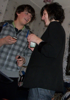
This image shows Jacob and I at a party together smiling and laughing happily, possibly
exchanging numbers shown from the phone in his hand, a suggestion of the very starting point of our relationship.

This image shows me and jacob sat together, possibly in a bar from the dark background. Our expressions are open and relaxed, as though we are having a conversation.
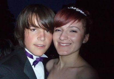
This image shows me and jacob at a ceremony or special event somewhere ,from the formal dress that we are wearing. We are stood very closely together and are both smiling, showing our intimate relationship together. This could be some time into the relationship.
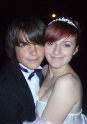 The last image is similar to the previous, showing us again in the same formal dress. We are both showing obvious smiles here, and are stood even closer than the last image. We decided that this would be the one that we would use in our props, are the close proximity of the way that we are stood shows that we are in love and happy together, from our facial expressions, whereas in other images we are not stood as close, and do not look as happy as in this image.
Here are the images that we are going to use;

This image shows Jacob and I at a party together smiling and laughing happily, possibly
exchanging numbers shown from the phone in his hand, a suggestion of the very starting point of our relationship.

This image shows me and jacob sat together, possibly in a bar from the dark background. Our expressions are open and relaxed, as though we are having a conversation.

This image shows me and jacob at a ceremony or special event somewhere ,from the formal dress that we are wearing. We are stood very closely together and are both smiling, showing our intimate relationship together. This could be some time into the relationship.
 The last image is similar to the previous, showing us again in the same formal dress. We are both showing obvious smiles here, and are stood even closer than the last image. We decided that this would be the one that we would use in our props, are the close proximity of the way that we are stood shows that we are in love and happy together, from our facial expressions, whereas in other images we are not stood as close, and do not look as happy as in this image.
Tuesday, 7 December 2010
Filming-day 4-Final meeting scene
This is the final ending scene, 'the meeting place', where the two characters finally complete their journey, and their story that the audience have been brought through, as the female expresses her feelings to the male. For this scene, we wanted to give a big impact as it was the final climax of the whole video, therefore needed the right settings and lighting to make it the perfect romantic location, gripping the audience and pulling their emotional heartstrings, making them wonder what will happen. We wanted this scene to take all of the emotions of the previous scenes and completely break them down, leaving no walls or barriers of the past to hide behind, making the characters stand face to face in complete honesty and openness with each other for the first time in the video.
We chose to film this at the water's edge at the marina, as there are many backlights of the city behind, and with this combined, we are making a stereotypical romantic convention, used in many other films and videos in the same genre, such as the film 'Sleepless in Seattle'.
However, when filming this, we found that the lighting would sometimes cut underneath our faces, making a scary undertone, and giving off the wrong feeling to the video. We then tried to stand over the lights, as our feet could not be seen anyway as we were filming in a medium close up. This helped to dim out the right parts of light during the scene. The wind was also a problem, as it was hard for us to properly look at each other as it was constantly blowing in our eyes. The last problem that occured, was that me and jacob found it hard to look into each other's eyes, so had to keep re-filming this scene until we found a way around it, which was for me to divert my eyes around him rather than straight at him. Next time we film, we aim to try to work when it is not so windy, and also practice many times before filming, incase me and jacob find it hard to act out the scene without feeling nervous and laughing.
Monday, 6 December 2010
Subscribe to:
Comments (Atom)